
- Updated 4/20/07: Removed myNotes⤴ from the list. It’s a notepad rather than a PIM.
- Updated 3/18/07 with review of KIT.
- Updated 1/15/07 with review of TopXNotes.
- Updated 12/6/06 with review of Daily vX.
- Originally published 11/7/06 with review of six PIM apps.
The list of PIM apps in the “review queue” for this ongoing review are listed in the Addendum. New items completed are noted there as well.
There are definitely some life decisions that you should think twice before revisiting. I’m talking things like your marriage, your decision to have kids, your choice of college, your upcoming vacation plans… maybe your car and house. But honestly, don’t politicians make too much of clinging to decisions they made that turn out to be wrong? And don’t some of them place way too high a value on consistency over a long period of time in one’s personal values and beliefs? Is that “fortitude” or “stupidity”? Heck, as Joni Mitchell once pointed out, “Life is for learning.” If you acknowledge that learning changes you by adding new ideas and insights, then individuals who never change their mind about things aren’t particularly good role models for an advanced society… are they?
Astute readers of this page are probably starting to wonder where the hell I’m going with this topic. “Is this an article about PIM software, or not?” Well, it’s actually highly relevant, because one type of decision we make quite often nowadays should be easily reversed. If it isn’t, we’ve made the wrong choice and should change our minds immediately. I’m talking about one’s choice of software applications.
Decisions about software should never be forever, but all too often people act as if they are, or must be. From my perspective on Mars, I can’t imagine why anyone would think it makes sense to cling to old software decisions. How can it make sense, when software is evolving at a more rapid rate than nearly any other human endeavor? Suppose I decide in 2006 that iTunes is the best digital jukebox ever, and that’s that. Then, 3 years from now, Google comes up with a startlingly new approach to managing digital assets that is so obvious and wonderful that it’s hard to cling to the idea that iTunes is better.
If I care about using the best (which I do), I’d better be prepared to try Google’s new software without regret that I invested so heavily in iTunes over the years. Fortunately, iTunes is the kind of software that lets me take advantage of its features without locking me in to them. Given my overall philosophy about software, portability of content and meta data is a pretty important feature in whatever I decide to use. This is actually one of my objections to Windows and the Microsoft way, which is to tie users to their software through proprietary formats that only Microsoft controls.
As a frequent, self-appointed technology consultant within my organization, I always make decisionmakers consider how they will be able to extract themselves from their software decision if it turns out to have been the wrong choice. My view is that in today’s software market, you have to be prepared to make software choices quickly, or risk never making a decision at all as the feature set and universe of software products rapidly shifts. But you have to be prepared to jump ship just as quickly. It’s telling, I think, that the decisionmakers who are least willing to consider jumping ship are those locked firmly into a Microsoft environment. Somehow, these folks feel that if only they could buy all their software from Microsoft—for everything from routers and storage to email and desktop—all their problems would be solved. How can they not see that with each decision to commit another chunk of their organization’s IT infrastructure to one company’s “DNA,” they further restrict their flexibility to make quick decisions, all but ceding their decisionmaking power to that other company. Anybody remember the Star Trek episodes about the Borg? ![]() Seriously, though, it’s very much like that if you let a software Borg get too close to you.
Seriously, though, it’s very much like that if you let a software Borg get too close to you.
It’s ironic that so many “technology experts” think of Apple as the company that locks users in with proprietary hooks, when Apple has never been the source of such danger at all. Yes, Apple’s hardware is proprietary, but think about it: If you want to extract your data from a computer, what form does the data take? Hardware? Of course not… it’s the software, stupid!
The danger of lock-in isn’t from hardware, it’s from software. Since Mac OS X hit the scene 5 1/2 years ago, Apple has been delivering a platform built on open source, standards-based software. Even when they come up with a proprietary file format, they will shortly reveal easy ways of getting your data into and out of that format. I’m not saying Apple has never been stupid about this, but their stupidity about formats is the exception rather than the rule. As a pure software company, Microsoft’s business model is built on secret, proprietary formats that hook in to secret code in Windows, closing the Windows environment and locking users into an apparently velvet prison.
I didn’t mean to digress onto Microsoft (yet again), but my point is that one of the main reasons I use Mac OS X drives a lot of my software decisions: I don’t want to get stuck. I want to be able to migrate freely to a new software application if the features and benefits are compelling enough, and I don’t want worries about how I’ll migrate my data to be a show-stopper.
With this in mind, I’ve been eyeing the market for personal information management (PIM) software on Mac OS X for a couple of years now. I’ve felt a little like a honey bee, alighting briefly on this software package, then moving on to another, and another, all the while sampling a dozen more. The tool I’m currently using has been my “flower” for the longest period so far: DevonThink Pro.
Though far from perfect, it’s the best tool I’ve yet found, with the most flexibility for getting data into and out of its data store. DevonThink Pro covers the widest range of data types, and encompasses a large universe of possible uses and usage scenarios. However, it took me quite awhile to get comfortable with DevonThink, and even now I continue to discover better ways of working with it. And because of a few glaring limitations, as well as my general Software Addict’s mindset, I continue to sample the competition.
This article is not about DevonThink Pro, although I’ll share a few thoughts along the way. Rather, it’s intended to be an ongoing repository of my observations about software products that overlap with DevonThink as I try them out. Given time constraints, these are not complete reviews of the various products, but rather they simply document my quickly written notes on pros and cons during the course of my evaluations. Because new versions of software often overcome limitations in earlier versions (but, as self-evident as this may be, it’s not always true), it wouldn’t be fair to set these notes in stone forever. For any products that have enough “pros” to make me want to return and sample new releases down the road, I intend to revise the entries as the products evolve.
One of these days, I’ll hopefully find the “perfect” product and can close the door on this category of software for awhile. But in the meantime, I’m keeping the door wide open and welcome any newcomers that look interesting and aren’t outrageously expensive. Here is my current list of required features for a PIM product:
- Flexible import and export of data in as many file formats as possible
- Excellent support for HTML formatting and/or conversion, since it’s the final resting place for all my writing nowadays
- Thorough, robust integration with Mac OS X application services, so I can interact with the application from whatever work I’m doing.
- Top-notch search interface for quickly locating my data.
- Flexible user interface for handling data of varying formats and complexity
- Support for smart folders as well as for deep nesting of tags, categories, and folders as aids for organizing data
- Support for to-do lists
- Support for regular word-processing tasks.
- Support for tabular presentation of data and/or spreadsheet-style organization
- Persistent utility for taking notes without having to open up the main application interface.
- Integration with WebKit to enable easy import of web content.
- Robust support for the PDF file format.
- Easy integration of image data, as well as audio and video files.
- Intuitive, easily understood navigation and toolbar functions.
- Excellent, extensive support for contextual menu functions.
- Full accessibility of functions to AppleScript and Automator to enable workflow automation.
One last introductory note… The products in this category overlap with those in the “note pad” or “sticky notes” category, but though I am reviewing those products too, I don’t intend to include those reviews here. In my ideal PIM application, there would be no need for a separate “note pad” or “sticky notes” category, because such functionality would be built into the PIM tool. But nothing that’s come along to date quite fulfills that vision, unfortunately.
The following list has links to the mini-reviews that are included in the article at a given time (in alphabetical order). Products that I intend to keep watching for awhile are designated with checkmarks (![]() ).
).
At the end of the article, I’m keeping a list of the software products that are in my “review queue,” and notes about these will be added here as they’re done. OK… enough jabbering… On with the show!
![]()
Daily vX
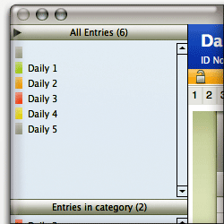 Daily vX is a powerful and, in many ways, impressive personal information manager. Unique among the applications reviewed thus far, Daily is actually a FileMaker application that comes with a FileMaker 8.x runtime. (Note: I know extremely little about FileMaker, and didn’t investigate its capabilities for this review… I simply looked at Daily as a Mac OS X application and assessed its usability and functionality in my usual quirky way.) Apparently, it’s hard to hide this fact, because even if you look at the usual “About” page for Daily, all you get is “About” the FileMaker runtime. (Oh well…) Daily is a product of the German company INtex Publishing, which appears to use FileMaker as the foundation for all their applications.
Daily’s reliance on FileMaker is probably a strength for certain kinds of applications, but in general I found it to be a weakness. FileMaker gives Daily’s data entry system a consistency that would probably be great in a business environment, where you want all records of a given type to be entered the same way. However, for a PIM, it’s not that helpful, because it’s too inflexible to handle a wide variety of information types that you may want to enter. Reflecting its data structure, Daily entries have a certain set of fields for each entry. You can add more text fields, but you can’t, for example, add more than one image or other media file. For that matter, the main text field can’t contain images, and it lacks a number of formatting options that many consider essential for a PIM—for example, bullet or numbered lists.
It’s important to note that if you already have some FileMaker expertise, Daily’s structure becomes much less rigid. That’s because you can use the FrameMaker runtime INtex provides to develop new layouts and data models for your documents. In this case, you can add new fields of various types, rearrange them in the view, and more. As powerful as this capability is, however, it’s hard to imagine busy professionals finding the time to develop their own entry types, or even modifying the layout of existing ones.
Apparently, Daily’s underlying architecture also precludes it from leveraging standard Cocoa-framework goodies like application services, resizable interface elements, customizable toolbars, access to standard text styles, and so on. The interface itself is attractive, but eventually you realize it’s just one big window, and nothing within it can be changed. Reviewing Daily was an adventure unlike the others here, because it’s not a Carbon app… and it’s not Cocoa, either. This is a big drawback if you’re expecting users to take some comfort from standard interface components. Heck, you don’t even get aqua scrollbars!
Now, all of that said, Daily can do a heckuva lot with what it gives you. It has numerous ways to export your information (though there are drawbacks there as well, as I note in the table) and offers sorting and other database-related options that most PIMs don’t. Taken on its own, without the context of the Mac OS X desktop, I found Daily’s interface to be quite usable. In fact, if this were a web application instead of a Mac OS X desktop application, my expectations would be quite different, and Daily more impressive. Daily makes it relatively easy to bring content into its fields (though not by drag/drop) and has some useful hooks into other Apple applications (e.g., Mail, Address Book, Safari, iCal, etc.) At $19, Daily is pretty inexpensive, and if you have fairly rigid content types to manage, which you’d like to be able to export easily to HTML, spreadsheets, or other formats, you should check it out.
| Daily vX (Version 2, $19) |
|
|---|---|
| Pros | Cons |
|
|
![]()
Formation
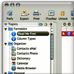 My summary impression of Formation is that it was developed from the point of view that users would spend most of their time in Formation, using the file system and Formation tools to browse to content, or to directly cut/paste content into it. Formation assumes that content is mostly created within its boundaries, and it’s exceedingly difficult to get external content into Formation without manually cutting and pasting. Formation is not taking advantage of the numerous facilities in Mac OS X for letting users put content in other applications without having to switch to them first. In this, it simply fails to provide what I consider core functionality: Use of application services, Applescript, contextual menus, Automator actions, PDF workflows, and other tools to make it easy to get content here and there the way that makes the most sense in a given situation.
| Formation (Version 1.14, $30) |
|
|---|---|
| Pros | Cons |
|
|
![]()
iData
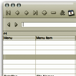 iData’s database orientation initially intrigued me, but after spending some time with it, I came to feel it was a serious limitation for the ordinary day-to-day business of managing personal information. Perhaps the iData developers have other audiences in mind—for example, companies who build specialized databases of content for their employees—but that’s not exactly how the software positions itself in its marketing. I found iData 2.0’s user interface to be confusing and inconsistent, and I had a hard time even getting started without reading some of the help pages. Some readers will be saying to themselves, “Well, why shouldn’t you read the Help pages?” Perfectly reasonable question if you think a user should have to read the manual before starting to use a software application. However, I think making users reach for the manual to do the most simple tasks is a failure of the interface design. We know how to build software that’s intuitive for most newcomers nowadays, but it requires thinking like a user rather than as a programmer or data-modeler. The iData interface is too much a reflection of the underlying application architecture, and not enough a reflection of how users think about the tasks they want it to do.
I notice that the developer has an early beta of iData 3.0 available now… I might give it another try, although it’s pretty far down on my list at the moment.
| iData (Version 2.1.8, $70) |
|
|---|---|
| Pros | Cons |
|
|
![]()
Journler
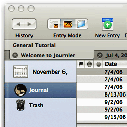 Journler is an incredible bargain, and my hat is off to the developer who’s building this marvelous package. Journler is a cornucopia of Cocoa and Mac OS X goodies, and it takes advantage of every opportunity Apple’s engineers are providing to extend Mac software to the latest and greatest possibilities. Just a quick look at the full range of Journler’s capabilities makes me drool about its potential, and I’m in awe of the programmer’s skills and his generosity in making this hard work available for free. Here’s a concise list from the Journler website:
- Entries by date and folder
- Standard word processing capabilities
- Record audio and video entries
- iLife integration: iPhoto, iTunes, iMovie and Safari bookmarks
- Spotlight support
- AppleScript support
- Edit entries in tabs or multiple windows
- Inline media viewing: audio-video, images, pdfs, websites and archives, Address Book records
- Import and export entries: text, rich text, pdf, word, html, webarchive
- Print and export a single entry, collections of entries, or any dated range of entries
- Integrated iWeb, emailing and Address Book
- iPod notes export
- Integrated blogging: Blogger.com, LiveJournal and MetaWeblog API systems
- Relevance ranked searching and live filtering
- Elegant and easy to use, powerful with well documented features
- Unicode compliant, write in any language
- 256 bit AES encryption
At this time, however, my testing found Journler’s performance a bit spotty, and implementation of some of the features—in particular, the multimedia features—a bit weak. I took other notes indicating that Journler’s use of some Mac OS X technologies needs a bit more work. All in all, this is a marvelous product with loads of potential and numerous great ideas, and I’m definitely going to keep an eye on it. Journler already has a large, satisfied user base, and if you don’t have money to spend and need a tool for managing personal information, it’s a no-brainer to give Journler a try.
| Journler (Version 2.0.2, Free) |
|
|---|---|
| Pros | Cons |
|
|
![]()
KIT
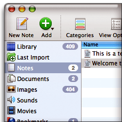 KIT is one of the least expensive PIM tools in this list, and its latest version clearly follows Yojimbo, Mori, and other applications into the new, Tiger application style—of which I’ve grown quite fond. As such, KIT is very attractive and easy to use. Its feature set is as complete as the others in the list of those I’ve given a “checkmark”, but there are just too many missteps in the user interface and unstable behavior in basic functions like search, to recommend. Like the others in my “checkmark” category, KIT is also missing a number of features I consider essential in a PIM: Ability to accommodate structured tabular data (i.e., spreadsheet-type views), support for nested folders, and support for smart folders that are smart enough to handle custom data types.
If it were just a matter of missing features, however, I’d give KIT a checkmark and keep it on the “promising” list for future reviews. Based on my experience with the current release, however, it appears that KIT has a ways to go merely to get basic application stability and user interface consistency under control, before tackling more complex functionality. My list of pros and cons will explain the specifics. KIT gets above-average reviews from sites like MacUpdate and VersionTracker, so clearly it has its fans… Price may well be a factor here, since you get quite a bit for $25. However, I also noticed some comments corroborating my experience with KIT’s search feature, and I do tend to have very high expectations in Mac software. ![]() (By the way, KIT stands for “Keep It Together.”)
(By the way, KIT stands for “Keep It Together.”)
| KIT (Version 1.3.2, $25) |
|
|---|---|
| Pros | Cons |
|
|
![]()
Mori
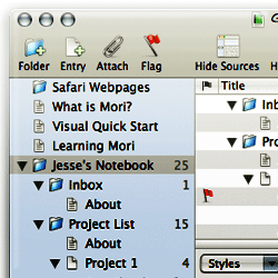 Mori is a very attractive, powerful PIM tool that handles most of the tasks I threw at it well. It falls flat in one critical area, and after determining this I didn’t spend too much time exploring further.Â
It turns out that Mori is very weak at processing HTML. It can’t display HTML without converting to to RTFD, thereby losing formatting and some critical styles. Try importing a web page, and Mori will probably import only the text content. There was one plugin that sounded good, but it didn’t work when I tried it.
Speaking of plugins, Mori is one of the few tools here that has a robust plugin model. In fact, it already has a fairly large—and growing—repository of plugins written by the developer and third party users. If Mori fixes the HTML problem and addresses my needs for a “quick note” functionality, it would definitely be on my short list of PIM candidates.
| Mori (Version 1.4, $40) |
|
|---|---|
| Pros | Cons |
|
|
![]()
Soho Notes
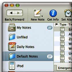 Soho Notes is really the only one of the commercial products I’ve tried that’s tempted me to part with my dough. It comes reasonably close to DevonThink in the import/export department, and it has one killer feature that I first remember seeing in Yojimbo: A persistent “dock” that appears as a tab on the edge of your screen, which can accept drag/drop input from other sources. In addition to this, Soho Notes’ dock has other uses, most notably, an amazing clipboard utility that makes it super easy to see and re-use your clipboard history. Soho Notes also has a menubar tool called “FlashNote” that serves as a search tool for your notes. Unfortunately, ever since I first saw this in Sticky Brain (the predecessor to Soho Notes), I’ve expected that FlashNote would be a tool to let me create notes, not just search them. I’m always disappointed to discover I can’t do this. That’s one feature from Yojimbo that I really want in my ultimate PIM tool. Â
Another thing I like from Soho Notes, which DevonThink doesn’t address yet, is the ability to use Soho Notes as a blogging tool. This makes perfect sense, since at the moment I have to switch from DevonThink to another tool (Ecto) when it’s time to publish my notes. Unfortunately, Soho Notes doesn’t have support for WordPress blogs in the current release, so I can’t make use of that feature.
All in all, Soho Notes is an impressive software package with a great icon. ![]() At the moment, it has too many limitations that would create more work for me if I were to switch from DevonThink Pro. You can read the gory details in the accompanying table, but suffice it to say that Soho Notes is sufficiently interesting at the moment that I plan to continue trying out new releases for awhile.
At the moment, it has too many limitations that would create more work for me if I were to switch from DevonThink Pro. You can read the gory details in the accompanying table, but suffice it to say that Soho Notes is sufficiently interesting at the moment that I plan to continue trying out new releases for awhile.
| Soho Notes (Version 5.6.2, $40) |
|
|---|---|
| Pros | Cons |
|
|
TopXNotes
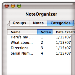 I don’t know the history of TopXNotes, but it looks like it comes from the class of Mac apps that were originally built for Mac OS 9 and achieved some success on that platform but have made an incomplete and awkward transition to Mac OS X. In the case of TopXNotes, it’s hard to imagine why anyone would choose it given the broad array of modern Mac OS X apps that do all that it does, plus more—and often for quite a bit less money. Not only is TopXNotes ugly (heck, it still uses unaliased text and doesn’t even offer aliasing as an option!), but the workflow it envisages doesn’t make much sense on the modern Macintosh. By this, I mean that TopXNotes offers no way to make a note without bringing its window to the front and either typing directly, or pasting something from the clipboard. Yet, Mac OS X now has tools that let customers create notes without ever leaving the app they’re copying from (called Services), or developers have built applications that let you take a note in a tiny window that doesn’t take over from the app you’re working in when the idea for a note hits you. In other words, PIM apps need to be able to take notes while in the background, so you can keep working without interrupting your train of thought. Another basic failing of TopXNotes is the absence of a search interface. This is software that apparently expects you’ll search by browsing, which might have been fine 10 years ago, but we all have information stores that simply require a robust search tool nowadays.
 Clearly, TopXNotes considers itself a PIM-type application rather than a Stickies replacement. Yet it doesn’t offer as much as some less-expensive Stickies replacements do. For example, Edgies is only $10, but it has a better interface (unobtrusive notes hide on the edges of your screen), app services, a notes organizer with search, and much more. Compare that with $30 for TopXNotes and you’ll understand my disappointment. It’s also disturbing that TopXNotes went from being $25 in June, when I first downloaded it, to $30 in October when a new version (1.2) was released. Version 1.2 did have some useful enhancements, but only ones that tried to catch it up with things that more modern tools like Yojimbo and Soho Notes offer for the same price. I think the developer considers TopXNotes’ “QuickNotes” feature innovative, but it’s quite lame in comparison with similar features from these other tools. For one thing, it only shows notes you put in a certain “Quick Notes” category… and then, only 10 of them. It doesn’t let you create notes or search through them.
The fundamental problem with TopXNotes, in my view, is that it’s based on the older Carbon framework, which doesn’t have access to features that become automatic and second-nature in more modern apps. For example, TopXNotes won’t let you store images, PDF files, web pages, movies, or other document types. Is this because it doesn’t have access to the Cocoa framework? I’m not expert enough in Cocoa vs. Carbon to say for sure, but I suspect it does. Further, because of its Carbon heritage, the interface is unintuitive to users of more modern Mac applications. More detailed observations are in my notes on pros and cons (below.)
| TopXNotes (Version 1.2, $30) |
|
|---|---|
| Pros | Cons |
|
|
![]()
Yojimbo
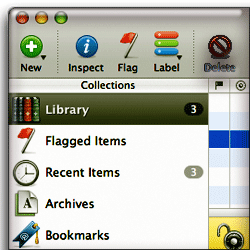 When I first saw Yojimbo at the beginning of 2006, I thought, “Wow! This is It!” But once I took a closer look, I realized that Yojimbo’s charms are fairly shallow at this time. It isn’t really suited to heavy-duty research use, or for more than very light note-taking. The primary drawback is Yojimbo’s lack of support for nested folders. Without them, you kind of have to give up on the folder concept entirely, since otherwise the navigation panel quickly becomes too crowded to be useful. Further, like Soho Notes, Yojimbo comes with a set of default folders that you can’t change, and these defaults use up a good deal of your navigation real estate right off the bat.
Without those limitations, Yojimbo would be very tempting. It’s got the best persistent utility for taking notes of any tool here in its “Shelf”, which is like a tab that attaches to one edge of your screen. I wish Yojimbo would implement the Soho Notes behavior for this, however, so that one could take notes without the full application residing in memory. Soho Notes handles this by utilizing a helper application with a much smaller memory footprint, which starts up when you login, but at the moment it’s the only application with such a feature. What I really want is some combination of DevonThink, Soho Notes, and Yojimbo, and perhaps one of these days such a beast will be born. Until then, I’ll keep looking… and Yojimbo is one of the apps I’ll keep an eye on.
| Yojimbo (Version 1.2, $40) |
|
|---|---|
| Pros | Cons |
|
|
Addendum: PIMs in Waiting
Other applications in this category (some may actually be “notepad” apps, but I won’t know for sure until I try them out) that are in my “review queue” include:
- I Know & Manage⤴
- EagleFiler⤴
- Nifty Box⤴
- JournalX⤴
- Container⤴
myNotes⤴(Removed 4/20/07. myNotes is a notepad app rather than a PIM.)KIT⤴(Added review 3/17/07)- VoodooPad 3.0⤴ (I bought a license for VoodooPad once upon a time, but it wasn’t up to my needs at the time. I’ve put it back on the list because of a new version that came out a few months back.)
TopXNotes⤴(Added review 1/15/07)Daily vX Journal⤴Review added 12/06/06.Hot Plan⤴(Removed 12/5/06. Hot Plan is a personal organizer (”to-do list”) tool, not a PIM.)- MacJournal 4.0
- Circus Ponies NoteBook⤴ (Added to list 11/8)
- Dossier⤴ (Added to list 11/8)
- viJournal (Added to list 11/14)
- Snippet Mind⤴ (Added 11/28/06)
- Scrivener (Added 12/18/06)
- Tinderbox⤴ (Added 1/4/07)
- Chandler⤴ (Added 1/9/07) Note: Chandler is also a Personal Organizer, so it’s on that list as well.
- TAO⤴ (Added 1/23/07)
- Scrap Book⤴ (Added 2/16/07)
- NoteTaker⤴ (Added 2/16/07)
- Notae⤴ (Added 2/16/07)
- Caboodle⤴ (Added 3/3/07)
The following are apps I’ve reviewed already and marked with a “checkmark”, which have released new versions that I plan to try out:
- Yojimbo 1.4 (latest version released 1/9/07)
- Mori 1.5.1 (latest version released 1/23/07)
- Journler 2.5 (beta version available… to be released late March 2007)
As I look at these and others that may come along, I’ll update this article with my notes.


