Ulysses: The text editor for creative writers
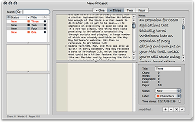
 Originally downloaded 3/20/06. This looks like another innovative software product from Blue Technologies. Ulysses is designed to focus the writer’s attention on the text and away from formatting worries. It even does away with the whole document metaphor. How well it succeeds at this is something I’m anxious to find out!
Update 12/17/06. I’m sorry to say that I think Ulysses is a big software scam. Really, folks. I’ve tried hard to like Ulysses and “get” its point of view. I’ve never been accused of being closed-minded to new viewpoints or new approaches, but honestly, I just don’t see how Ulysses is any kind of improvement for writers. It’s hardly capable of doing anything and lacks the most basic user interface components for modern Mac applications (such as customizable toolbars, contextual menus, toggle-able panes, and more). Even its vaunted full-screen mode is so blah that it’s hard to imagine this is where the idea started.
If Ulysses were freeware, or even reasonably priced shareware, I wouldn’t be nearly so harsh in this judgment. But do you know how much Blue Technologies wants for this stripped-down jumble of Cocoa text views? One hundred Euros. Not a misprint, I assure you. That’s about $130 at today’s exchange rate. I can’t imagine what anyone thinks they’re getting for that price.
In fact, if you want to look at Ulysses actually implemented creatively, with the writer’s actual needs and work habits in mind, with a really nice full-screen mode, and with dozens of other features that Ulysses leaves out (do they really think writers never want to form bulleted or numbered lists, for heaven’s sake?), check out Scrivener. For free, you can start using Scrivener Gold, which is an early beta of Scrivener that the developer is now giving away. For some undefined amount (but estimated to be $20-$40), you can try a late beta of Scrivener 1.0, which is, as far as I can tell so far, the total cat’s meow of writer’s editing tools. (More about Scrivener when I finish testing it.)
If I hadn’t tried Scrivener before trying Ulysses, I might have had different expectations. But certainly, after you try an innovative product like Scrivener Gold, and realize you can have it for nothing, you’ll tend to have really high expectations for a product that looks a great deal like it at first glance but costs $130. Then, when you realize how very little Ulysses actually does, you start to get a little angry that anyone is trying to pull such a scam on the world’s fine Mac users.
There’s so much wrong with Ulysses–and so little right–that I’m not going to go into it further other than to leave you with my table of pros and cons.
|
Pros |
Cons |
|---|---|
|
|
You know, another thing that makes me think “scam” is that Ulysses hasn’t been updated all year, except for a minor bug fix or two. So, what is the developer doing with my $130, I wonder? Oh well, it’s clear I won’t be buying this one, isn’t it?
Version as tested: 1.2.2r2.


