
It’s a common myth in the Windows world that Mac users have to make do with only one software title for every 10 that run on Windows. The myth arises from the teeny-tiny or nonexistent retail space afforded to Mac software in the computer stores where Windows users shop. However, the reality is far from that perception. Prior to the emergence of Mac OS X, Mac users did commonly face slim pickings in many software categories, but times have changed dramatically, and nowadays many software categories present so many choices for Mac users that the situation is downright uncomfortable. I certainly feel that way at times!
One of these days, I’m going to do a study of the comparative availability of software titles between Mac OS X and Windows, and my going-in assumption will be that users have an equivalent or greater degree of choice on the Mac platform today in categories such as
- personal information management
- personal organizers
- graphic design tools
- 3D design and animation tools
- image management tools
- project management
- word processing tools
- programmers text editors
- Music mixing and editing tools
- News aggregators (RSS/podcast readers), and
- many others.
Notice that not all of the categories I’m listing are in the realm of creative arts.
However, one category that’s still under-served, in my view, is the original killer app, the good-old spreadsheet. I haven’t researched the Windows market for spreadsheet software, so perhaps the same dilemma affects those guys, too. Undoubtedly, the underwhelming selection of spreadsheets for Mac OS X results directly from the influence of Microsoft Office, and what is probably its best component, Microsoft Excel.
![]() As Mac history buffs know, Excel was a hit on the Mac market long before it won the battle for supremacy on IBM PCs. Because Excel was entrenched on the Mac OS from early on, there never really was much competition in this space, as there was on DOS and Windows.
As Mac history buffs know, Excel was a hit on the Mac market long before it won the battle for supremacy on IBM PCs. Because Excel was entrenched on the Mac OS from early on, there never really was much competition in this space, as there was on DOS and Windows. ![]() Combine that with Microsoft’s success in convincing everybody who makes software purchases for organizations, large and small, that installing Microsoft Office was a requisite for business success in the electronic age, and Microsoft hasn’t even had to breathe hard to stay way out in front of the spreadsheet race on Mac OS X.
Combine that with Microsoft’s success in convincing everybody who makes software purchases for organizations, large and small, that installing Microsoft Office was a requisite for business success in the electronic age, and Microsoft hasn’t even had to breathe hard to stay way out in front of the spreadsheet race on Mac OS X.
However, this situation doesn’t mean that spreadsheet users are being optimally served. In fact, coming to Excel from Mars makes its shortcomings quite clear. How is it that Mac users put up with an application that is so over-built, unintuitive, uninspired in design, and backwards technologically? Is it because Excel really is the quintessential spreadsheet experience? Is it just that we’re used to it? Or is it because we have no better options?
The answer, I believe, is mostly the second question, with heavy support from the third.
Even after Apple came along and gave Mac users a presentation package that runs rings around PowerPoint and a word-processor that makes Microsoft Word look like the illogical, incomprehensible morass of functions that it is, how many Mac users have turned off PowerPoint and Word and put Keynote and Pages in their place? I suspect the answer is “Not many.” Mac users may like to think they are more discerning than Windows folk, but most are also just as scared of switching software packages, in my experience. Most Mac users will take whatever their employer gives them for the key business processes of writing words and making bullet lists. Heck, some may even try Keynote and Pages and return to the hellhole of PowerPoint and Word because they are more comfortable there.
![]() However, if you’re the least bit adventurous where software is concerned, I challenge you to get a copy of the $79 iWork, install it, and then delete Word and PowerPoint from your system for 2 weeks. I guarantee you will not miss those Microsoft crown jewels one bit at the end of that time. I’ve been using both for over 2 years now, and no one in my organization has the slightest idea that I’m not using the “corporate standard” for word processing and presentations. These babies not only make preparing your documents much easier and more enjoyable, but they can read and write native Microsoft formats better than I thought possible. (Pages is particularly compatible… I always convert my Keynote presentations to high-quality, interactive QuickTime movies and use those if I have to present something on a Windows machine.)
However, if you’re the least bit adventurous where software is concerned, I challenge you to get a copy of the $79 iWork, install it, and then delete Word and PowerPoint from your system for 2 weeks. I guarantee you will not miss those Microsoft crown jewels one bit at the end of that time. I’ve been using both for over 2 years now, and no one in my organization has the slightest idea that I’m not using the “corporate standard” for word processing and presentations. These babies not only make preparing your documents much easier and more enjoyable, but they can read and write native Microsoft formats better than I thought possible. (Pages is particularly compatible… I always convert my Keynote presentations to high-quality, interactive QuickTime movies and use those if I have to present something on a Windows machine.)
All of this is prelude to my complaint that Apple hasn’t completed building its iWork triumvirate to replace Microsoft Office. iWork also seems incomplete to the thousands (millions?) of people who had relied on the company’s now dog-eared, orphaned gem, AppleWorks, as an Office stand-in at home. In other words, finding a spreadsheet that’s a solid replacement for Excel is still a challenge on Mac OS X.
This isn’t to say that it’s impossible, mind you. As you’ll see in a moment, there are several alternatives out there that can stand in for Excel just dandy, if you are just patiently determined to use something that’s not from Microsoft. Some of these feel obliged to don all of Excel’s familiar, flawed complexity and its stilted user interface, to make you feel at home. However, you gain nothing in functionality or usability, and you have to put up with quite a bit of pokiness and interface weirdness.
![]() There is also one spreadsheet package for Mac OS X that I would happily continue using if it weren’t so expensive. In its previous incarnation, RagTime had a free-for-personal-use option called RagTime Solo, which I have used for a couple of years. However, RagTime 5, on which Solo is based, had grown out-dated by 2006, and I found recent releases of Excel to be more responsive and usable. Therefore, I was thrilled when the RagTime 6 beta program began early last year. RagTime 6 is a marvelous suite of business software offering numerous significant improvements over the previous edition. I was happy to migrate to RagTime 6, content that my spreadsheeting needs were being well attended to. Imagine my dismay, then, to discover last fall that RagTime 6 wouldn’t continue a free version, and that I’d have to spend 249 Euros (what’s that… about $325?) to “upgrade” from Solo. This, I was assured, was a terrific bargain, since the commercial rate for RagTime 6 is 850 Euros ($1,100)!
There is also one spreadsheet package for Mac OS X that I would happily continue using if it weren’t so expensive. In its previous incarnation, RagTime had a free-for-personal-use option called RagTime Solo, which I have used for a couple of years. However, RagTime 5, on which Solo is based, had grown out-dated by 2006, and I found recent releases of Excel to be more responsive and usable. Therefore, I was thrilled when the RagTime 6 beta program began early last year. RagTime 6 is a marvelous suite of business software offering numerous significant improvements over the previous edition. I was happy to migrate to RagTime 6, content that my spreadsheeting needs were being well attended to. Imagine my dismay, then, to discover last fall that RagTime 6 wouldn’t continue a free version, and that I’d have to spend 249 Euros (what’s that… about $325?) to “upgrade” from Solo. This, I was assured, was a terrific bargain, since the commercial rate for RagTime 6 is 850 Euros ($1,100)!
*sigh* No matter how good I think RagTime is, I’m just not willing to spend that much money for a spreadsheet package… Sorry! And the German company that makes RagTime is making the same mistake other software vendors do: You have to buy the whole “suite” or nothing, even if, like me, you only use one of its many components.
RagTime 6.0 performs all of the tricks I require from a modern spreadsheet application. This list is quite specific to my needs, and no doubt leaves off key functions that other users find invaluable, but here are my “must-have” requirements (in no particular order):
- Read and write Excel files from the last 5 years without requiring anything more than superficial cleanup (e.g., font replacements).
- Support column and row hiding.
- Support multiple sheets per workbook.
- Unlimited rows and columns.
- Support antialiased fonts.
- Allow drag-and-drop reordering of columns and rows.
- Support styles or an equivalent method for styling cells with frequently used attributes.
- One-click support for optimizing row and column width.
- Handle copy/paste from and to delimited ASCII data files.
- Export to generic HTML as well as to Excel and delimited ASCII files.
- Speedy sorting of rows and columns by the usual range of options.
- Easy to use math functions for adding formulas to cells.
- Flexible copy/paste of cells, allowing visual formats, data formats, and formulas to be selected independently.
- Easy to use typograpic and visual style management, together with simple, intuitive manipulation of cell data types.
- Simple, intuitive controls for merging/splitting cells and for adding/deleting rows and columns.
- Simple, intelligent controls for printing spreadsheets.
- Simple, intuitive controls for merging sheets into workbooks and for extracting sheets from them.
- Simple, intelligent controls for charting selected data ranges.
- Intelligent handling of text and image content in data cells, minimizing user work in incorporating these data types into a workbook.
- Tools to easily change orientation of data: rows to columns, or vice versa.
See? “I don’t want much,” as Ringo Starr once said. But like Ringo, my tests have confirmed that the holy grail of Mac spreadsheets in 2007 just “don’t come easy.” In fact, as of March, I must report that it don’t come at all!
Still, it do come close. ![]() (Gotta stop talking in rock-lyric vernacular already!)
(Gotta stop talking in rock-lyric vernacular already!)
![]() I have, in fact, purchased a license this month for Mesa, which I’ve come to enjoy using quite a lot after learning a few of its quirky moves. And there is a new Mac spreadsheet package that is evolving swiftly toward my holy grail: With each new release since its debut last summer, Tables gets steadily better, and I’m hoping it’ll give Mesa a run for my affection in the near future. Of course, looming over the horizon, which we originally thought we’d reach in January at Macworld, is Apple’s rumored “Numbers” or “Sheets” or whatever they’re going to call the planned addition to iWork. Apple’s rumored spreadsheet application is probably giving the developer of Tables an ulcer, since I suspect it’s going to look and feel a lot like Tables does. Unfortunately, the U.K. developer of Mesa seems to be sitting this little contest out. My biggest gripe with Mesa is that the company hasn’t released a significant update in more than 2 years, even while both Apple and the Tables developer have been feverishly fixing up their entries in the “Great Mac Spreadsheet Sweepstakes” of 2007. Mesa is a terrific little software product, and I only hope it doesn’t get left behind in the race.
I have, in fact, purchased a license this month for Mesa, which I’ve come to enjoy using quite a lot after learning a few of its quirky moves. And there is a new Mac spreadsheet package that is evolving swiftly toward my holy grail: With each new release since its debut last summer, Tables gets steadily better, and I’m hoping it’ll give Mesa a run for my affection in the near future. Of course, looming over the horizon, which we originally thought we’d reach in January at Macworld, is Apple’s rumored “Numbers” or “Sheets” or whatever they’re going to call the planned addition to iWork. Apple’s rumored spreadsheet application is probably giving the developer of Tables an ulcer, since I suspect it’s going to look and feel a lot like Tables does. Unfortunately, the U.K. developer of Mesa seems to be sitting this little contest out. My biggest gripe with Mesa is that the company hasn’t released a significant update in more than 2 years, even while both Apple and the Tables developer have been feverishly fixing up their entries in the “Great Mac Spreadsheet Sweepstakes” of 2007. Mesa is a terrific little software product, and I only hope it doesn’t get left behind in the race.
![]() I also looked at a few semi-spreadsheet products that just don’t do enough of my list to qualify for this competition. They are, nevertheless, sufficiently interesting to list here, and those whose needs for formatted data are even less rigorous than mine may find them of value:
I also looked at a few semi-spreadsheet products that just don’t do enough of my list to qualify for this competition. They are, nevertheless, sufficiently interesting to list here, and those whose needs for formatted data are even less rigorous than mine may find them of value:
- TableX. Can read and write delimited ASCII data files. Best for use in read-only mode, though… not particularly easy to use for data entry. Totally unique metal-window interface, but you have to pay $20 for the privilege.
- XTabulator. Also limited to reading and writing delimited text files, but better at data entry and with a more flexible interface. That said, you can’t easily use the $10 XTabulator for textual data.
- nView. nView is very similar to XTabulator, with the same limitations. It’s donationware, though, and you can make one contribution good for any of the developer’s many interesting Mac OS X utilities. XTabulator has a much better icon, though.

![]() Then there’s an application that may in fact be a very good spreadsheet package, but I’ll never know because I don’t have the patience to review another application from this particular vendor. Please don’t take that statement as a sign of disrespect for the vendor’s Mac applications… I just happen to find Intex’s FileMaker-centric software uncomfortable to use. They all have this really quirky interface, an artifact of their heredity as FileMaker “documents,” which require a FileMaker “runtime” that launches them. Unlike regular apps, there is no version number you can find in an “About” sheet. Instead, the “About” sheet tells you what FileMaker version you’re running. (Oh, OK… that’s relevant, I guess.) They have some of the same un-Mac-like weirdness that make certain Java applications hard to use. I reviewed the company’s journal software, Daily vX Journal, in December, and many of the problems I identified with it apply also to their List vX software. But if this doesn’t bother you, you might want to check List vX out, since at 19 Euros, it’s reasonably priced.
Then there’s an application that may in fact be a very good spreadsheet package, but I’ll never know because I don’t have the patience to review another application from this particular vendor. Please don’t take that statement as a sign of disrespect for the vendor’s Mac applications… I just happen to find Intex’s FileMaker-centric software uncomfortable to use. They all have this really quirky interface, an artifact of their heredity as FileMaker “documents,” which require a FileMaker “runtime” that launches them. Unlike regular apps, there is no version number you can find in an “About” sheet. Instead, the “About” sheet tells you what FileMaker version you’re running. (Oh, OK… that’s relevant, I guess.) They have some of the same un-Mac-like weirdness that make certain Java applications hard to use. I reviewed the company’s journal software, Daily vX Journal, in December, and many of the problems I identified with it apply also to their List vX software. But if this doesn’t bother you, you might want to check List vX out, since at 19 Euros, it’s reasonably priced.
Finally, it’s worth noting that many word processing apps for the Mac have a native ability to construct data tables. If your needs are pretty simple, they might be all you want. For example, the little chart you’ll see in the NeoOffice review below was done in Pages using its built-in spreadsheet tool. Pages doesn’t do everything an accountant would require, but for putting together a few numbers, with maybe a few simple formulas, and then quickly charting them, it’s much faster than Excel and can produce nicer results to boot! It’s far superior to the limited table-making tool Microsoft gives you in Word, though it makes no claims to being a full-fledged spreadsheet: You wouldn’t want to ask Pages to handle a table with 1,200 rows and 50 columns. Nevertheless, Pages has surprised me with some nifty spreadsheet-like tricks. For example, you can copy a range of cells from an Excel sheet and paste it into a Pages table. As long as the Pages table has the right number of columns and rows, it’ll parse the data without blinking. Similarly, you can copy and paste any tab-delimited ASCII file into Pages and easily make a handy, sortable, chartable table. Being a word processor, Pages is great at handling text and graphics, so… it’s better than you might suspect for most of the things I see people turning to Excel for.
![]() Besides Pages, there’s the previously mentioned AppleWorks, which, although a brilliant rethinking of the multipurpose office application, is probably a software dead-end now. Besides, its spreadsheet chops were always iffy, I found. For example, it immediately crashed when trying to open my test Excel file. Finally, a software suite called Papyrus has a table-making component, but in my testing it didn’t appear to be nearly as robust as the one in Pages and was more like that in Microsoft Word. Unlike AppleWorks, Papyrus couldn’t import or export Excel files of any kind, though it could handle delimited ASCII files. At $100, Papyrus probably has other virtues, but I only tested its spreadsheeting skills.
Besides Pages, there’s the previously mentioned AppleWorks, which, although a brilliant rethinking of the multipurpose office application, is probably a software dead-end now. Besides, its spreadsheet chops were always iffy, I found. For example, it immediately crashed when trying to open my test Excel file. Finally, a software suite called Papyrus has a table-making component, but in my testing it didn’t appear to be nearly as robust as the one in Pages and was more like that in Microsoft Word. Unlike AppleWorks, Papyrus couldn’t import or export Excel files of any kind, though it could handle delimited ASCII files. At $100, Papyrus probably has other virtues, but I only tested its spreadsheeting skills.
That left the following list of candidates from which I chose Mesa. As confirmation of the paucity of choice in spreadsheets, I have no candidates waiting in a review queue this time, as I have in previous roundups. Mesa is it, until Tables matures some more, or Apple releases a “Numbers” that does for spreadsheets on Mac OS X what Pages and Keynote have done for word processing and presentations. (Note that I’m giving Tables a checkmark, signifying that even though I can’t use it today, it’s close enough to my requirements that I plan to keep an eye on its progress.)
![]()
MarinerCalc
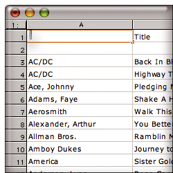 I really hate to say anything bad about Mariner, a Mac software development company that’s been faithfully supplying Mac users with Microsoft-alternative office tools for many years now. Some of their newer products look quite good in fact, but Mariner Calc is not one of their newer products. Designed back in 1998 for the classic Mac OS, it has never really been redesigned for Mac OS X. In fact, from what I can tell, Calc hasn’t been significantly changed since July 2001, when Calc 5.0 was released. Since then, there have been point releases (which, unlike the Mac OS X ones, have really been just that), bringing Calc up to 5.5 today.
Calc looks and feels like a 5-year-old product, one that Mariner has essentially abandoned. Since Calc is probably the most widely used and best-known Mac spreadsheet app outside of Excel, I kept downloading new releases as Mariner offered them, in hopes that Calc would begin to incorporate some of Mac OS X’s enhanced user interface capabilities, but it always looked the same each year… and now I know why. The best thing I could find to say about it was that it opened my test Excel file successfully. Call me picky, but I have been living in Mac OS X since October 2001 when OS X 10.1 came out, and I have no desire to go back to OS 9, thanks very much. Heck, even Microsoft has done a better job updating their old Excel code for Apple’s new operating system, and Calc, sadly, just looks like a pale imitation product. Besides, isn’t anybody else getting tired of the Calc lady, who has been peering up at us from the cover of the Mariner Calc box for 5 years? Mariner, let me give you a word of advice: She ain’t no Betty Crocker or Aunt Jemima or Mr. Clean.
| Mariner Calc (Version 5.5.1, $50) |
|
|---|---|
| Pros | Cons |
|
|
![]()
Mesa
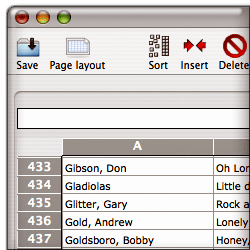 Mesa is a refreshing spreadsheet to use after putting up with Excel for so long. It doesn’t meet all of my requirements, though the main one it misses is the ability to export sheets as HTML. I can work around that, but have asked the company to make it a priority for the next release. Spreaking of which, I found the U.K. company that makes Mesa to be very responsive and forthcoming about the questions I emailed them in January. As I mentioned earlier, I hope they take the work of updating Mesa seriously, or its quirkiness and slightly outdated feel will not keep pace with upcoming competitors. That said, after using it for a few weeks recently, I have found Mesa to be the best all-around spreadsheet (outside of RagTime 6) now available for Mac OS X, and I recently ponied up the $34 for a full license.
If you decide to try Mesa, approach it with a fresh eye. This is not an Excel clone, as so many of the other products I reviewed are. The Mesa developers have actually attempted to rethink a number of the activities one engages in while spreadsheeting, and they’ve made the process remarkably easy. But you do have to learn how Mesa does things occasionally, rather than expecting Mesa to behave the way you’re accustomed. My advice is, if you can’t find a ready function and begin to think Mesa can’t do a given thing, open up the handy Help file and take a look. Chances are, it can. In some cases, Mesa’s “ways” are actually ingenious improvements, but all too often they’re just clumsy missteps that the company should invest time in fixing. (I believe my list of Pros and Cons give examples of both, so I won’t go into detail here.)
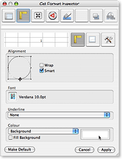 Like the best Mac software nowadays, Mesa utilizes an “Inspector” window where you perform a lot of the contextual work that older software stuffs into menus and toolbars. Mesa’s inspector looks a little dated now, but it’s definitely a welcome step. Also welcome is Mesa’s blissfully simple four-pane Preferences window. Between the Inspector and Preferences, Mesa is a good example of how software developers can simplify a user’s work in adapting to and using spreadsheet software, and it stands in stark contrast to all of the Excel clones in this regard.
One of the most complicated aspects of Mesa, though an example of delightfully simple complexity, is the way the company has utilized the standard Cocoa toolbar. Instead of providing one set of choices on a single sheet (as virtually all other apps I’ve seen do), Mesa lets you make the toolbar as robust and personalized as possible, giving access to any function that you see in Mesa’s menus. The simplest way I can describe this is that when you select “Customize Toolbar,” Mesa first says, “Which menu do you want to add functions from?” You then select, say, the “Edit” menu, and Mesa presents a set of icons representing those functions. You can make this as complicated as you like, by repeatedly digging into Mesa’s “icon chest” and adding items you use frequently to the toolbar. It’s true that all of the Excel clones have very robust toolbar-customization functions, but I just find the Cocoa toolbar’s easy access, customizability (large icons/small icons/text only, etc), and easy disposability a huge improvement over earlier software that envisions toolbars as row upon row of tiny, 16-pixel-square graphics whose purpose you must either guess or ignore.
| Mesa (Version 3.1, $34) |
|
|---|---|
| Pros | Cons |
|
|
![]()
NeoOffice
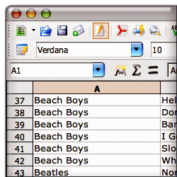 I am probably the biggest proponent of open source software solutions in my agency, and I’m constantly at odds with the IT department over the issue. In my writings as well, no one would ever find anything but delight and joy in open source software development and the programming heroes who make it happen. Even so, as a Mac user I can’t say anything nice about NeoOffice or the project from which it sprung, OpenOffice. If the goal of this project is to provide a realistic, practical, cost-effective alternative to Microsoft’s Office monopoly, it’s going about it ass-backwards, in my humble opinion.
There… now that I’ve insulted all the hard-working, well-meaning, highly intelligent programmers who’ve been toiling for years to make OpenOffice a reality, let me briefly explain why I think their project is fatally flawed. Here’s a simple, one sentence statement of the problem: You can’t beat Microsoft Office by pretending to be Microsoft Office. There are two assumptions this team has made that I happen to disagree with:
- First, Microsoft Office is the cadillac of office suites, and everybody loves using it. Therefore, we have to make sure our product does as much as possible just like Office.
- Second, the Office Suite is an inevitable product of software evolution. We know this because Microsoft won the market, and Office is the standard that won.
Both of these assumptions lead directly to the path the OpenOffice movement has been following, namely: Why mess with success? If Office is what people want, we’ll give them Office… only, for free.
Un-Unh. You can’t win that way, and the reasons are long and complex and would take too many words to completely cover here. Let me try to summarize and hope this isn’t taken too literally: All software migrations are disruptive, no matter how little change is involved. They’re especially disruptive to the IT staff who has to manage the change, and it’s the IT department that will decide whether a company will switch from Microsoft Office to another product. It’s not the accountants or the CEO or the users. As long as the head of IT has a budget to defend, he or she will have no incentive to cut costs by adopting OpenOffice. The only actors that could motivate a company to switch from Microsoft Office today are strong pressure from users, strong pressure from upper management, or strong pressure from the market.
As a strong proponent of user-centric software, I naturally believe the best approach to toppling Office is to build a better mousetrap, not one that just looks like a cheap knockoff. This requires software developers to take a hard look at today’s requirements for (a) word processing, (b) number crunching, and (c) making “decks.” It’s a mistake to assume that the morass of coding that has evolved into Microsoft Office is the platform from which you should build a better experience for users. Surely we’ve learned something in the last 12 years about an organization’s needs for writing memos and reports, making lists and calculations, and making persuasive arguments in front of audiences that could yield us something better than Microsoft Word, Excel, and PowerPoint.
In my opinion, one of the things that’s wrong with Microsoft Office is its assumption that nobody wants to buy word processors, spreadsheet software, or presentation software a la carte. To see how flawed this assumption is, just recall that users didn’t benefit from this conglomeration one iota. It was a strategy concocted by Microsoft to win the office marketplace… and obviously, a very successful one. Clearly, once Microsoft prices its a la carte components ridiculously high, and sets a tempting price on the suite, it seems to make economic sense to buy the suite. Certainly, this is the case if there’s no one selling equivalent components at more reasonable prices. However, there’s no reason why Microsoft Excel should cost $200, if Microsoft can sell you the whole Office suite for $450. Right? Go to Microsoft’s site today, and you won’t find any incentives to buy Excel outside of the suite.
But why? Does every employee of every organization that uses Microsoft Office really use or need all of its components? What exactly do employees need in the way of a word processor in 2007? Does everyone need the same level of complexity in such products? How many of your staff did PowerPoint presentations last year? How many built a spreadsheet? If you begin to ask user-centered questions such as these, I guarantee you’ll come away with a very different set of requirements for office productivity software that looks nothing like Microsoft Office… or NeoOffice or OpenOffice or ThinkFree Office.
This is the fundamental tragedy facing those who are rooting for OpenOffice. OpenOffice isn’t like the Mozilla project, where software designers actually did some hard thinking about user requirements for a web-browser-based computing platform. From what I’ve seen, it’s an attempt to outdo Microsoft using Microsoft’s rules of engagement, and I just don’t think it’s going to advance the state of the art of office computing even if it’s successful.
Instead, take a look at what small, inexpensive software products like Mesa and Tables are doing. By taking a fresh look at the whole business of using spreadsheets, they’re moving the state of the art in the right direction. Apple has already shown one such improved approach in Pages and Keynote. NeoOffice, sadly, is not just a Microsoft Office knockoff, it’s a very bad knockoff that’s impossible to use. Sorry for the lengthy pontificating… take a look at the accompanying data on memory utilization for these products, and you’ll see one reason why they make no sense for Mac users. My test system has 4 GB of RAM, yet NeoOffice was straining my PowerMac’s capabilities after only a few minutes of use. Using ThinkFree Office had similar results, with OpenOffice not far behind. Note that since I’m expending so much hot air on a subject that really covers NeoOffice, OpenOffice, and ThinkFree Office, don’t be surprised if the writeups for the other two are much shorter. ![]() I’ll be mostly including the Pros and Cons noted during my testing.
I’ll be mostly including the Pros and Cons noted during my testing.
One last word for those who may not know the difference between OpenOffice and NeoOffice. OpenOffice is the core open-source project, with heavy backing by Sun Microsystems. The OpenOffice project was very slow in providing a build that would run on Mac OS X, but eventually gave us one that will run in the Unix X-Window system, using Apple’s X11 software. The NeoOffice project is a relatively small offshoot devoted to building a native Cocoa version of OpenOffice for the Mac. Resources for NeoOffice are likewise very limited compared with Sun Microsystems and the OpenOffice core, so work on the Cocoa build is understandably slow and the resulting software buggy. I have tried numerous times to becomes friends with NeoOffice, but each time, it slaps me back down, and reminds me why the whole project has struck me as odd from the start. That said, I am very grateful that Patrick Luby and Edward Peterlin initiated it, since otherwise the high-profile OpenOffice project was giving the Mac platform very short shrift. Now, at least, Mac OS X has some visibility among that developer community, and hopefully that exposure will be positive in some way.
| NeoOffice (Version 2.0 b3, Free) |
|
|---|---|
| Pros | Cons |
|
|
![]()
OpenOffice
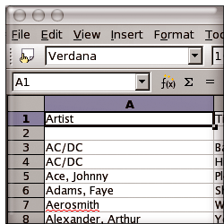 You can read all about OpenOffice and my opinion about its development in the preceding writeup on NeoOffice. The only thing I’d like to add here is that OpenOffice is frankly an insult to the Mac community. Why anyone would expect a Mac user (or any computer user) to have to fire up two applications in order to launch one is beyond me. And then, to expect Mac users to politely suffer the silly dialog-box behavior that Windows users take for granted is unreasonable. The final insult is to be expected to like software that takes 20 seconds merely to present the splash screen, followed by an unexpected but predictable recovery operation to rescue a document that didn’t appear to be in distress, with an inevitable invitation to take a few minutes to let Sun Microsystems know about the failed recovery (which was actually successful… I think). It’s nice to think that OpenOffice is actually usable on Windows or Linux, but it’s far from being so on Mac OS X. For even once the spreadsheet
  has been drawn (to the full width of my 23-inch monitor, natch), the software has buried my resize corner below the bottom of my viewing area, and it caused me a fair amount of frustration trying to whittle that rectangle down to a reasonable size. As if all this weren’t bad enough, every time OpenOffice attempts to communicate with me, I feel like it’s transporting me back in time to the 1990’s, when Windows was 95 or 98, and all text was square and all buttons were shaded to look faux-3D by use of a white pixel painted along the left and top sides and a black pixel along the other two. Sorry… I just can’t take OpenOffice seriously, and hopefully neither will you.
 ![]()
| OpenOffice (Version 2.0, Free) |
|
|---|---|
| Pros | Cons |
|
|
![]()
Tables
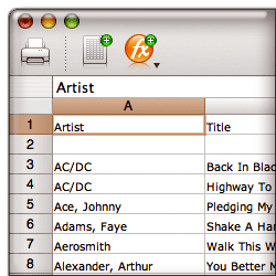 As I wrote when Tables first appeared last summer, “Any time a new spreadsheet package comes out for the Mac, it’s cause for celebration.” With its clean, modern Mac OS X look and feel, Tables was—and remains—a breath of fresh air, but at this point it’s clearly still in development, and not yet up to the task of handling heavy processing loads. The good news is that it’s in active development, with new versions coming out once a month or so. In fact, it’s the only application in this group that had an update during the course of my testing. As usual, the new version of Tables let me scratch out one or two “cons” from the list, while adding one or two new “pros.” The developer seems to understand that his app isn’t yet fully sea-worthy, because he’s made the very user-friendly decision to let your 30-day demo license renew each time he refreshes the application.
At this point, if he can fix the problem with handling large spreadsheets 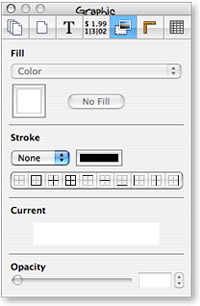 that I note, and make sure copy/paste operations are reliable and intelligent, I just might be willing to hand him a few bucks for his troubles. Like Mesa (and all of Apple’s iLife apps), Tables employs a handy Inspector window to help you out. Clearly understanding the best features of such tools, Tables lets you spawn multiple Inspectors if the need arises (some of Apple’s products, such as Pages, do this as well), and it understands that minimizing the screen real estate required for such helper windows is worth a programmer’s effort.
| Tables (Version 1.2, $51) |
|
|---|---|
| Pros | Cons |
|
|
![]()
ThinkFree Calc
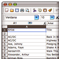 I had such high expectations for ThinkFree when it was first launched about 5 years ago. Here was a $50 office suite that even in its early stages was a good stand-in for Microsoft Office’s “Big Three,” and it was available simultaneously for Windows, Linux, and Mac OS X. Not only that, but the ThinkFree developers were thinking ahead to Web 2.0 by providing a web-hosted workspace for your documents, so that they could be always available, like the Web. In a November 2002 white paper to my agency IT directors recommending that employees be permitted to use Macs as an alternative to Windows (which was loudly ignored, by the way), I wrote of ThinkFree:
ThinkFree Office is a $49.00 office productivity suite that does an excellent job of mimicking Office formats—both in reading and writing them. It comes with modules for writing, spreadsheets, and presentation that are compatible with Microsoft Office. ThinkFree only implements a subset of the Office functions, however, leaving out many advanced functions. The ThinkFree interface is almost identical to that of Microsoft Office.
So what happened to ThinkFree? I checked up on their progress periodically, but there didn’t seem to be much happening. Trying ThinkFree Calc last week, almost 5 years after the first version came out, gave me a strong, sad sense of deja vu. For a nauseatingly long tirade on why I have come to think it’s a mistake to build products like ThinkFree to compete against Microsoft Office, check out the writeup above on NeoOffice. To that, I only have to add that it’s nice to see ThinkFree is still only $49.
Flying in from Mars over the weekend when I was using Calc, a friend looked over my shoulder and wondered why in the world these silly humans choose to spend $400 or more per user to equip them with software that could be had for a tenth of the price merely by switching vendors, and I shrugged my shoulders and quipped,
“Gets me. Free thinking comes naturally to us Martians, but here a product has to make the suggestion to get attention. And even then, the idea backfires when it becomes clear that the developers themselves weren’t thinking freely when they designed their almost-free alternative. Maybe some humans are more comfortable in chains, as long as they’re expensive and come with friendly, talking paper clips…? You know, I’ve observed that it seems to be a common human trait to automatically assume that the most expensive product in a market is the best one. Watch long enough, and you’ll see it time and again.”
My Martian buddy merely shook his head sadly and walked to the kitchen for a bowl of steaming hot fudge.
| ThinkFree Calc (Version 3.2, $50) |
|
|---|---|
| Pros | Cons |
|
|
Addendum: More Spreadsheet Apps?
At the time this article was originally published, it included information about every Mac OS X spreadsheet application I was aware of. Since then, readers pointed to the following two, related applications. I’ve checked them out and agree they should be covered here as well, so I’m adding them to my “review queue”:
- FlexiSheet (Added 4/6/07)
- Quantrix Modeler (Added 4/6/07)


