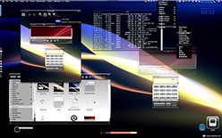
This  article introduces the latest version of Crystal Clear, which features an enhancement to the system menubar transparency that was described in an article last week. Although I didn't find time to work on the Crystal Albook icon set since the last release, Crystal Clear has a large number of enhancements in various button elements, as described below. I do hope to get some work done on Crystal Albook next time around.
- An experimental approach to solving the problem of "extra overlay shine" on most menu extras in the system menubar (statusbar). This approach can eliminate the visual discord created as menu extras overlay their own "toolbar" over the preexisting one. In opaque toolbars, this isn't noticeable, but it's bothersome in any toolbar with alpha transparency. (This part of the update is described in the recent Mars article, "Desperately Seeking Clarity: Wiping the Dirt from My Crystal Clear Menubar."
- Crystal Clear toolbar elements for Camino.
- New design for menu selection highlights in Crystal Clear Dark. Similar highlights also appear now in the Finder sidebar.
- Completion of pushbutton and popup button elements for Carbon apps (such as Photoshop). (The buttons were already complete for Cocoa apps.)
- New Crystal designs for the bevel buttons (butted and otherwise) that are the bane of my existence when theming Mac OS X. (O! Apple... Please make these go away in Leopard!)
- Reworking of the large metal buttons.
- Various other tweaks and fixes, plus a few more menu extras.
Future releases will work on standardizing the appearance of various otherwise-similar button elements, reducing the height of some pushbutton elements, and completing unfinished work on the slider elements.

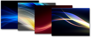
Along with the new menubar approach comes four specially prepared background pictures from the wonderful Xanthic collection. These are included in the ShapeShifter guikit and are available in four resolutions: 1280x800, 1440x900, 1680x1050, and 1920x1200. The Crystal Clear download package also includes four menubar graphics in Photoshop format, each sized for those four monitor resolutions. You can add the menubar to your own favorite backgrounds for use with Crystal Clear. (I've found that layering the menubar in the Linear Dodge mode works best for dark backgrounds, but you can experiment to see what works best for you.)
Crystal Clear also includes a folder of additional menu extras for some third party applications, a Growl style, and an iCan theme. Crystal Clear 1.2 adds a couple more menu extras to the collection:
- MainMenu
- YouControl Tunes
I'm also adding a copy of the terrific freeware utility FastAndSlow (my apologies to the software's developer, Giuseppe Tribulato, whose website no longer exists). I had just about given up trying to change this menu extra's icon from black to white (which works better with Crystal Clear's menubar) when I decided to try peeking at its code with a hex viewer. Sure enough, the icon is defined as a vector graphic in the Objective C code, and fortunately I located where I needed to substitute "white" for "black". Now I can see the icon clearly!
Crystal Albook Icons
Crystal Albook is an icon set based on Laurent Baumann's excellent Albook series, which is generously released under the Creative Commons license. The Crystal Albook series incorporates transparency to accompany the Crystal Clear theme and its variants. Crystal Albook is now available only as a separate download and is not included in the Crystal Clear package.
SetAlphaValue
Also in the folder is an updated version of Michael Parrot's open-source SetAlphaValue, a plugin to Mac OS X Cocoa software that's needed to enable full transparency in the application toolbars. Simply doubleclick on the SetAlphaValue4CC.pkg file, and you will be guided through the steps necessary to install this software. (Note: If you have previously installed SetAlphaValue, you don't need to reinstall it. The version bundled with Crystal Clear 1.1 is the same as that in version 1.0.)
 As noted in the original article, this version of SetAlphaValue is specifically modified for use with Crystal Clear. It sets SetAlphaValue's defaults so that background windows automatically fade to about 35% of opaque, while the frontmost window stays opaque. This makes it much easier to distinguish the window you're working on from other active windows on your screen. You can, of course, modify the defaults for your own use once you install and start using SetAlphaValue.
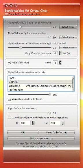
Using SetAlphaValue is very easy... deceptively so. If it's active in an application after you install it and restart your system, you'll see a "SetAlphaValue" menu item near the bottom of the application's "main" menu. (The main menu is the one named after the application.) When you select this item, SetAlphaValue's preferences window will open. Here, you have a wide variety of options for customizing its behavior.

You can disable it for that application only by clicking on the first checkbox, “Disable for this application.†You can also change the transparency settings for that application, modifying the separate sliders for:
- All the application's windows (the default, in other words).
- The main window (the one that's in front of all the others).
- The application's windows when the application itself is visible but inactive.
As if this weren't enough, you can use the text box in the middle of the SetAlphaValue window to change the default transparency settings for windows with specific titles. For example, I use this in Safari to tell SetAlphaValue never to dim the Downloads window or the JavaScript Console window. Likewise, in some apps you may always want the Colors window to remain opaque. This can be used productively for any window an application spawns that always has the same name. It's a very useful way to customize SetAlphaValue for specific apps.
Another customization worth experimenting with is the section headed "AlphaValue for windows..." If you leave the slider set at 99 and click the checkbox in this section, you can then set the x and y values to tell SetAlphaValue to never dim windows that size or smaller that have no titles. I've modified SetAlphaValue so that it never dims "sheets," and I suspect that Parrot included this feature as a workaround to that problem. Still, you may encounter windows that have no titles which you'd like to remain visible, and you can use this section of the preferences for that.
Remember, all of these settings are tied to the application from which you launched SetAlphaValue. If you want to change SetAlphaValue defaults for all applications, just set the three sliders at the top of the window and then click on the "Default Value" button. This will change SetAlphaValue's defaultsfrom that point forward, but it won't change settings in applications you've already opened since installing SetAlphaValue. I've more than once changed my mind about what I want the defaults to be, and if you find yourself opening SetAlphaValue once too many times, I recommend simply trashing its preferences file and starting again.
The SetAlphaValue preferences file (located as usual in your ~/Library/Preferences folder) contains all your settings for every application in which it's been activated. Delete this file, and you'll see the SetAlphaValue window open once again in the first Cocoa application you launch. Then, you can set your defaults as you like, click on the Default Value buttons, and be done with it. After that, you'll only need to open the preferences to customize opacity for particular windows in certain apps.
Uninstalling SetAlphaValue: If you want to delete SetAlphaValue, simply delete its folder in the /Library/InputManagers folder, where it was installed originally. If, on the other hand, you want to disable SetAlphaValue just for certain users on your Mac, move the SetAlphaValue folder from /Library/InputManagers to the user's home library (~/Library/InputManagers). If the user doesn't already have an InputManagers folder in ~/Library, you'll need to make one first. The InputManagers folder is one of the places Cocoa applications look when they launch to see if there are any additional attributes they need to take on... it's sort of a "plugins" folder for Cocoa.
What's In the Package?
 The Crystal Clear download includes the following files in the main folder:
- CrystalClear_v12.guiKit (Both variants of Crystal Clear and four desktop pictures, courtesy of the artist known as Xanthic, customized to include the Crystal Clear menubar and each available in four standard resolutions.)
- SetAlphaValue4CC (Installer for SetAlphaValue)
There are five subfolders in the package:
- docs: The ReadMe file for SetAlphaValue and this Welcome document.
- menu extras: Here you'll find folders with menu-extra graphics and installation ReadMe files for Chronosync, DropCopy, FastAndSlow, FastScripts Lite, iKey, MainMenu, Sound Source, Yahoo Widget Engine, and YouControl Tunes.
- other extras: This is where you'll find the iCan theme, the Growl style, and a folder for the extra SafariStand toolbar graphics.
- pics: Contains full-screen previews for both the Lite and Dark variants of Crystal Clear. (Note: These screenshots do not show the latest changes in the Crystal Clear theme... they are the ones released originally with the Dark and Lite versions.)
- crystal menubar: This is a new folder that contains the Crystal Clear system menubar in Photoshop (PSD) format, ready to be applied to desktop pictures of your choosing. Simply pick the PSD file corresponding to your screen resolution, and add it as a layer at the top of the image.
Known Issues and Usage Notes
Please refer to the article introducing Crystal Clear from February 2007 for all the gory details behind its creation and the usability issues involved in designing for transparency in Mac OS X user interfaces: "Crystal Clear: Pushing Mac OS X Windows Beyond Translucent." I'm reproducing the following excerpt from that article, because it's still a relevant list of "known bugs" and offers useful tips on using Crystal Clear.
- Cocoa toolbars get temporarily "messed up" when closed and reopened. However, if you refresh the screen (switch to another app and switch back, or hide and then show the window), the toolbar will clear up.
- Occasionally, you'll see "ghost" images of previous window titles or icons in metal toolbars or titlebars ... if this bothers you, the only way I've found to "clear up" the toolbar is to use the haxie WindowShade to reduce its custom shadow density. If you don't use WindowShade, you may not experience this problem. If you do, try reducing the density slider in the custom window shade section.
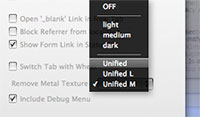
 In Safari, the tab bar will look best if you install the free SafariStand plugin. Use one of the themes in Stand to enable a unified toolbar look. I recommend the "Unified Medium" option.
- Main menubar "extras" that don't use the MenuCracker bundle show a second layer of shine, and I haven't found any way around it. As it turns out, these menu items are basically loading the full application menubar, except that their only presence on the menubar is their tiny spot. As a result, they load the toolbar a second time, causing the space they occupy to be twice as shiny as the rest of the menubar. MenuCracker seems to take care of the problem, but most menu extras don’t use it, unfortunately. (I’m not completely sure that MenuCracker is the variable here, and if anyone knows a way around this, please share!)
- The optimum setting for the Finder toolbar is to use "icon only" with regular (not "small size") icons. Otherwise, the toolbar area will either overlap the opaque area somewhat when you use Spotlight, or the text labels won't be very readable. The problem is that, unlike Unified toolbars in Cocoa apps, the transparent toolbar in metal windows doesn't expand and collapse as you change view options. This is why I recommend using SafariStand to enable a unified toolbar in Safari.
- Because of the issues noted in the preceding bullet point, I find that in general Mac OS X toolbars look best if you select "icon only". This can be a problem if you're using an app and don't know what the icons stand for (yet). If it's a unified Cocoa toolbar, just keep the text on in that case.
 If you use a lot of Carbon applications, you might find Crystal Clear less than optimum. That's because unless it uses a metal window theme, you won't see any transparency except for the titlebar. In fact, for non-metal Carbon apps that have a toolbar, you'll find the toolbar background is black. This is because the Carbon framework doesn't support alpha transparency in its windows (I assume). The way I think of it is that the Carbon framework today is to Cocoa as Windows XP framework is to Vista's: Namely, not exactly state-of-the-art. Still, so far Apple hasn't been able to convince a lot of major application developers (including the big guys like Microsoft and Adobe) to utilize the Cocoa framework. So, my advice is, avoid applications that don't use the Cocoa framework where possible. The only one I use daily is Photoshop, and it looks just fine in Crystal Clear. So does BBEdit and Firefox. Microsoft Word, however, does not. But I find the combination of Pages and TextEdit superior to Word anyway.
- Avoid background pictures with large patches of white, especially at the top of the screen. Although Crystal Clear seems to work well with both light and dark desktop pictures and with pictures that are both "busy" and "serene," it doesn't do well against pure white, since the white text in toolbars and titlebars (and the status bar) will not be distinguishable.
Download
Download Crystal Clear 1.2 (10.3 mb)
The package for the Crystal Albook 1.0 icon set is still available on my deviantArt site:
- Crystal Albook 1.0 (6.3 mb) (Updated 4/29.)
Version History
| 0.5 | 2/13/07 | First release of Crystal Clear. This version is what became known later as Crystal Clear Dark. The development of Crystal Clear was described in this introductory article on Musings from Mars. A few days earlier, this preview article appeared, with many application screenshots. |
| 0.6 | 3/2/07 | Introduced a variant called Crystal Clear Lite, which utilizes translucent white menus instead of translucent black ones. The variant also incorporated numerous other improvements and bug fixes to the original release. |
| 1.0 | 3/26/07 | Crystal Clear 1.0 provided a complete package, with both "Lite" and "Dark" variants included. This release also included an initial set of Crystal icons based on the Albook icon set. |
| 1.1 | 4/19/07 | Crystal Clear 1.1 has several major new interface elements as well as a newly designed, full set of Crystal Albook icons (version 1.0). |
| 1.2 | 6/6/07 | Crystal Clear 1.2 introduces a new approach to the system menubar that attempts to solve the problem created by backgrounds in menu extras there. There are many other new interface elements as well as some fixes to earlier ones. This version does not include the Crystal Albook icons, but they can be downloaded separately. See this article for the latest information on Crystal Clear releases. |


