 Each new operating system that's come out in recent years has tried to make previewing content from your file system easier and easier. Both Mac OS X and Windows have been able to preview images and some other types of documents within their relative file browsers (Finder and Explorer) for several years, and with both Leopard and Vista, the two are once again trying to outdo each other.
Mac OS X has had the upper hand in handling digital media, though, since you can browse and play live audio and video within the Finder as well. As far as I can tell, this functionality, which has never been part of Windows XP, is still left out in the forthcoming Windows Vista.
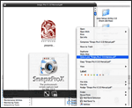 Vista has a document preview pane that lets you scroll through Office documents (and possibly text files), but as far as I can determine it doesn't help you with PDF files. Microsoft has added a number of other features like "smart" folders and live search, which of course come straight from Mac OS X.
But despite Microsoft's attempts to improve Explorer's looks and functions, it mostly seems to keep making Explorer more complicated than anyone really wants or needs. Of course, this is the Windows Way, isn't it? Never miss an opportunity to add an "Advanced" button whenever possible in order to cram in more useless but impressive-looking functions that only a Help Desk person could love. ![]()
 This has left the field free for Apple to continue raising the bar on usability, making the Finder more and more indispensable. Although many of us keep hoping they'll rewrite Finder in Cocoa and add useful features like tabs, I have to say I'm pretty delighted with a new feature they've slipped in to the latest build of Leopard.
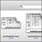
With "Quick Look," Apple is leaping ahead of the file-previewing game by providing a separate, translucent preview window of amazing flexibility and beauty. It can preview movies at full size or even full screen. It can preview text, HTML, and PDF documents and even let you navigate them. If you select multiple files, Leopard provides an "expose"-like view that lets you navigate among them. Or, if the files are images, you can quickly go into slideshow mode. There's much more... but ain't that enough for now?
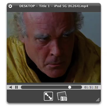
Last night I made three movies of "Quick Look" in action. The first shows simple file browsing with multiple file types--HTML, PDF, and images (including a Photoshop file).
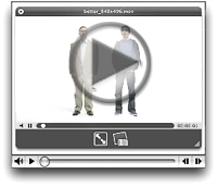
The second one I made while quickly browsing some Apple "Mac vs. PC" ads that I'd downloaded in QuickTime format. In recording the movie, I was simply moving my cursor in the Finder from one video to the next, and somehow Quick Look picked each movie up at the same point in the timeline rather than starting at the beginning each time.
The final movie is a quick snippet of one of my favorite scenes from Stanley Kubrick's A Clockwork Orange. To me, this is the most amazing innovation of Quick Look. Although in Tiger, you can preview movies right in the Finder... it's not much fun, since you can't make them more than about 128 pixels square. In Leopard, you'll be able to resize the Quick Look bezel to full size or even full screen, just as easily!
And of course, Apple has endowed Quick Look with some eye-catching animation techniques, so that it's almost as much fun to invoke as it is to actually employ for previewing your files.
Besides Quick Look, Apple has enhanced file previewing in Leopard in a few other ways. First, you can now set a view preference to see file previews, which makes thumbnails for movies, images, PDF files, text documents, and other types. Of course, Quick Look can be invoked in any Finder view, even icon view. Also, if you're in column mode, you can now resize videos to their full size, whereas in Tiger there is some arbitrary size limit to video resizing, just as there is for images.


