Articles from
Optimizing Objective-C and Other Goodies
Ayluro’s Source Code Snippets
Cocoa Traces: New Repository for Cocoa Snippets
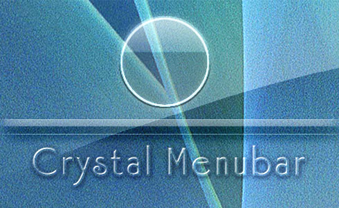
New Crystal Trinket Eliminates Maintenance on Your Menubar

I’m releasing this in advance of Crystal Clear 1.5 since it’s ready to go and there may be one or two folks who are tired of dealing with the “roll your own” menubar from version 1.2, even though it did eliminate the ugly menu-extra smudgies of previous releases.
With Crystal Menubar, you just drag the application to your hard drive (the “Applications” folder, maybe?) and click it. This will put the nice, clear Crystal Menubar in its rightful place at the top of your screen. After that, you can just forget about it. Use whatever desktop picture that strikes your fancy!
If you decide to use it, just add it to your Login Items in System Preferences (the Accounts pane) so it gets launched when you log in.
An Intimate Evening With Two Dozen iTunes Controllers
One question that might pop into your head when you contemplate the fact that there are at least two dozen different software applications for Mac OS X that want to be your iTunes controller is, “So, why not just use iTunes to control iTunes?” If you’ve never used iTunes before, you might also be wondering, “What’s wrong with iTunes that makes so many people avoid using it directly?”
This is indeed a curious paradox at first blush. iTunes is the world’s most popular digital music jukebox software. It has a screaming wonderful interface that just gets better with each iteration. Its innovative design practically defines “ease of use” in this category. So, why have so many developers expended so much energy and creative imagination on redefining how we interact with it?
There isn’t just one answer to that question, but here are a few possible ones:
- Mac users are too impatient to switch applications in order to change songs. They want an application that can overlay whatever they’re currently doing, providing immediate access. Call this a variation of the “Instant gratification” impulse.
- Because the iTunes API makes building external interfaces to it so easy. You often get the impression that some iTunes controllers are their developers’ first foray into xCode and/or Cocoa programming. Call this a variation of the “Because we can” impulse.
- Because a programmer had a new idea that was too cool to pass on. Either the idea was really new, or it was building on someone else’s idea. Some of the iTunes controllers are clearly attempts to improve other ones that already exist. Call this simply the “Urge to create.”
Notice that none of these possible motives is an attempt to remedy a shortcoming in iTunes, or even to add significant functionality to the application. The only thing that comes close is the addition of tools to fetch album art from the web, or to integrate with a social music networking system like Audioscrobbler. Instead, they’re simply tools that extend the iTunes interface into every aspect of a Mac user’s workflow… making it practically ubiquitous as we work.
A couple of weeks ago, I set out to survey the market to identify all of the iTunes controllers that are currently supported. (There are still old links to some phantom controllers on MacUpdate, but I won’t tell you which.) Having found 24 of them, I clearly don’t have the time to prepare a full snapshot of each as I’ve done for other software categories recently. In order to keep this workload sane for me, I have to skinny it down to the basics–my notes, a link, price info, a version number, and a recommendation.
ThisService Lets Developers Easily Build App Services from AppleScripts or Command-Line
Etoile: An Open Source Mac OS X Desktop Alternative in the Works
Crystal Clear 1.5 Preview:
Yes! The Term “Opaque Window” Is An Oxymoron
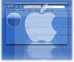
After all, who  would ever install an opaque window? In the real world, a window by definition is clear—you can see through it. If it weren’t clear, you couldn’t very well call it a “window.” In other words, an opaque window is an oxymoron. Yet, that very oxymoron is the norm on our computer desktops today. As Crystal Clear evolves, its aim is coming closer to making opaque windows as much of an oxymoron on your desktop as they are in that wall over there.
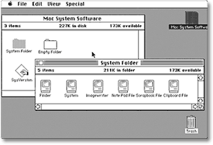
Computer desktops have slowly evolved since 1984, when the first Macintosh was introduced. With each operating system release, Apple has added more realism to the graphics that make up application windows, the desktop, and their various “widgets” and icons. Microsoft and other GUI-design-wannabes have followed along as closely as they could. Through this process, our software windows and icons have gained a little 3D through primitive shading, higher resolution displays, larger icons, better shadows, alpha transparency and compositing, smoother animation and transition effects, and so on. These changes have produced a dramatically more “realistic” look-and-feel today than we had in the beginning. Undoubtedly, this evolution  will continue, and desktops 10 years from now will make today’s look similarly primitive.
The Crystal Clear experiment is asking the graphical question, “How about using transparency to improve realism, while enhancing the beauty of our desktops at the same time?”
Up to now, the Crystal Clear theme for Mac OS X has brought clarity to your Aqua window toolbars, titlebars, and menubars. Crystal Albook icons clarified your system and application icons. And there has been much rejoicing.
However, a common question from early users of the theme was, “How about the window edges? How about the status bar? How about Safari’s bookmark and tab bars?” Unfortunately, none of the tools in a Mac OS X themer’s bag of tricks (chiefly, ThemePark ) can help affix transparent colors or graphics onto those bits of Aqua windows, so I had to throw my shoulders up in a major, sad shrug.
Fortunately, my little experiment in alpha transparency didn’t end there. The SetAlphaValue software that’s been a key part of Crystal Clear’s magic from the beginning has led me on a merry (well, mostly merry) romp through Objective-C and Cocoa Land, the world of geeky wonder that lies behind each object on your Mac OS X desktop. With much open-source Cocoa software code, two excellent books, and the rich universe of web Cocoa resources in hand, I’ve been slowly absorbing the syntax and grammar of Objective-C, the programming language of choice for Cocoa application development. As I got deeper into the “messaging” framework that’s a key part of Cocoa, I realized I could hack SetAlphaValue to do much more than just adjust window transparency.


