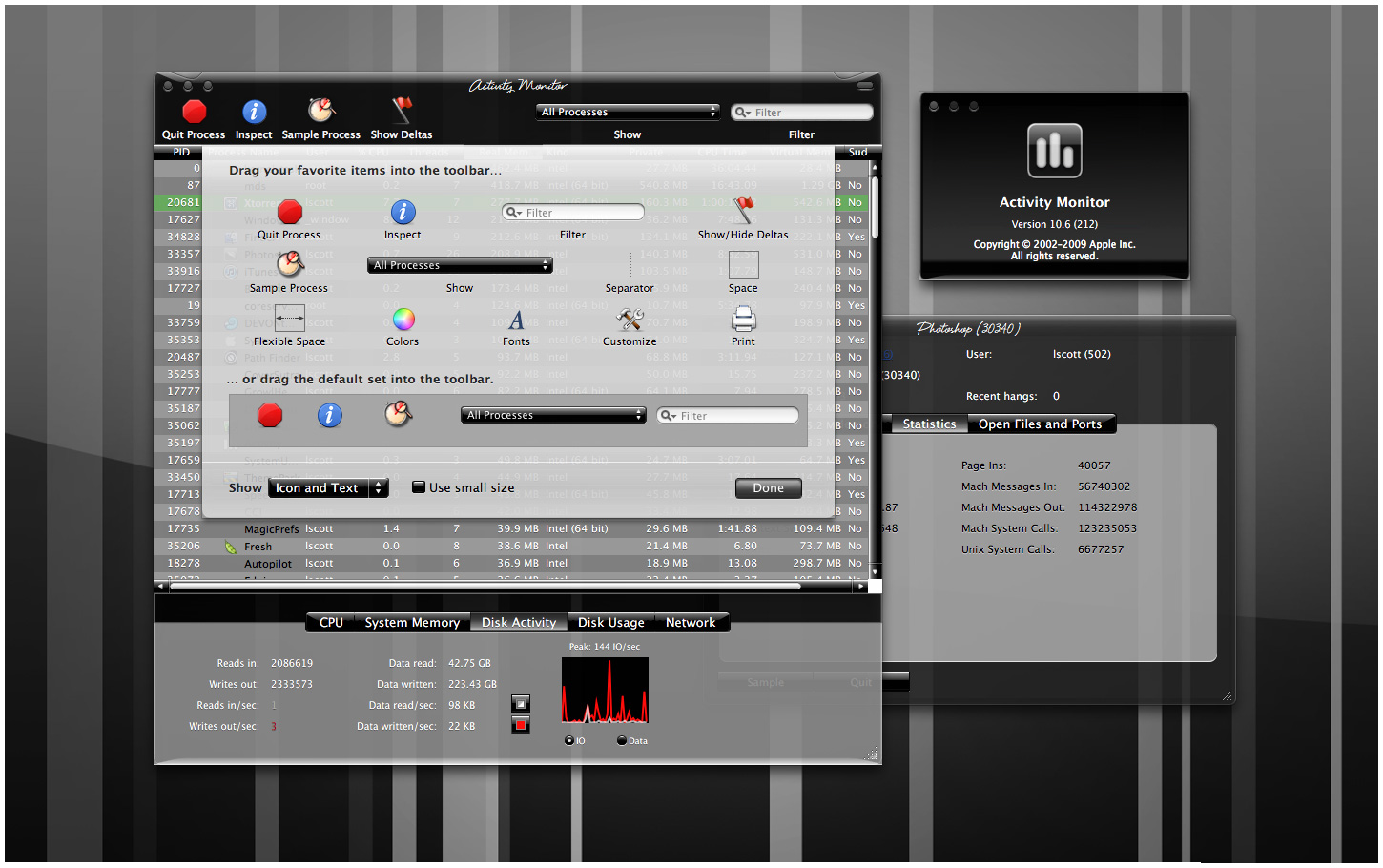
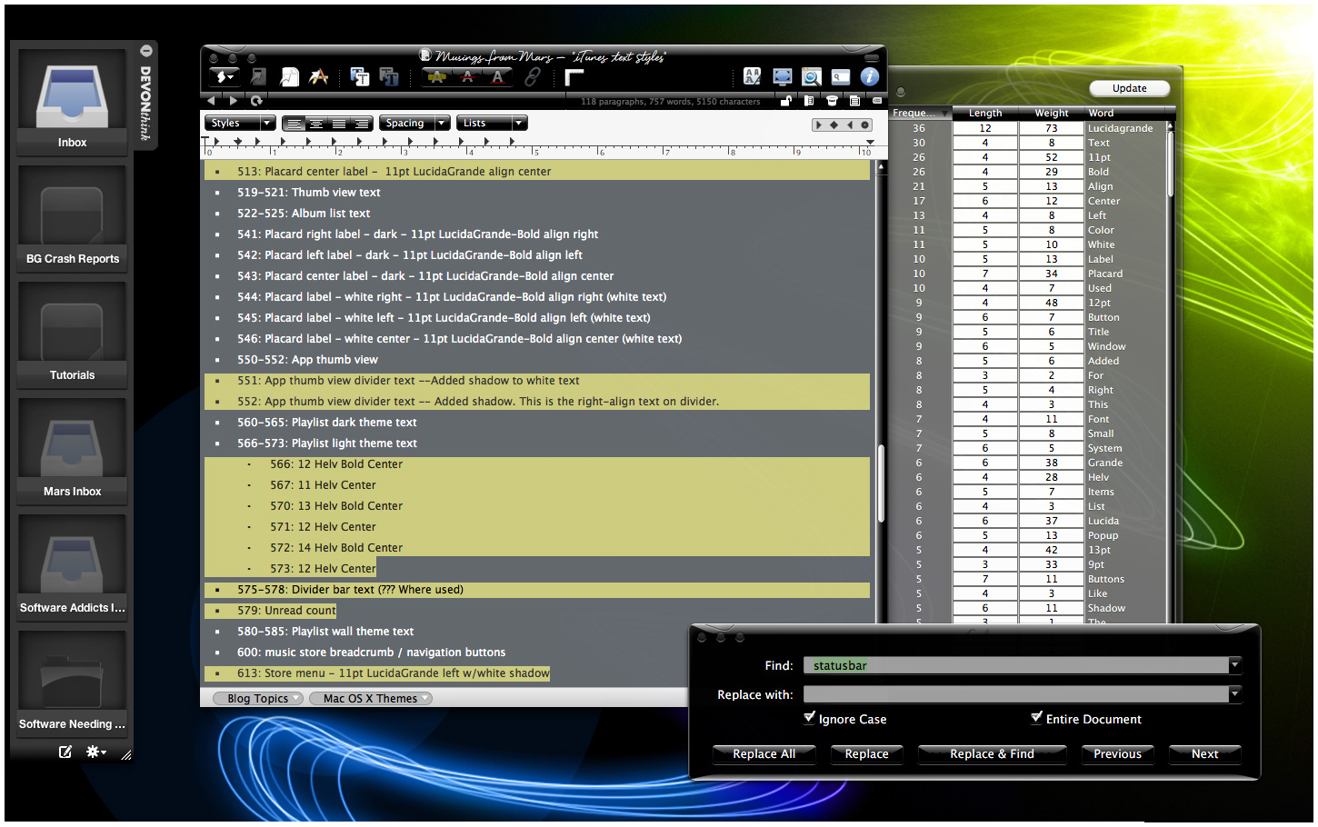
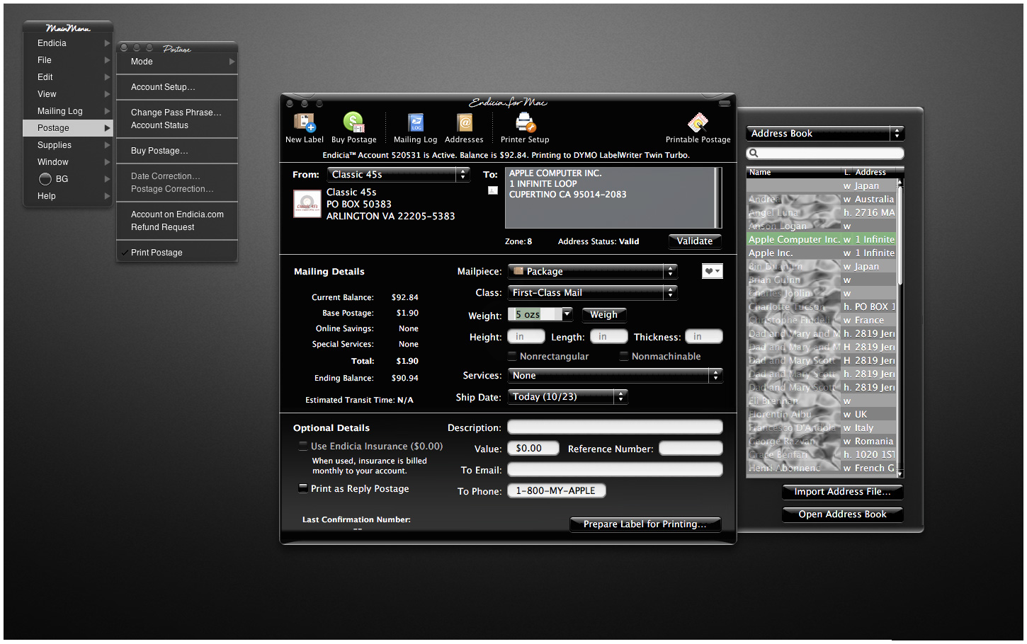
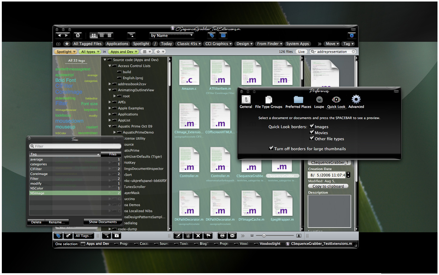
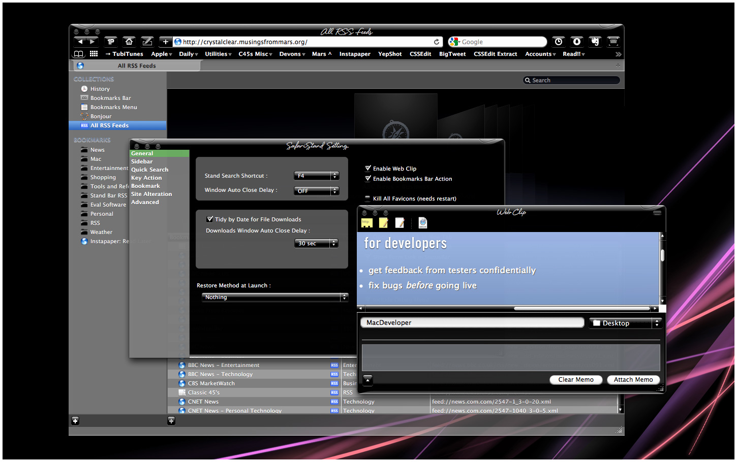
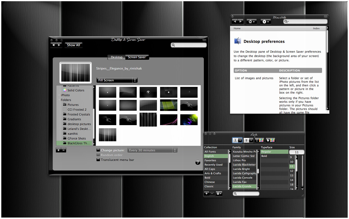
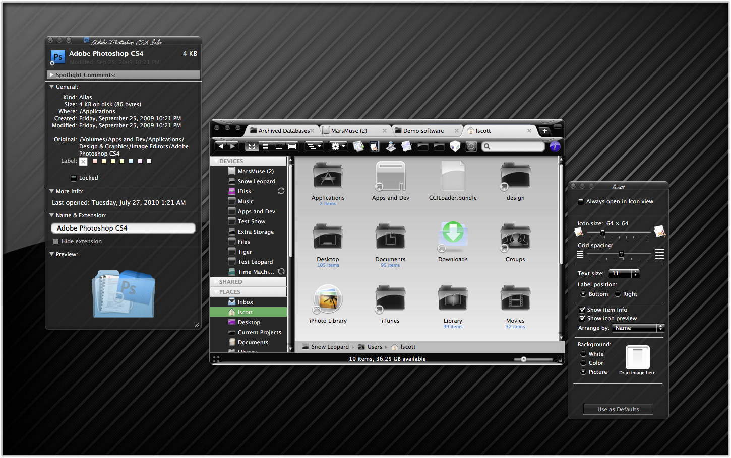
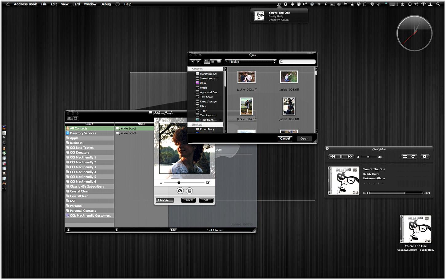
Like many themers for Mac OS X 10.3 ("Panther"), I was awed by the beta releases of a theme called "Cathode" back in 2004. An artist named Dragun took the theme through a few iterations and then abruptly halted development.
 Those of us who used ShapeShifter to run Cathode on our Macs understood why. Although Cathode was beautiful, in practice it was impractical. There were too many elements of too many applications that resisted a dark theme for buttons and window backgrounds.
For me, however—and I'm sure for many theming fans—the dream of using a beautiful black theme like Cathode was a siren call impossible to forget. Over the years, the dream receded further from our grasp because of roadblocks Apple erected—intentionally or not—to the existing mechanisms of theming Mac OS X.
Starting with Mac OS X 10.5 ("Leopard") in 2007, the main tool for applying Mac themes, ShapeShifter, went bye-bye and has never returned. This is one of the main reasons I continued development of CrystalClear Interface, because it was the only way for me to apply a fully realized theme to Mac OS X.
Since Leopard, themers have been able to finesse the problem by changing the system graphics files that apply buttons, menubar background, basic window shape and color, and a few other items to your window appearance. Despite best efforts to unravel the secrets of the Mac's new ways of drawing itself, this mechanism isn't able to consistently change text color in the many contexts in which it appears in a window, thus making design and use of dark theme impractical.
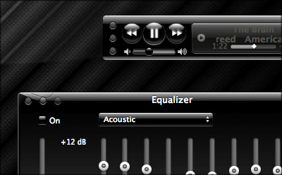
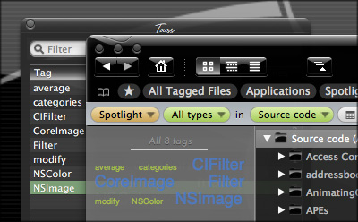
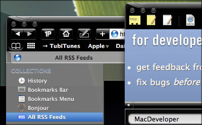
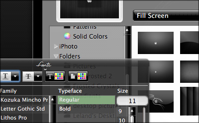
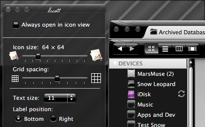
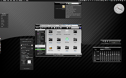
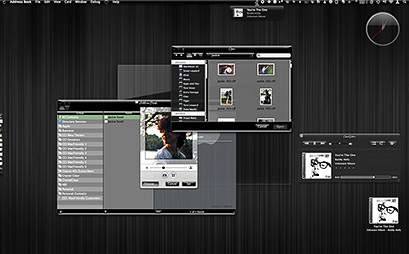
As I'll describe in a future article, tackling the design of Crystal Black, a new theme inspired by Cathode, has been far from easy. And there remain user interface elements that totally resist its charms. But for me, those elements are few enough to make Crystal Black practical.
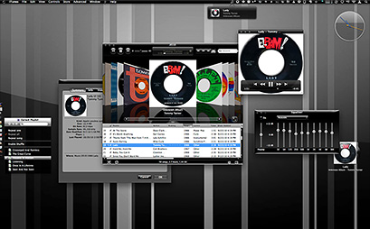
At this point, I'm confident that I'll be able to complete Crystal Black and release it at some point for all Mac users of Snow Leopard (Mac OS X 10.6). The theme is an offshoot of CrystalClear Interface (CCI) and uses much of the same code. However, Crystal Black is much simpler, has a smaller impact on the operating system, and is compatible with many more applications than CCI. Also unlike CCI, Crystal Black provides a complete theme for iTunes 10.
During early development of Crystal Black, I had intended it to be a feature of the next major release of CCI—and eventually it will be. In mid-September, though, I got the bright idea of forking Crystal Black as a separate application, mostly because I thought it would simplify its development and allow me to get it into user's hands more quickly.
Like all software development, it seems, the code cooperates only so far, and timelines end up stretching beyond intentions. That's been the case with Crystal Black, but I'm happy to say that not only is it nearing the end of its core development, but a lot of the Crystal Black code will be able to optimize CrystalClear Interface. It's kind of like what Jobs talked about in the recent keynote about Mac OS X and the development of the new Macbook Air: Things I've learned in developing Crystal Black will ultimately make CCI a better product as well.
As an aside to CCI users, I'm planning to put out a minor update soon that will incorporate the Crystal Black-enabled optimizations as well as address bugs and other changes made since the release of version 2.5.6.3 in August.
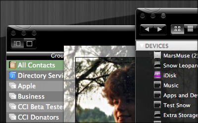
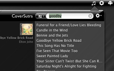
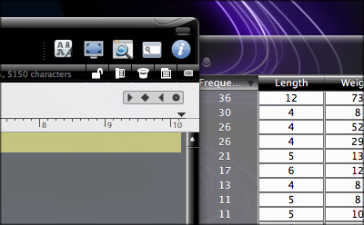
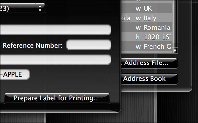
This post, then, is simply a preview of Crystal Black, showing how it appears in various widely used Mac applications as well as in full desktops. I hope you find it to be as gorgeous as I do!


