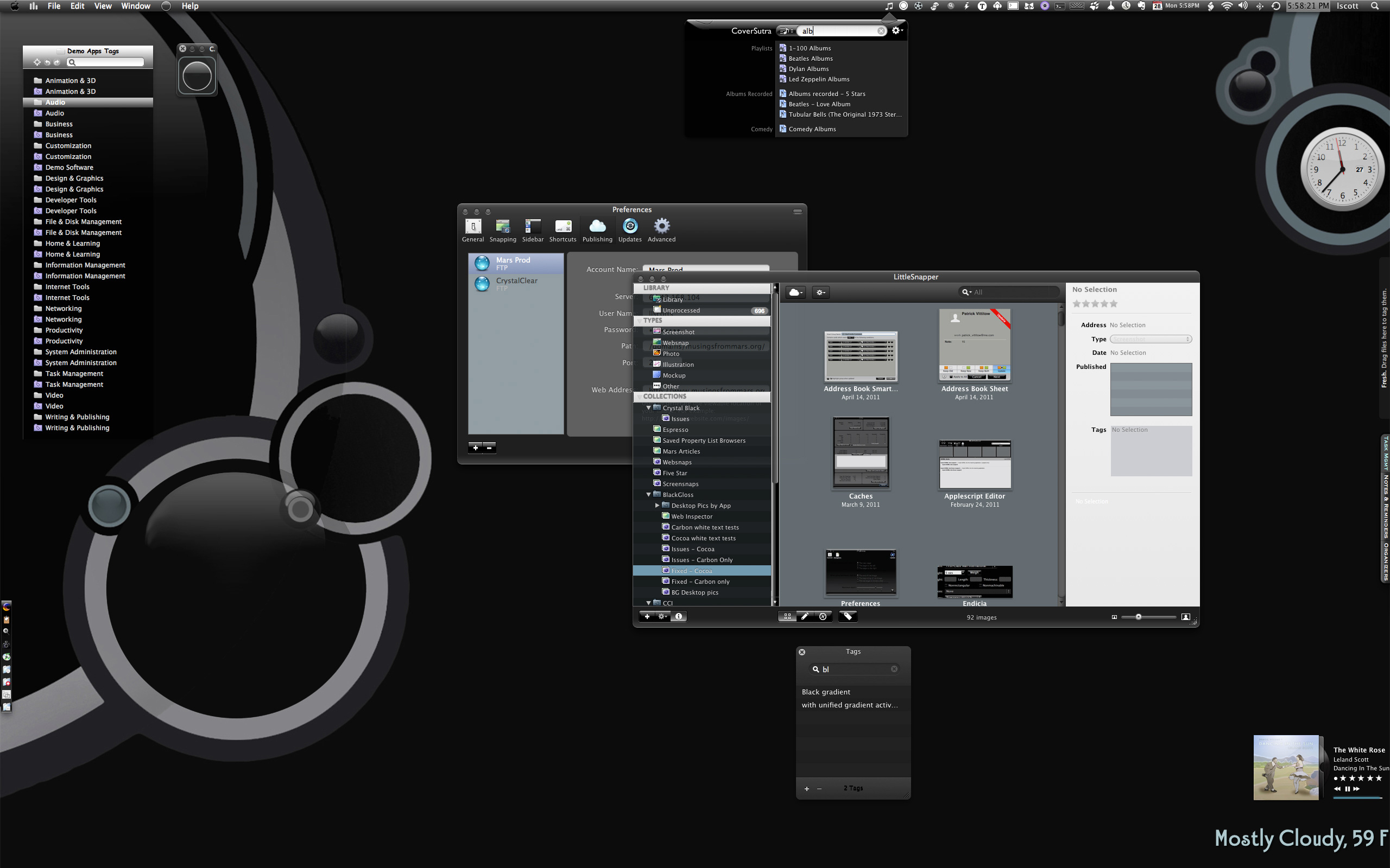
As I wrote in a brief post yesterday, I am not using Lion myself, and don't plan to. So it's particularly hard to develop for. I expect to revisit this decision when Mountain Lion is released in a few months. I'll be installing the developer preview soon to see what I'm in for.
I'm sorry to leave my Lion users out of the party, but at least they still have stable versions of CCI and CB to fall back on.
Work on programming and graphics is now far enough along that it's safe to say that CrystalClear Interface 2.6 will be ready for release soon. How soon? Don't ask, because my answer is always wrong.
CCI 2.6 will be a major upgrade, with some features customers have wanted for quite awhile now. The upgrade will be free for current CrystalClear Interface license-holders, but after release the software's price will increase to $18. The price increase reflects the major amount of work required to push CCI's functionality to the new level, and a lot of that work has to do with making it work — and look right — on Lion (Mac OS X 10.7).
Briefly, the main new features in CCI 2.6 will be:
- Incorporates the Crystal Black button theme for users on both Snow Leopard and Lion.
- Adds eight menubar themes users can mix and match with their chosen button theme.
- Seamlessly swaps custom application graphics for a given theme with the chosen new one.
- Fleshes out the custom system graphics for Lion, so that both the Gradient and the new Black Gloss button themes are almost in parity with Snow Leopard.
- Adds two new window frame styles — "Black Gloss" and "Black Gradient."
- Incorporates two new preset themes — "Black Gloss" and "Smooth Black" — to take advantage the new window styles.
- Adds numerous new Crystal Docs icons, and improves the icons tab to show previews of the various icons.
- Automates the installation of third-party Crystal Docs icons, so the user isn't interrupted and prompted to install for each app as they open it.
- Provides a new set of Crystal Desktop pictures, mainly for users who want a dark desktop. This set of "Deco Bubbles" desktops has six dark variations and four light ones.
- Adds code to enable readable statusbar text for the clock and username "menu extras." (Note: This feature currently doesn't work consistently on Lion.)
In addition to those features, the release incorporates numerous bug fixes and enhancements. Of those, the most noteworthy are:
- Lets you collapse the CCI Preferences window when you need to temporarily minimize it.
- Adds new menu extra icons for some third-party apps: Tags, Proxi, TotalFinder, and My Living Desktop.
- Adds a "Refresh" button to the list of disabled apps in the CCI Preferences Pane, letting you force the table to update if it doesn't do so automatically.
- Fixes a bug in Mail that could cause the app to crash when the user closes a window with the Cmd-W shortcut.
- Adds a better workaround to the problem of black test on dark background for Safari's URL field on Lion.
- Improves theming of text colors on buttons in disabled apps.
So, you may be wondering why building CCI 2.6 has been so hard. No problem... I'm dying to explain. The four main areas of work that have kept me up late nights are (1) Designing workable graphics for Lion, (2) making sure text colors change appropriately as the user changes button themes from or to Black Gloss, (3) making sure all the customized app and system graphics change to match a new button theme, and (4) writing the new menubar function to be smart enough to provide only options appropriate for each button theme, and to swap out the menubar text and "menu extras" icons as necessary.
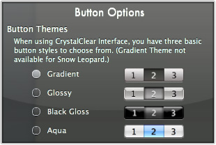 Lion introduces a whole new paradigm for a large swath of its button graphics. Prior to Lion, Apple's graphics have always been opaque, though for many of them a themer could substitute translucent ones. However, Lion has a whole class of transparent graphics, which are widely used for segment buttons and popup/popdown buttons. This wouldn't be a problem except that the way these buttons are composited on window frames is altogether different from Snow Leopard and any earlier Mac OS X release. Thus, making substitute graphics requires a large amount of trial and error.
Even for graphics unchanged from Snow Leopard — including those for titlebar buttons, radio and checkbox buttons, and tab bars — Lion's algorithm for displaying the graphics on a window makes it impossible to simply reuse Snow Leopard graphics. In particular, Lion is picky about graphics with white in them, and is also unfriendly to graphics that try to cast a light shadow under the button. Again, solving these problems has required a huge amount of trial and error — including a reboot on Lion to test each change.
Since it isn't possible to simply reuse graphics from the previous operating system version — a procedure that's made transitioning themes to new versions much easier in the past — I've had to build by hand an unfair number of tiny graphics. For each theme, Lion has two art files — one that has graphics for the menubar, other menu highlights, drawer frames, apple menubar icons, and various graphics that appear on buttons (arrows, text items, disclosure images, and so on). The second file has all the button graphics, which total 2,668. That's 2,668 graphics that could be themed in Gradient and Black Gloss style for CCI 2.6. So this is an exercise in sheer drudgery.
Prior to Lion, the theming world was blessed with a tool called "ThemePark," which greatly simplified the process of adding and changing this vast universe of button parts. However, given the issues with Lion, ThemePark has not been available. Instead, we have a couple of Unix executable files which are run from the command line. Thus, all the work in incorporating buttons must take place in Finder (or another file browser) and then compiled in Terminal.
Another issue that's made theming Lion drive me crazy is that Apple changed the Art Files from 10.7.1 to 10.7.2 — meaning that you couldn't use the files from one with the other. The files are not just incompatible, they double the graphics workload. With double the workload, the job of keeping track of the various art files and of making sure changes in one are in sync with the other becomes not only difficult but dangerous. Keep in mind that covering both sets of Lion art files, as well as those for Snow Leopard, means that there are 6 art files for the button graphics to manage. Because CCI 2.6 includes 8 menubar options, as well as seamless changes in text color for the various menu graphics (which is controlled by a third system graphics file), the total number of art files explodes to 58 — 22 for Black Gloss, 26 for Gradient, and 10 for Glossy.
Because of the unreasonable effort required and the great risk of error — which could disable users' application usage — I decided a couple of weeks ago to abandon support for 10.7.1. Thus, CCI 2.6 will only support Snow Leopard and Lion 10.7.2 (and greater).
- Making sure text is readable as users change background colors or use different window styles has always been a challenge. With Crystal Black, the problem is somewhat less because the window background style doesn't change, and users have fewer options for changing colors in the interface. However, combining the Glossy Black window style and buttons with CCI's light varied window styles and gradient buttons more than doubles the programming logic required.
- Adding eight menubar styles to the software requires multiple text-color options instead of the single option in CCI and Crystal Black. Some of the menubars require white text for inactive menus and white text for selected ones, some require white text with black text, others require black text with white text, and then there are those that require black text with black text. Further, there are variations in the colors needed for selected menu items on open menus. Some must be white, and some black. The various combinations mean I need to prepare 18 different versions of the art file that controls the text color.
 Adding the Crystal Black button theme to CrystalClear Interface also means that all the custom application and system graphics included with Crystal Black must go away when a user switches to the Gradient or Glossy buttons. Likewise, the Gradient and Glossy themes come with a set of their own graphics. These must be swapped out with whatever button theme the user switches to. Though the Black Gloss theme has far more custom graphics than the other two, the functions to handle BG would necessarily have to work with Gradient and Glossy. To build functions that automatically toggle sets of graphics — the set of which differs with each theme — has required developing logical structures and routines for storing the files, for determining the set of default graphics that are common to all three themes, and for determining which files are unique to each. These tasks have proven much more difficult than I had anticipated.
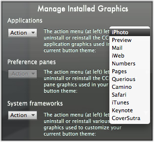
- Because it includes so many custom graphics, Crystal Black provides a set of tools that CCI does not: Tools for uninstalling and reinstalling graphics for Applications, Preference panes, and System frameworks. CCI 2.6 needed to add these functions to handle the tasks described in the previous item, but the code required to enable them in CCI turned out to be far more complicated than that for CB. The end result is a new tab in the CCI Preferences panel called "Manage Installed Graphics." The functions here need to know which applications, preference panes and system frameworks pertain to the current theme, and it provides a dynamic list showing users what items are affected by the "Reinstall" or "Uninstall" actions.
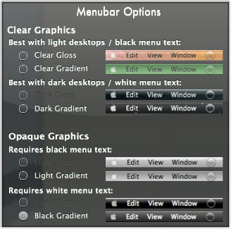 Providing menubar options in CrystalClear Interface — a much-requested enhancement — threatened to mushroom the number of a particular system graphics file unless I could restrict the options to some reasonable extent. In the past, each button theme came with one "SArtFile.bin" file. This file contains the menubar graphics, as well as graphics for drawers, apple icon, and numerous PDF files used for symbols throughout the OS — things like arrows, gears, disclosure triangles, magnifying symbols, and many more. If users could choose any menubar type with any button theme, each button theme would have to maintain eight "SArtFile.bin" files — one for each theme. In the interest of my sanity and code maintenance, I cut that number in half, so each theme can use only four menubar styles at a time. To access the other menubars, the user will have to switch button themes.
- In addition to managing the switching out of different menubars, this function also needs to coordinate with the system file, "Extras.rsrc," to make sure the text used with each menubar is readable. As previously described, each menubar has unique requirements, and since on Snow Leopard the "Extras" file also provides the system graphics for scrollbars and a few other interface widgets, the menubar function must swap out the appropriate "Extras" file not only for itself, but also for the current operating system. Needless to say, this ended up being a pretty complex function.
So, was it worth the effort? I've certainly been enjoying the flexibility of CrystalClear Interface 2.6, but ultimately you'll have to tell me once the software is released. ![]() Keep an on the MarsThemes or CCI websites for the latest news.
Keep an on the MarsThemes or CCI websites for the latest news.


