Articles In Category
EazyDraw: Powerful Drawing and Painting Tool
Telegraphics - Free plugins for Photoshop …and other software
CrystalClear Interface Update: Version 1.9.1
 This release fixes a problem with the uninstaller, and is otherwise the same as 1.9.0. (Note: Today’s update fixes the error in yesterday’s release, which inadvertently still had the 1.9.0 installer. Sorry about that!) The uninstaller now runs a new utility, GraphicsToggle, after running the installer/uninstaller, and this takes care of making sure the Leopard graphics are fully restored. See the documentation included with the download for more information about GraphicsToggle.
Ayluro’s Source Code Snippets
Crystal Clear 1.5 Preview:
Yes! The Term “Opaque Window” Is An Oxymoron
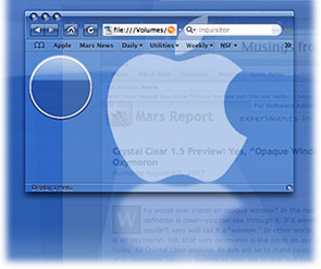
After all, who  would ever install an opaque window? In the real world, a window by definition is clear—you can see through it. If it weren’t clear, you couldn’t very well call it a “window.” In other words, an opaque window is an oxymoron. Yet, that very oxymoron is the norm on our computer desktops today. As Crystal Clear evolves, its aim is coming closer to making opaque windows as much of an oxymoron on your desktop as they are in that wall over there.
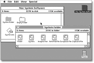
Computer desktops have slowly evolved since 1984, when the first Macintosh was introduced. With each operating system release, Apple has added more realism to the graphics that make up application windows, the desktop, and their various “widgets” and icons. Microsoft and other GUI-design-wannabes have followed along as closely as they could. Through this process, our software windows and icons have gained a little 3D through primitive shading, higher resolution displays, larger icons, better shadows, alpha transparency and compositing, smoother animation and transition effects, and so on. These changes have produced a dramatically more “realistic” look-and-feel today than we had in the beginning. Undoubtedly, this evolution  will continue, and desktops 10 years from now will make today’s look similarly primitive.
The Crystal Clear experiment is asking the graphical question, “How about using transparency to improve realism, while enhancing the beauty of our desktops at the same time?”
Up to now, the Crystal Clear theme for Mac OS X has brought clarity to your Aqua window toolbars, titlebars, and menubars. Crystal Albook icons clarified your system and application icons. And there has been much rejoicing.
However, a common question from early users of the theme was, “How about the window edges? How about the status bar? How about Safari’s bookmark and tab bars?” Unfortunately, none of the tools in a Mac OS X themer’s bag of tricks (chiefly, ThemePark ) can help affix transparent colors or graphics onto those bits of Aqua windows, so I had to throw my shoulders up in a major, sad shrug.
Fortunately, my little experiment in alpha transparency didn’t end there. The SetAlphaValue software that’s been a key part of Crystal Clear’s magic from the beginning has led me on a merry (well, mostly merry) romp through Objective-C and Cocoa Land, the world of geeky wonder that lies behind each object on your Mac OS X desktop. With much open-source Cocoa software code, two excellent books, and the rich universe of web Cocoa resources in hand, I’ve been slowly absorbing the syntax and grammar of Objective-C, the programming language of choice for Cocoa application development. As I got deeper into the “messaging” framework that’s a key part of Cocoa, I realized I could hack SetAlphaValue to do much more than just adjust window transparency.


