Articles In Category
Shortcuts Nirvana, Part 2
Shortcuts Nirvana: How I Accumulated 800 Shortcuts
Building Smart Automations With Apple Home, Siri Shortcuts
Over the past few months, I've had a blast building out my smart home, using Apple's Home app as the foundation. Who knew how much fun it would be making things happen in the house without having to move a finger? I'm still at the beginning stages, but I thought it would be useful to document what I've done and learned so far.
Automating your smart home and life makes use of two apps that come with your iPhone: Home and Shortcuts. (The links to each in the following text take you to Apple's User Guide for for each app, which I would recommend perusing if you get lost.)
Can You Fall In Love With A Watch Face?
I recently began exploring all the different faces that are now available for the Apple Watch. There are many cool options these days, but I happened upon one that I simply can't get enough of. It's the kaleidoscope face, which comes with a nice array of image options and several "facet" styles.
An Audiophile Listening Room with Apple’s HomePod
Apple's HomePod has been the underdog in the "smart speakers" category since its introduction last year. It's more expensive than the offerings from Google and Amazon, and Siri doesn't seem to be as powerful. I haven't used Alexa or the Google AI assistant, so I can't say what the difference may be. But let me just say that HomePod is a revelation in audio quality, and its "smart" features are more than adequate for my needs. The most surprising aspect of HomePod is that it has finally let me put together an audiophile listening room without taking out a second mortgage!
Trying To Tame Mountain Lion Without A Hat
 Remember my angst about whether I should migrate my computing life to Mountain Lion? Well, that story's now over, and Mountain Lion has won.
Still Thinking About It: Can You Mount A Lion Virtually?
One of the main reasons to upgrade is to take advantage of iCloud, which has become a more serious need now that Apple took MobileMe away from us. I can no longer sync my Safari bookmarks automagically, for example. However, I'm still pissed that Apple hasn't made a version of iCloud available for the many folks still on Snow Leopard.
Speaking of which, what exactly is the breakdown of Mac users in August 2012? It's only been a month since Mountain Lion was released, but clearly upgrading is happening pretty quickly. According to the stats from NetApplications.com, Lion users account for about 35% of the market, Snow Leopard users about 34%, and Mountain Lion users about 20%. There are still about 10% of users hanging on to Leopard. That Snow Leopard figure is pretty damn high considering how long Lion has been out, and is one that Apple should be paying more attention to.
Apple v. Samsung: The True Story
Searchlight: Spotlight for Your Network
On Theming Mac OS X: How Long Can I Hold On?
CrystalClear Interface and Crystal Black are marvelous, foolhardy, and frivolous experiments in theming the Mac OS X user interface. As they were in the beginning, so they remain today: Elegantly imperfect software products, which will always be buggy. It's just the nature of the experiment. Why? Because they try to do something Apple works hard to prevent, and therefore are outlaw apps: Only able to pop up here and there with a sparkling, think-different approach that just isn't meant to be.
I am the foremost user of these two themes, and I continue to develop them because (1) it's still possible and (2) I really like them. As the author, I'm tolerant of their occasional misbehavior, but I understand that not all observers are so patient. Nobody likes a screaming 3-year-old while enjoying a quiet evening at one's favorite restaurant. I'm no different in that, but I do try to make sure my children learn how to behave as new situations arise that cause them to flare up.
Still, there are always new situations, and, well, children will be children. My children are still quite young, but the day may come when either they are banned from new restaurants for their behavior, or I become too exhausted from apologizing for them to take them out in public any more.
With each release of its operating system, Apple drives me one step closer to that edge. It's not intentional, I'm sure... In the interest of providing a safe OS environment, Apple continues to tighten the knot around inter-application interactions — especially those that allow third-party software, like CrystalClear Interface (CCI), to load itself into other applications, such as the Finder or TextEdit. And yet, without that kind of interaction, CCI and Crystal Black (CB) could not function.
For now, it appears that CCI will survive the transition to Mountain Lion (Mac OS X 10.8), but as with every release of Mac OS X since Tiger (Mac OS X 10.4), the amount of effort to do so is greater. And I fear that as the technologies introduced by Apple for increased security in Lion and Mountain Lion are more widely adopted by software developers, the number of applications that won't run CCI properly will increase.
In some future update, Apple could introduce a change that will turn off the lights for CCI and CB for good, as well as those for AppMenu Magic and my freeware Text Tools. Such a change would mean I could no longer develop the software, let alone support it.
Too Tame To Tempt: Eleven Things That Keep Me From Upgrading to Lion (Mac OS X 10.7)

As anyone who reads any of my voluminous writing on the subject over the years can attest, I am a big admirer of Apple, Steve Jobs, and Mac OS X. This is one of the only negative articles about Mac OS X I've ever felt need to publish. (The only previous one I can think of was about Spaces, which is still a flawed implementation of virtual desktops.)
However, as much as I've tried to, I just don't like Mac OS X 10.7 ("Lion") — certainly not enough to upgrade to it from Snow Leopard. Unlike every previous update to Apple's Unix-based operating system, there's really nothing in Lion that's truly compelling or will make me more productive on my Mac, and lot that isn't and won't.
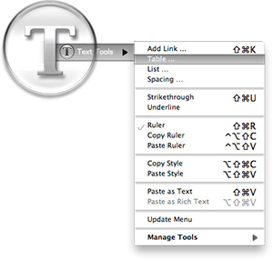
Text Tools for Mac OS X: Free At Last!

Some variation of these text tools have been included in CrystalClear Interface, as well as Crystal Black, since those applications were first released. However, the tools have nothing to do with the theming of buttons and windows, or with the general appearance of Mac OS X. I added them because they address a real need of mine, which no other software could do.
As a writer, I need ready access to a range of text functions, and I need them in whatever application in which I happen to be writing. In most of the rich text editors I use, those functions are available somewhere in the app’s menus, but typically they're in different places within each app. Some apps don’t include one or two key functions at all.
Mac OS X has a rich text framework that provides just the set of editing tools I require, and it would be extremely handy to be able to access those tools consistently across apps. This is precisely what the MarsThemes Text Tools do: Grant easy access to the key Cocoa text tools that writers and editors need but can’t find.
Crystal Black for iTunes
Last fall, I released an early version of Crystal Black for iTunes 10.1 on my deviantART site and have updated it once or twice since then. This post announces an update of the theme for iTunes 10.1.2 and adds a couple of minor enhancements for 10.1.1.
Crystal Black is a theme for Mac OS X "Snow Leopard" that I'm still refining and plan to release eventually. I published a preview of the theme last fall, and also migrated the theme to iTunes 10 when it came out. Since theming iTunes is  quite a bit easier than theming the entire operating system, I decided to release Crystal Black for iTunes first.
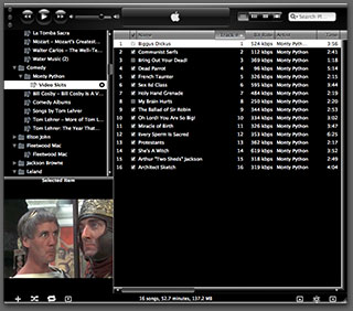
This version of Crystal Black for iTunes continues to improve its usability when iTunes is set with the hidden "High Contrast Mode" option. High Contrast Mode effectively inverts white and black in the iTunes sidebar and playlist contents (see screenshot at right), and looks great with Crystal Black. The high-contrast option is accessible through various utilities you can download to customize "hidden" features of Mac OS X. I use and recommend the free, open-source Secrets for such customizing. Secrets installs an easy-to-use and auto-updated Preference Pane and includes hidden options for a wide variety of third-party apps, in addition to Mac OS X.
One more application-specific Crystal Black theme I plan to release soon will be of interest primarily to web developers: It's a theme for Safari's Web Inspector module. Stay posted for more on that, and for more about Crystal Black as a whole.
Google Ditching Windows?
The Future for Home Computing
The Ultimate Solution To Window Clutter:
You Can Call Me SAM
I've observed that one of the most intractable problems bedeviling computer users, which makers of operating system software never seem to solve, is that of "Window Clutter." The inability to …
- Stay focused on the window you're working in, while
- Keep auxiliary windows handy and visible when needed,
- Avoid confusing any of these windows with those of other running applications, and
- Maintain some reasonable level of aesthetic quality to your computer desktop.
… is a nettle that keeps on pricking. At least, judging from continued user grumbling about it and the continued, less-than-satisfactory, though often valiant, solutions that user-interface experts keep offering users as the final salvation from this longstanding hindrance to productivity, I conclude that the nettle is alive and well.
That Window Clutter should still be a topic of conversation among engineers at Apple (I don't think Microsoft has any high-level staff who really care about or understand the issues surrounding interface usability, and Linux developers don't have the time to do so) is testament to their failure to stamp out a problem that appears from Mars to have a fairly simple solution, namely:
- Make it so that only one application's windows are visible at any one time.
Affectionately referred to as Single Application Mode, or SAM, this is the default desktop environment on Mars. It's also widespread on Earth, though its human adherents often practice SAM quietly or even in secret because it's not an official, supported Mac OS X desktop environment.
Still, we find SAM the best way of dealing with today's large monitors, huge RAM capacity, and equally huge software options—all of which spell Window Clutter at a scale never before experienced.
Government Going Apple?
Microsoft Exec Admits Windows 7 Emulates OS X
ComputerWorld Pits Snow Leopard Against Windows 7 (Again)
Analysis Shows Snow Leopard Faster Than Windows 7
WebKit Introduces Styleable Scrollbars
A Gift for Self-Deception
 For a long time now, I've been explaining why the world would have been better off if Apple's computers had come to dominate homes and businesses. I've focused on the virtues of Apple's software almost exclusively, even though Apple has for most of existence been primarily a hardware company, like Dell or Hewlett Packard. Why? Because it's clear to all us Martians that what makes or breaks a computing experience is the software. To paraphrase one of your ex-Presidents, "It's the Software, stupid!"
I've also come to believe that humans are genetically predisposed to self-deception, allowing them to talk themselves into whatever point of view is most convenient, or is perceived as being in their best self-interest. Thus, argument over the relative worth of one technology or another is pointless, because no carefully researched and supported set of facts will ever be enough to persuade someone with the opposite view. Indeed, the truth of this axiom is encapsulated in the common human phrase of folk wisdom,
"You can lead a horse to water, but you can't make him drink."
I've noted that when someone conjures this phrase to explain a colleague or acquaintance's intransigence about something, those listening will nod to each other knowingly and somewhat sadly aver, "So true."
And yet, how many humans really think they're as "stupid" as horses?
Compass: A New Concept for Managing CSS Styles
Another Windows Guru Falls For A Mac
Microsoft’s ‘Apple tax’ claims are ’stupid,’ counters analyst
Mac web share just shy of 10% in January
Apple a Monopolist? Only in Microsoft-Think
I recently read another positive article about Apple in Computerworld, this one covering Apple's 5 Biggest Moments in 2008. Unlike some other Apple coverage in Computerworld, this one was largely a yawn, but don't you know that most of the comments (as usual) were from Windows partisans who were simply angry that Apple was given any positive coverage at all!
Recently, that seems to be the standard for virtually any online article that has something nice to say about Apple. Rather than commenting on the substance of the article, some anti-Apple type will immediately start dissing the company in a totally ignorant and offensive manner. Sometimes, such drivel will be met with commenters defending Apple, but quite often it merely attracts other Apple hecklers.
The Computerworld article cited above was no different, but there was one comment from a guy who, though claiming to have some positive feelings about Apple, levels a charge that comes straight from the Microsoft propaganda machine. This propaganda only started a few years ago, when Apple began to have success with non-computer products like iTunes, the iPod, and now the iPhone. Microsoft loved to spread the word that Apple's products were all "closed," while Microsoft's were "open," and many listeners, without actually thinking about this illogical line of thinking, bought the propaganda and are now spreading it themselves.
I just couldn't let this challenge go unanswered, so I didn't. The following is what I published in response on Computerworld. In a nutshell, it explains why this guy's line of reasoning is bunk, and why, no matter how much Microsoft would like folks to think so, Apple is absolutely not a monopolist in any sense of the term.
Microsoft Still Spreading Apple FUD on Prices
New Zunes Killing Themselves In Droves
Computerworld: 68% of Businesses Say They’ll Add Macs in ‘09
iPhone Races Past Blackberry to No. 2 in SmartPhones
A Treasure Trove of iPhone eReader Software Part II:
13 Apps for Managing Documents

This second part of my report on the iPhone application marketplace covers the class of software that, while still falling squarely in the overall eReader category, is designed primarily for storing and managing documents. The primary distinctions between this class and the one covered in Part 1 are that the eReader apps discussed here:
- Handle a wide variety of common file formats found in the workplace, rather than just text and proprietary eBook formats,
- Don't include controls for customizing fonts,
- Don't let users do full-text search on documents,
- Have good embedded browsers and follow web links,
- More easily let users move files to and from their iPhones, and
- Typically let users organize and rename files and folders within their interface.
It still surprises me how rapidly this market is evolving, and that evolution makes keeping tabs on the capabilities of each application--and even on the entire set of applications--quite challenging. As I was finalizing this report, a new application in this class came to market that, it turns out, I've found to have among the very best features of any that came before. I have no doubt that many of the applications reviewed here will continue to be refined, rendering this snapshot fairly obsolete fairly quickly. But the observations here accurately reflect the current state of iPhone eReaders.
Discover a Treasure Trove of iPhone eReader Software
Part I: Eight Apps for Reading Books

The iPhone application marketplace now offers a tantalizing variety of tools that can be used as eBook readers and file managers. As I concluded in the September 2008 report, "Without Even Trying, Apple's iPhone Takes the eBook Reader Sweepstakes," the iPhone and iPod Touch hardware finally enables truly practical eBooks, and the software now available for the iPhone platform just clinches the deal.
Having worked with the growing number of these applications since the first started appearing in June, I've concluded that the market is clearly divided into two major objectives:
- Applications designed primarily for reading text (books), and
- Applications designed primarily for storing and managing documents.
As I compiled notes and usability data on this group of applications, it became clear that trying to cover all 19 different applications for the iPhone that can server as e-document readers in one article (a 20th was released just as I was finalizing this report) would be a bit much--for me as well as for readers. As a result, this will be the first of two installments of the overall report. (Note: All of these applications, with one exception, work equally well on both the iPhone and iPod Touch. For simplicity and brevity, I'll use "iPhone" to refer to both devices going forward.)
This first part covers the following iPhone applications, which are primarily aimed at reading text and HTML documents:
- Bookshelf
- Bookz
- Reader
- Evernote
- Instapaper
- iSilo
- ReaddleDocs
- Stanza
The second installment will cover applications that specialize in enabling document repositories on the iPhone: Air Sharing, Annotater, Caravan, DataCase, File Magnet, Files, Folders, iStorage, Mobile Finder, TextGuru, and TouchFS.
Microsoft IT Shops Upset At Apple’s “Patch Process”
Without Even Trying, Apple’s iPhone Takes the eBook Reader Sweepstakes
I recently decided it was time to look again at the state-of-the-art in eBook reader hardware. It seems like I've waited forever for a company to design one I could really use in place of the traditional paper-filled parallelepiped. I first got excited by the possibility while implementing the PDF format for a magazine on CD-ROM back in 1995. "Wow!," I thought, "Whoever wrestles PDF onto a small electronic device is going to make a mint!"
Of course, PDF turned out to be not particularly well suited to small viewing screens, since publishers would have to make a special layout for the PDF version. And so, years went by, with talk of E-Ink, electrowetting, electronic paper, and other exotic technologies appearing to be on the verge of practicality.
What most of the would-be designers of eBook readers have seemingly failed to grasp, however, is that to replace paper books, eBooks must be nearly as light and portable as a paperback. They must work without cords, and be compatible companions to one's daily trip to the little boy's room. (I've honestly never met a woman who reads in the john, but it seems nearly all men do.) They must be able to accompany you to the beach, the pool, or the mountains. I'd really like something I could read while holding it in one hand, like I do a paperback. I don't want a reader that will break the bank, either. And most of all, an eBook reader needs to be comfortable to use in bed or in your favorite armchair.
Even today, with devices shrinking towards the ideal size and weight, nearly all fail to meet my needs for one reason or another. Quite surprisingly, one device has in fact replaced books for me, and it's not one I ever thought would or could. Because I had bought the device for another purpose entirely, this eBook reader has actually cost me nothing whatsoever.
This article covers five eBook reader devices, including two that are full-fledged personal computers serving as an eBook reader by way of third-party software, and another that is a multifunction "smart phone" with eBook reader capabilities. All five devices have strongly positive characteristics, and two of of them possess the full range that would allow them to serve as portable eBook readers for organizations that need access to technical and policy documentation. Even though I personally need a reader that's useful for novels and such, I'm evaluating these based on their utility as devices for storing and reading technical and other documentation rather than literature, each of which have quite different requirements for eBook reading.


