Articles In Category
Shortcuts Nirvana, Part 2
Shortcuts Nirvana: How I Accumulated 800 Shortcuts
Building Smart Automations With Apple Home, Siri Shortcuts
Over the past few months, I've had a blast building out my smart home, using Apple's Home app as the foundation. Who knew how much fun it would be making things happen in the house without having to move a finger? I'm still at the beginning stages, but I thought it would be useful to document what I've done and learned so far.
Automating your smart home and life makes use of two apps that come with your iPhone: Home and Shortcuts. (The links to each in the following text take you to Apple's User Guide for for each app, which I would recommend perusing if you get lost.)
Can You Fall In Love With A Watch Face?
I recently began exploring all the different faces that are now available for the Apple Watch. There are many cool options these days, but I happened upon one that I simply can't get enough of. It's the kaleidoscope face, which comes with a nice array of image options and several "facet" styles.
An Audiophile Listening Room with Apple’s HomePod
Apple's HomePod has been the underdog in the "smart speakers" category since its introduction last year. It's more expensive than the offerings from Google and Amazon, and Siri doesn't seem to be as powerful. I haven't used Alexa or the Google AI assistant, so I can't say what the difference may be. But let me just say that HomePod is a revelation in audio quality, and its "smart" features are more than adequate for my needs. The most surprising aspect of HomePod is that it has finally let me put together an audiophile listening room without taking out a second mortgage!
Apple v. Samsung: The True Story
Introducing Smooth Black: A New Button Theme for CrystalClear Interface
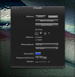 In my previous article I spoke of a desire to get back to theming, and specifically mentioned a desire to do that "black matte" theme I've been thinking about. I guess the article helped spur me on, because after several weeks of work I'm now ready to release Smooth Black, a new button theme for CrystalClear Interface (CCI).
On Theming Mac OS X: How Long Can I Hold On?
CrystalClear Interface and Crystal Black are marvelous, foolhardy, and frivolous experiments in theming the Mac OS X user interface. As they were in the beginning, so they remain today: Elegantly imperfect software products, which will always be buggy. It's just the nature of the experiment. Why? Because they try to do something Apple works hard to prevent, and therefore are outlaw apps: Only able to pop up here and there with a sparkling, think-different approach that just isn't meant to be.
I am the foremost user of these two themes, and I continue to develop them because (1) it's still possible and (2) I really like them. As the author, I'm tolerant of their occasional misbehavior, but I understand that not all observers are so patient. Nobody likes a screaming 3-year-old while enjoying a quiet evening at one's favorite restaurant. I'm no different in that, but I do try to make sure my children learn how to behave as new situations arise that cause them to flare up.
Still, there are always new situations, and, well, children will be children. My children are still quite young, but the day may come when either they are banned from new restaurants for their behavior, or I become too exhausted from apologizing for them to take them out in public any more.
With each release of its operating system, Apple drives me one step closer to that edge. It's not intentional, I'm sure... In the interest of providing a safe OS environment, Apple continues to tighten the knot around inter-application interactions — especially those that allow third-party software, like CrystalClear Interface (CCI), to load itself into other applications, such as the Finder or TextEdit. And yet, without that kind of interaction, CCI and Crystal Black (CB) could not function.
For now, it appears that CCI will survive the transition to Mountain Lion (Mac OS X 10.8), but as with every release of Mac OS X since Tiger (Mac OS X 10.4), the amount of effort to do so is greater. And I fear that as the technologies introduced by Apple for increased security in Lion and Mountain Lion are more widely adopted by software developers, the number of applications that won't run CCI properly will increase.
In some future update, Apple could introduce a change that will turn off the lights for CCI and CB for good, as well as those for AppMenu Magic and my freeware Text Tools. Such a change would mean I could no longer develop the software, let alone support it.
The big-talk, no-action Congress
The Bother of Biological Bodies

When I came to Earth, I of necessity adopted a human form — in order to be less conspicuous. Little did I know what a mess caring for the human body would be.
The worst part about the tasks required to keep the body from deteriorating too much is that they take so much time. All of these mostly unpleasant activities could — if I let them — gobble up 1-2 hours of my day. Unfortunately, what I've found is that putting off some of these tasks merely means spending more than 1-2 hours when the deterioration has become more annoying than the tasks themselves.
Mars Themes Website: New Home For Mars Downloads
A few weeks ago, I launched a new website — Mars Themes — as a central repository for all the various themes, app skins, applications, widgets, and so on that I've developed over the years.
These items — all available as free downloads, except for two — were previously in a section of the Mars website linked to the "Downloads" item in the navigation bar. That link now takes you to Mars Themes. (Oh yeah, the two not-free items are the software apps CrystalClear Interface and Crystal Black. They have their own websites, but are also linked to Mars Themes.)
The new site has all the content previously available here, plus a few more things. . .
“Just Say No To Flash”
Join The Campaign! Add A Banner To Your Website
 In the past few years, Adobe Flash has become more than an annoyance that some of us have kept in check by using "block Flash" plugins for our web browsers. More and more, entire web sites are being built with Flash, and they have no HTML alternative at all! This goes way beyond annoying, into the realm of crippling.
I had noticed the trend building for quite awhile, but it only really hit home when I realized that Google, of all companies, had redesigned its formerly accessible Analytics site to rely heavily on Flash for displaying content. This wouldn't be absolutely horrible except for the fact that Google provides no HTML alternative. I tried to needle the company through its Analytics forums, but only received assurance that yes, indeed, one must have the Flash plugin running to view the site.
Keep in mind that content like that on Google Analytics is not mere marketing information, like the sales pitch on the Analytics home page.
Those of us who are disturbed by the trend need to be a bit more vocal about our opinion. Hence, I'm starting a "Just Say No To Flash!" campaign, with its own web page, graphics for a banner, and the CSS and HTML code to deploy it on your own web pages.
I've mentioned this to some of my family and friends, and they often come back with: "So, Why should I say no to Flash?" I admit that as a power browser and a programmer geek type who, shall we say, makes more efficient use of the web, I'm more keenly aware of the ways that Flash is chipping away at the foundation of web content.
In the beginning, it seemed harmless: Flash was an alternative to animated GIFs, and an easy way to embed movies on web pages. But then advertisers wrapped their meaty mitts around it, and that's when Flash started to be annoying. However, one could block Flash in the browser, as part of a strategy of shutting out obnoxious advertising.
But publishing content via Flash is just wrong, for a number of reasons.
Introducing “Clear Crystal” System Icons for Mac OS X
I'm happy to present a complete, new set of icons for Mac OS X, specifically designed to complement the Crystal Black theme. These icons can be used to replace the default "system" icons for folders, devices, toolbar items, Finder sidebar items, and others. The screenshots below display the icons for each system type.
The Sociology of Tornadoes
- Paranoid?
- Envious?
- God-Fearing?
- Intolerant?
- Republican?

In recent days, I've been barraged by friends back on Mars inquiring about what psychological effects the spate of tornadoes in the South and Midwest United States must have on the humans there. Their interest got me to thinking, and I suddenly had an insight, which I'm sure has brightened the intellectual glow of many humans over time.
The insight encompasses the sociological effects of Hurricanes as well, since the two devastating natural phenomena share some common traits... the most obvious being those furiously spinning wind and clouds.
My Martian theory also explains why tornadoes and hurricanes affect humans in ways that volcanoes, tsunamies, and earthquakes do not.
For brevity in the following paragraphs, I'm using the term "Recurring Events of Mass Destruction" (REMD) to refer to tornadoes and hurricanes, and the term "Unpredictable Events of Mass Destruction" (UEMD) to refer to volanoes, tusanimies, and earthquakes.
Theming Snow Leopard:
How Hard Could It Be To Paint A Leopard Black?
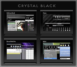
Dark interface themes are extremely popular with a small, but very passionate, group of Mac users. Sadly, since Apple introduced Leopard (Mac OS X 10.5), the old, relatively simple method of creating such themes on the Mac can't be used, and it took the theming community a good year and a half to figure out the current, relatively hobbled tools to theme the few bits of the interface that can be themed.
Given the weakened state of theming on the Mac, it's not surprising that the number of themes available has dwindled to a mere handful. And even those only go part of the way compared with what we used to be able to achieve with ShapeShifter. Still, the yearning for Mac themes remains strong among this community, and black themes are virtually nonexistent now.
Black themes have always been a challenge, because the frameworks used to build applications were designed to assume that text would always be black and the color of windows and buttons always light. Apple introduced a dark-theme paradigm a few years ago with its Heads-Up Display window style, which, with its translucent black background actually assumes that text will be white.
So, why would anyone undertake an effort to introduce a fully black theme for Snow Leopard?
I suppose it's because we Martians just can't step back from a challenge. Not to mention the fact that we, too, are afflicted with the passion for dark themes that many Earthlings suffer from. I also have a good starting point, having developed some useful techniques for the challenge through building CrystalClear Interface.
To acknowledge the theme's heritage, I've dubbed the theme Crystal Black.
Theming A Web Page With Crystal Black:
A CSS Design for Web Inspector
For awhile, I've wanted to theme Safari's Web Inspector—the incredibly useful built-in website viewer/debugger/designer assistant—with the Crystal Black look and feel, but it wasn't immediately obvious how to do this. I assumed that the tool was just a part of Safari, and therefore built with classes and widgets from the Cocoa AppKit (which is the framework all Cocoa apps are built with). However, when I began to inspect the Inspector, I discovered that everything contained within its borders was simply web content: HTML, CSS, JavaScript, and images.
In other words, the Web Inspector tool is nothing but an intricate, sophisticated, and extremely well designed web page!
Having built a Crystal Black CSS file for web pages in general, and with my past expertise in CSS, I attacked this challenge with relish! It reminded me of the time I realized that Dashboard widgets are, at their core, nothing but little web pages (as are simply apps for the iPhone). In tackling this one, the main question was, How should the various elements look? And the hardest part was inspecting the various parts in of the Inspector in great detail to determine which CSS rules governed their default appearance and behavior.
As I discovered, the WebKit has a a sub-framework called "WebCore," which in turn has a folder of resources specifically for the Web Inspector. In the Inspector folder, among other things, is a suite of CSS files that handle different aspects of the Inspector's design and behavior. Of these, the primary one I needed to tweak was called simply "inspector.css."
A Black Gloss Theme for CoverSutra
I recently posted another member of the coming Crystal Black theme for Snow Leopard on my deviantART site. This new component is a glossy black theme for the popular iTunes controller CoverSutra.
Crystal Black is a theme for Mac OS X "Snow Leopard" that I'm still refining and plan to release eventually. I published a preview of the theme last fall, and a few weeks ago released a Crystal Black theme for iTunes. The skins for both iTunes and CoverSutra will, of course, be included in the full theme once it's out.
Crystal Black for iTunes
Last fall, I released an early version of Crystal Black for iTunes 10.1 on my deviantART site and have updated it once or twice since then. This post announces an update of the theme for iTunes 10.1.2 and adds a couple of minor enhancements for 10.1.1.
Crystal Black is a theme for Mac OS X "Snow Leopard" that I'm still refining and plan to release eventually. I published a preview of the theme last fall, and also migrated the theme to iTunes 10 when it came out. Since theming iTunes is 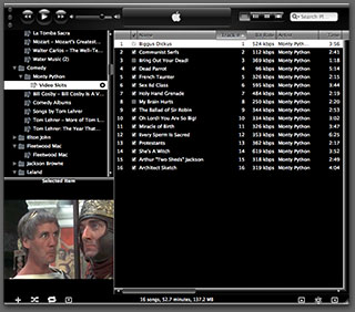 quite a bit easier than theming the entire operating system, I decided to release Crystal Black for iTunes first.
This version of Crystal Black for iTunes continues to improve its usability when iTunes is set with the hidden "High Contrast Mode" option. High Contrast Mode effectively inverts white and black in the iTunes sidebar and playlist contents (see screenshot at right), and looks great with Crystal Black. The high-contrast option is accessible through various utilities you can download to customize "hidden" features of Mac OS X. I use and recommend the free, open-source Secrets for such customizing. Secrets installs an easy-to-use and auto-updated Preference Pane and includes hidden options for a wide variety of third-party apps, in addition to Mac OS X.
One more application-specific Crystal Black theme I plan to release soon will be of interest primarily to web developers: It's a theme for Safari's Web Inspector module. Stay posted for more on that, and for more about Crystal Black as a whole.
The “Bloated” Federal Bureaucracy:
A Lie That’s Either Malicious Ignorance Or Deliberate Malice

One of the truly bewildering traits of human beings is their ability—and even carefree willingness—to ignore facts that conflict with their current worldview. I touched on this topic in an earlier article, and find it manifested in numerous ways in this most viciously anti-rational political climate.
This article picks one of these non-facts as a particularly good example: Has the U.S. Federal Government workforce grown too large, or not?
The "Tea Party" politicians, in particular, appear to be masters at the art of selling people willful ignorance, perhaps partly because they themselves drink from that cup religiously. Among the false ideas they consider common knowledge is the idea that the Federal workforce needs to be cut—presumably because it, like the Government as a whole, has grown too big. While they're at it, they'd also like to make sure Federal employees don't have a benefits package better than members of their own congregation do.
Recently, a Republican from Texas, Rep. Kevin Brady, submitted a legislative proposal to cut the Federal workforce by 10 percent. According to a Washington Post article, Brady's reasoning goes like this:
There's not a business in America that's survived this recession without right-sizing its workforce, without having to become more productive with fewer workers. The federal government can't be the exception. We're going to have to find a way to serve our constituents and our taxpayers better and quicker and more accurately with fewer workers. I'm convinced we can do it and we don't have a choice.
Including its overall premise, Brady's short statement includes several fallacies, and on Mars we find it alarming to realize that this guy is chairman of the Joint Economic Committee and a senior member of the House Ways and Means Committee. Where I come from, those are pretty big britches! When someone with authority over such enormously important Government functions gets his facts wrong, one has to wonder whether he is deliberately lying for political reasons, or whether he's maliciously failing to determine the facts—instead shaping them to fit his policy goals.
Joint Economic Committee
The Joint Economic Committee is one of four standing joint committees of the U.S. Congress. The committee was established as a part of the Employment Act of 1946, which deemed the committee responsible for reporting the current economic condition of the United States and for making suggestions for improvement to the economy.
On Mars, such behavior is almost unheard of. When I first revealed it, my fellow Martians had trouble believing that sentient beings could behave this way. And even if someone were to deliberately distort reality, surely Earth's legal systems would be constructed to punish the act.
Apparently, however, this behavior is not only tolerated, it's rewarded by the mere awareness that it's tolerated. After all, if a lie—or deliberate ignorance—by someone in authority isn't challenged, it clearly achieves its purpose. And achieving one's purpose obviously counts as a success. (On Mars, we believe that this is one of the perverse lessons Americans learned from President Richard Nixon's downfall: If you're going to lie, cheat, embezzle, or otherwise commit illegal acts, be sure you aren't caught doing so.)
Big Man in a Tiny Bubble Pops In To D.C.

He arrived from the tiny town of Butler, Pennsylviania, as part of the new freshman class of Angry Republican Congressmen. After all the feting and touring that greeted him in Washington, Mike Kelly was asked who had impressed him the most.
"Nobody," he said.
To be impressed by "nobody" must mean this guy is hugely impressed with himself, one would surmise. Well, yes and no:
"I hope I don't sound arrogant about this, but at 62 years old, I've pretty much seen what I need to see.”
Today's article in the Washington Post doesn't explore what exactly Mr. Kelly has seen in his 62 years, but from his attitude and statements, I would venture to guess it isn't much.
You see, Mike Kelly came to Washington because he is angry that the Federal Government "intruded" on the running of his General Motors car dealership, where he'd spent 56 years of creative energy. (I guess that means he'd been working on the business since he was 6. Just kidding.)
And exactly how had it intruded? Why, it was making him sell Chevrolets instead of Cadillacs.
And exactly why was it ruining his business this way? Well, you see, Obama had (personally) taken over General Motors and was (personally) requiring dealerships to restructure as part of an effort to save the company.
"This is America. You can't come in and take my business away from me. . . . Every penny we have is wrapped up in here. I've got 110 people that rely on me every two weeks to be paid. . . . And you call me up and in five minutes try to wipe out 56 years of a business?”
This is a reasonable attitude if you believe that tiny, parochial self-interest should be the motivator of those elected to run a National Government. However, tiny attitudes from Big Men In Their Local Communities have no place in Congress. Indeed, those with tiny, uninformed beliefs who fail to see the big picture are precisely the ones inclined to take actions that will fail the interest of the public they're elected to serve.
Senate Exposes Gaping Hole in Conflict-of-Interest Law
To Act in My Own Interest, Or Not?
How Humans Deal With Conflicts of Interest (Part 1)
For several years now, I've been troubled by how humans define the concept of "conflict of interest." My concern has grown as I've realized the importance humans seem to place on avoiding "it", or, at times, even the "appearance of it." The more thought I've given to the topic, the more confused I've become. My confusion stems from the observation that whether or not someone has a conflict of interest seems to depend on who is asking the question, what the context is, and whether or not the answer is in that person's own interest or not.
Even more confusing is the paradox whereby humans believe that allowing a conflict of interest can be wrong in case A but right in case B. Again, the paradox may only be resolved if one assumes that the perspective of the believer is what determines the judgment of right or wrong.
Let me be a little more specific.
In most situations where humans raise the spectre that someone may have a "conflict of interest," the implicit notion is that having such a conflict is bad and should be avoided. Examples here are cases where a judge may issue a ruling that is in his own interest but not necessarily that of the conflicting parties. Or where a public official makes spending decisions that stand to benefit himself—or his friends, family, supporters, etc.—but not necessarily those who are supposed to benefit from the spending.
Most people I've talked to seem to think that this notion is obvious—that weighing such conflicts of interest in one's favor is wrong and should be avoided. As will become plain later in this essay, I certainly do not disagree with this notion.
On the other hand, either consciously or unconsciously, most humans in modern, West-European-modeled societies entertain notions of conflict of interest that, to my Martian mind, seem antithetical to the the one they espouse publicly. In this less-than-conscious notion, acting in one's own interest is something that society, instead of outlawing, should actually encourage, since acting in one's own interest is a natural human tendency that can't be legislated away. Not only that, but acting in one's own interest is viewed as ultimately the same as acting in everyone's interest.
This essay is the first of a series that will explore some specific cases where Western societies legislate to prevent "conflict of interest," and perhaps more interestingly, where they do not. The cases will be examined in the light of the way self-interest is perceived by individual humans, as well as by humans grouped into various, possibly overlapping, personal and business relationships.
Crystal Black Preview: A New Attempt To Put a Dark Skin on Snow Leopard
Like many themers for Mac OS X 10.3 ("Panther"), I was awed by the beta releases of a theme called "Cathode" back in 2004. An artist named Dragun took the theme through a few iterations and then abruptly halted development.
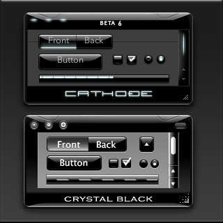 Those of us who used ShapeShifter to run Cathode on our Macs understood why. Although Cathode was beautiful, in practice it was impractical. There were too many elements of too many applications that resisted a dark theme for buttons and window backgrounds.
For me, however—and I'm sure for many theming fans—the dream of using a beautiful black theme like Cathode was a siren call impossible to forget. Over the years, the dream receded further from our grasp because of roadblocks Apple erected—intentionally or not—to the existing mechanisms of theming Mac OS X.
Starting with Mac OS X 10.5 ("Leopard") in 2007, the main tool for applying Mac themes, ShapeShifter, went bye-bye and has never returned. This is one of the main reasons I continued development of CrystalClear Interface, because it was the only way for me to apply a fully realized theme to Mac OS X.
Since Leopard, themers have been able to finesse the problem by changing the system graphics files that apply buttons, menubar background, basic window shape and color, and a few other items to your window appearance. Despite best efforts to unravel the secrets of the Mac's new ways of drawing itself, this mechanism isn't able to consistently change text color in the many contexts in which it appears in a window, thus making design and use of dark theme impractical.
As I'll describe in a future article, tackling the design of Crystal Black, a new theme inspired by Cathode, has been far from easy. And there remain user interface elements that totally resist its charms. But for me, those elements are few enough to make Crystal Black practical.
At this point, I'm confident that I'll be able to complete Crystal Black and release it at some point for all Mac users of Snow Leopard (Mac OS X 10.6). The theme is an offshoot of CrystalClear Interface (CCI) and uses much of the same code. However, Crystal Black is much simpler, has a smaller impact on the operating system, and is compatible with many more applications than CCI. Also unlike CCI, Crystal Black provides a complete theme for iTunes 10.
White House Freezes IT Projects To Revisit Wasteful IT Contracting
Google Ditching Windows?
The Future for Home Computing
Government Going Apple?
Eight New Themes Coming in CrystalClear Interface 2.5
Besides the set of Crystal Document icons previewed recently, another feature of the forthcoming CrystalClear Interface 2.5 is a new set of eight beautiful preset themes, shown below. (Click the images for a closer look.) The themes are designed to complement the eight Frosted Crystals desktop pictures released with CCI 2.2. Of course, you can still set colors, frames, and transparency settings for Mac OS X windows to your own taste, as always. The preset themes are ones I've enjoyed and find a convenient shortcut to designing custom themes.
Introducing Crystal Documents:
A Set of Document Icons for CrystalClear Interface
This is a set of 74 document icons intended to complement CrystalClear Interface and the set of Crystal Albook system and application icons I released a couple of years ago. The set covers most of the document types used by Apple's applications as well as a limited set of document types for third-party applications. The icon set for third-party apps will be augmented substantially as time permits.
These icons are available for download now, and they will be included in the forthcoming release of CrystalClear Interface 2.5 (more on that in another article). In CCI 2.5, you will be able to automatically install and uninstall the various icon sets displayed below, including any of the Crystal Docs icons for any of the third-party applications you use. The new icon install feature will be included in the new CCI Preferences window.
Enjoy!
Introducing Frosted Crystals for CrystalClear Interface
These are snippets of the 9 "Frosted Crystal" desktop pictures that'll be distributed with CrystalClear Interface 2.2. The look of frosted glass looks terrific when viewed through CrystalClear windows! I hope you enjoy using them as much as I have.
A Gift for Self-Deception
 For a long time now, I've been explaining why the world would have been better off if Apple's computers had come to dominate homes and businesses. I've focused on the virtues of Apple's software almost exclusively, even though Apple has for most of existence been primarily a hardware company, like Dell or Hewlett Packard. Why? Because it's clear to all us Martians that what makes or breaks a computing experience is the software. To paraphrase one of your ex-Presidents, "It's the Software, stupid!"
I've also come to believe that humans are genetically predisposed to self-deception, allowing them to talk themselves into whatever point of view is most convenient, or is perceived as being in their best self-interest. Thus, argument over the relative worth of one technology or another is pointless, because no carefully researched and supported set of facts will ever be enough to persuade someone with the opposite view. Indeed, the truth of this axiom is encapsulated in the common human phrase of folk wisdom,
"You can lead a horse to water, but you can't make him drink."
I've noted that when someone conjures this phrase to explain a colleague or acquaintance's intransigence about something, those listening will nod to each other knowingly and somewhat sadly aver, "So true."
And yet, how many humans really think they're as "stupid" as horses?
Compass: A New Concept for Managing CSS Styles
Taking a Snapshot of the Semantic Web:
Mighty Big, But Still Kinda Blurry
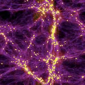
It's still somewhat difficult to get a handle on exactly what is meant by the "Semantic Web," and whether today's technologies are truly able to realize the vision of Tim Berners-Lee, who first articulated it back in 1999. From what I've read, I think there's general agreement that we aren't even close to being "there" yet, but that many of the ongoing Semantic Web activities, technologies, development platforms, and new applications are a big leap beyond the unstructured web that still dominates today.
There is a huge, seemingly endless amount of work being done by thousands of groups all trying to contribute to making the Semantic Web a reality. In my few weeks of research, I still feel as though I've just stepped my toe into that vast lake of semantic experimentation. Partly as a result of the many disparate projects, however, it does become rather difficult to see the entire forest for all the tiny trees. That said, these thousands of groups do appear to be working more or less together on the basis of consensus-based open standards, and they have set up mechanisms to keep everyone abreast of new ideas, solutions, and projects, under the general leadership of the World Wide Web Consortium (W3C)'s Semantic Web Activity.
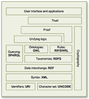
As a starting point for exploration into this topic, the Wikipedia article that describes the Semantic Web Stack is quite good. Among its good overview and many useful links, the article includes the original conception of the Stack as designed by Berners-Lee.
Besides cataloguing the sheer number of different projects all tackling different aspects of building a Semantic Web, it's important to distinguish ongoing projects from those that expired years ago—a distinction that's not always readily apparent to those peering in from the outside. Even excluding these, there are far too many projects to read up on in a few weeks, so this snapshot is necessarily incomplete. But after having the content reviewed by some Semantic Web experts, I'm confident it includes all the most significant threads of this new web, which, as Berners-Lee envisioned it:
I have a dream for the Web [in which computers] become capable of analyzing all the data on the Web – the content, links, and transactions between people and computers. A ‘Semantic Web’, which should make this possible, has yet to emerge, but when it does, the day-to-day mechanisms of trade, bureaucracy and our daily lives will be handled by machines talking to machines. The ‘intelligent agents’ people have touted for ages will finally materialize.
In my tour of the Semantic Web as it exists today, it's interesting to note that most of the projects are geared not toward machine-to-machine interaction, but rather to the traditional human-to-machine. Humans being by nature anthropocentric, the first steps being taken toward Berners-Lee's vision are to build systems that are semantically neutral with respect to human-to-human communication. Once we can reliably discuss topics without drifting off into semantic misunderstandings, then perhaps we can start teaching machines "what we mean by" ...
This paper is an attempt to assess the current state of today's steps, while compiling a list of resources that would prove useful to someone thinking about building a Semantic Web application in 2009.
A Treasure Trove of iPhone eReader Software Part II:
13 Apps for Managing Documents

This second part of my report on the iPhone application marketplace covers the class of software that, while still falling squarely in the overall eReader category, is designed primarily for storing and managing documents. The primary distinctions between this class and the one covered in Part 1 are that the eReader apps discussed here:
- Handle a wide variety of common file formats found in the workplace, rather than just text and proprietary eBook formats,
- Don't include controls for customizing fonts,
- Don't let users do full-text search on documents,
- Have good embedded browsers and follow web links,
- More easily let users move files to and from their iPhones, and
- Typically let users organize and rename files and folders within their interface.
It still surprises me how rapidly this market is evolving, and that evolution makes keeping tabs on the capabilities of each application--and even on the entire set of applications--quite challenging. As I was finalizing this report, a new application in this class came to market that, it turns out, I've found to have among the very best features of any that came before. I have no doubt that many of the applications reviewed here will continue to be refined, rendering this snapshot fairly obsolete fairly quickly. But the observations here accurately reflect the current state of iPhone eReaders.
Discover a Treasure Trove of iPhone eReader Software
Part I: Eight Apps for Reading Books

The iPhone application marketplace now offers a tantalizing variety of tools that can be used as eBook readers and file managers. As I concluded in the September 2008 report, "Without Even Trying, Apple's iPhone Takes the eBook Reader Sweepstakes," the iPhone and iPod Touch hardware finally enables truly practical eBooks, and the software now available for the iPhone platform just clinches the deal.
Having worked with the growing number of these applications since the first started appearing in June, I've concluded that the market is clearly divided into two major objectives:
- Applications designed primarily for reading text (books), and
- Applications designed primarily for storing and managing documents.
As I compiled notes and usability data on this group of applications, it became clear that trying to cover all 19 different applications for the iPhone that can server as e-document readers in one article (a 20th was released just as I was finalizing this report) would be a bit much--for me as well as for readers. As a result, this will be the first of two installments of the overall report. (Note: All of these applications, with one exception, work equally well on both the iPhone and iPod Touch. For simplicity and brevity, I'll use "iPhone" to refer to both devices going forward.)
This first part covers the following iPhone applications, which are primarily aimed at reading text and HTML documents:
- Bookshelf
- Bookz
- Reader
- Evernote
- Instapaper
- iSilo
- ReaddleDocs
- Stanza
The second installment will cover applications that specialize in enabling document repositories on the iPhone: Air Sharing, Annotater, Caravan, DataCase, File Magnet, Files, Folders, iStorage, Mobile Finder, TextGuru, and TouchFS.
Amar Sagoo: Software Design for Usability
Recognizing Self-Evident Truths
Extending these to more difficult lines of inquiry, it's clear that changes in earth's atmosphere are causing global temperatures to rise, for the Arctic ice cap to melt, for glaciers around the world to disappear, and for the incidence of hurricanes and droughts to increase. These are facts, and nearly all scientists today agree that the inference from these facts is that Global Warming is a fact. It is the truth, even if it's extremely inconvenient.


