Articles In Category
Can You Fall In Love With A Watch Face?
I recently began exploring all the different faces that are now available for the Apple Watch. There are many cool options these days, but I happened upon one that I simply can't get enough of. It's the kaleidoscope face, which comes with a nice array of image options and several "facet" styles.
Introducing Smooth Black: A New Button Theme for CrystalClear Interface
 In my previous article I spoke of a desire to get back to theming, and specifically mentioned a desire to do that "black matte" theme I've been thinking about. I guess the article helped spur me on, because after several weeks of work I'm now ready to release Smooth Black, a new button theme for CrystalClear Interface (CCI).
On Theming Mac OS X: How Long Can I Hold On?
CrystalClear Interface and Crystal Black are marvelous, foolhardy, and frivolous experiments in theming the Mac OS X user interface. As they were in the beginning, so they remain today: Elegantly imperfect software products, which will always be buggy. It's just the nature of the experiment. Why? Because they try to do something Apple works hard to prevent, and therefore are outlaw apps: Only able to pop up here and there with a sparkling, think-different approach that just isn't meant to be.
I am the foremost user of these two themes, and I continue to develop them because (1) it's still possible and (2) I really like them. As the author, I'm tolerant of their occasional misbehavior, but I understand that not all observers are so patient. Nobody likes a screaming 3-year-old while enjoying a quiet evening at one's favorite restaurant. I'm no different in that, but I do try to make sure my children learn how to behave as new situations arise that cause them to flare up.
Still, there are always new situations, and, well, children will be children. My children are still quite young, but the day may come when either they are banned from new restaurants for their behavior, or I become too exhausted from apologizing for them to take them out in public any more.
With each release of its operating system, Apple drives me one step closer to that edge. It's not intentional, I'm sure... In the interest of providing a safe OS environment, Apple continues to tighten the knot around inter-application interactions — especially those that allow third-party software, like CrystalClear Interface (CCI), to load itself into other applications, such as the Finder or TextEdit. And yet, without that kind of interaction, CCI and Crystal Black (CB) could not function.
For now, it appears that CCI will survive the transition to Mountain Lion (Mac OS X 10.8), but as with every release of Mac OS X since Tiger (Mac OS X 10.4), the amount of effort to do so is greater. And I fear that as the technologies introduced by Apple for increased security in Lion and Mountain Lion are more widely adopted by software developers, the number of applications that won't run CCI properly will increase.
In some future update, Apple could introduce a change that will turn off the lights for CCI and CB for good, as well as those for AppMenu Magic and my freeware Text Tools. Such a change would mean I could no longer develop the software, let alone support it.
Mars Themes Website: New Home For Mars Downloads
A few weeks ago, I launched a new website — Mars Themes — as a central repository for all the various themes, app skins, applications, widgets, and so on that I've developed over the years.
These items — all available as free downloads, except for two — were previously in a section of the Mars website linked to the "Downloads" item in the navigation bar. That link now takes you to Mars Themes. (Oh yeah, the two not-free items are the software apps CrystalClear Interface and Crystal Black. They have their own websites, but are also linked to Mars Themes.)
The new site has all the content previously available here, plus a few more things. . .
Introducing “Clear Crystal” System Icons for Mac OS X
I'm happy to present a complete, new set of icons for Mac OS X, specifically designed to complement the Crystal Black theme. These icons can be used to replace the default "system" icons for folders, devices, toolbar items, Finder sidebar items, and others. The screenshots below display the icons for each system type.
Theming Snow Leopard:
How Hard Could It Be To Paint A Leopard Black?

Dark interface themes are extremely popular with a small, but very passionate, group of Mac users. Sadly, since Apple introduced Leopard (Mac OS X 10.5), the old, relatively simple method of creating such themes on the Mac can't be used, and it took the theming community a good year and a half to figure out the current, relatively hobbled tools to theme the few bits of the interface that can be themed.
Given the weakened state of theming on the Mac, it's not surprising that the number of themes available has dwindled to a mere handful. And even those only go part of the way compared with what we used to be able to achieve with ShapeShifter. Still, the yearning for Mac themes remains strong among this community, and black themes are virtually nonexistent now.
Black themes have always been a challenge, because the frameworks used to build applications were designed to assume that text would always be black and the color of windows and buttons always light. Apple introduced a dark-theme paradigm a few years ago with its Heads-Up Display window style, which, with its translucent black background actually assumes that text will be white.
So, why would anyone undertake an effort to introduce a fully black theme for Snow Leopard?
I suppose it's because we Martians just can't step back from a challenge. Not to mention the fact that we, too, are afflicted with the passion for dark themes that many Earthlings suffer from. I also have a good starting point, having developed some useful techniques for the challenge through building CrystalClear Interface.
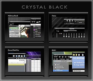
To acknowledge the theme's heritage, I've dubbed the theme Crystal Black.
Theming A Web Page With Crystal Black:
A CSS Design for Web Inspector
For awhile, I've wanted to theme Safari's Web Inspector—the incredibly useful built-in website viewer/debugger/designer assistant—with the Crystal Black look and feel, but it wasn't immediately obvious how to do this. I assumed that the tool was just a part of Safari, and therefore built with classes and widgets from the Cocoa AppKit (which is the framework all Cocoa apps are built with). However, when I began to inspect the Inspector, I discovered that everything contained within its borders was simply web content: HTML, CSS, JavaScript, and images.
In other words, the Web Inspector tool is nothing but an intricate, sophisticated, and extremely well designed web page!
Having built a Crystal Black CSS file for web pages in general, and with my past expertise in CSS, I attacked this challenge with relish! It reminded me of the time I realized that Dashboard widgets are, at their core, nothing but little web pages (as are simply apps for the iPhone). In tackling this one, the main question was, How should the various elements look? And the hardest part was inspecting the various parts in of the Inspector in great detail to determine which CSS rules governed their default appearance and behavior.
As I discovered, the WebKit has a a sub-framework called "WebCore," which in turn has a folder of resources specifically for the Web Inspector. In the Inspector folder, among other things, is a suite of CSS files that handle different aspects of the Inspector's design and behavior. Of these, the primary one I needed to tweak was called simply "inspector.css."
A Black Gloss Theme for CoverSutra
I recently posted another member of the coming Crystal Black theme for Snow Leopard on my deviantART site. This new component is a glossy black theme for the popular iTunes controller CoverSutra.
Crystal Black is a theme for Mac OS X "Snow Leopard" that I'm still refining and plan to release eventually. I published a preview of the theme last fall, and a few weeks ago released a Crystal Black theme for iTunes. The skins for both iTunes and CoverSutra will, of course, be included in the full theme once it's out.
Crystal Black for iTunes
Last fall, I released an early version of Crystal Black for iTunes 10.1 on my deviantART site and have updated it once or twice since then. This post announces an update of the theme for iTunes 10.1.2 and adds a couple of minor enhancements for 10.1.1.
Crystal Black is a theme for Mac OS X "Snow Leopard" that I'm still refining and plan to release eventually. I published a preview of the theme last fall, and also migrated the theme to iTunes 10 when it came out. Since theming iTunes is  quite a bit easier than theming the entire operating system, I decided to release Crystal Black for iTunes first.
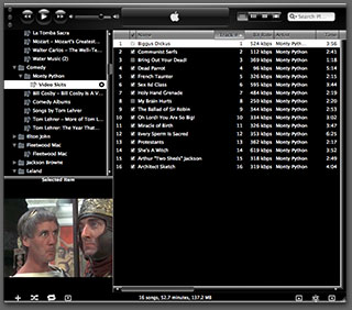
This version of Crystal Black for iTunes continues to improve its usability when iTunes is set with the hidden "High Contrast Mode" option. High Contrast Mode effectively inverts white and black in the iTunes sidebar and playlist contents (see screenshot at right), and looks great with Crystal Black. The high-contrast option is accessible through various utilities you can download to customize "hidden" features of Mac OS X. I use and recommend the free, open-source Secrets for such customizing. Secrets installs an easy-to-use and auto-updated Preference Pane and includes hidden options for a wide variety of third-party apps, in addition to Mac OS X.
One more application-specific Crystal Black theme I plan to release soon will be of interest primarily to web developers: It's a theme for Safari's Web Inspector module. Stay posted for more on that, and for more about Crystal Black as a whole.
Crystal Black Preview: A New Attempt To Put a Dark Skin on Snow Leopard
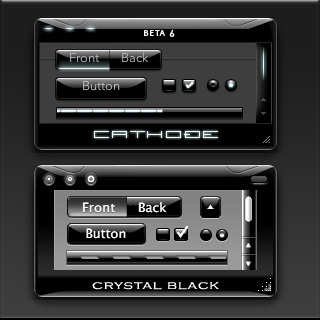
Like many themers for Mac OS X 10.3 ("Panther"), I was awed by the beta releases of a theme called "Cathode" back in 2004. An artist named Dragun took the theme through a few iterations and then abruptly halted development.
 Those of us who used ShapeShifter to run Cathode on our Macs understood why. Although Cathode was beautiful, in practice it was impractical. There were too many elements of too many applications that resisted a dark theme for buttons and window backgrounds.
For me, however—and I'm sure for many theming fans—the dream of using a beautiful black theme like Cathode was a siren call impossible to forget. Over the years, the dream receded further from our grasp because of roadblocks Apple erected—intentionally or not—to the existing mechanisms of theming Mac OS X.
Starting with Mac OS X 10.5 ("Leopard") in 2007, the main tool for applying Mac themes, ShapeShifter, went bye-bye and has never returned. This is one of the main reasons I continued development of CrystalClear Interface, because it was the only way for me to apply a fully realized theme to Mac OS X.
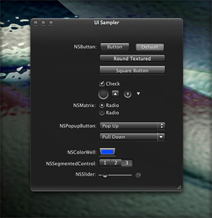
Since Leopard, themers have been able to finesse the problem by changing the system graphics files that apply buttons, menubar background, basic window shape and color, and a few other items to your window appearance. Despite best efforts to unravel the secrets of the Mac's new ways of drawing itself, this mechanism isn't able to consistently change text color in the many contexts in which it appears in a window, thus making design and use of dark theme impractical.
As I'll describe in a future article, tackling the design of Crystal Black, a new theme inspired by Cathode, has been far from easy. And there remain user interface elements that totally resist its charms. But for me, those elements are few enough to make Crystal Black practical.
At this point, I'm confident that I'll be able to complete Crystal Black and release it at some point for all Mac users of Snow Leopard (Mac OS X 10.6). The theme is an offshoot of CrystalClear Interface (CCI) and uses much of the same code. However, Crystal Black is much simpler, has a smaller impact on the operating system, and is compatible with many more applications than CCI. Also unlike CCI, Crystal Black provides a complete theme for iTunes 10.
Eight New Themes Coming in CrystalClear Interface 2.5
Besides the set of Crystal Document icons previewed recently, another feature of the forthcoming CrystalClear Interface 2.5 is a new set of eight beautiful preset themes, shown below. (Click the images for a closer look.) The themes are designed to complement the eight Frosted Crystals desktop pictures released with CCI 2.2. Of course, you can still set colors, frames, and transparency settings for Mac OS X windows to your own taste, as always. The preset themes are ones I've enjoyed and find a convenient shortcut to designing custom themes.
Introducing Crystal Documents:
A Set of Document Icons for CrystalClear Interface
This is a set of 74 document icons intended to complement CrystalClear Interface and the set of Crystal Albook system and application icons I released a couple of years ago. The set covers most of the document types used by Apple's applications as well as a limited set of document types for third-party applications. The icon set for third-party apps will be augmented substantially as time permits.
These icons are available for download now, and they will be included in the forthcoming release of CrystalClear Interface 2.5 (more on that in another article). In CCI 2.5, you will be able to automatically install and uninstall the various icon sets displayed below, including any of the Crystal Docs icons for any of the third-party applications you use. The new icon install feature will be included in the new CCI Preferences window.
Enjoy!
Introducing Frosted Crystals for CrystalClear Interface
These are snippets of the 9 "Frosted Crystal" desktop pictures that'll be distributed with CrystalClear Interface 2.2. The look of frosted glass looks terrific when viewed through CrystalClear windows! I hope you enjoy using them as much as I have.


