Articles In Category
Mars Themes and OS X Mavericks
Introducing Smooth Black: A New Button Theme for CrystalClear Interface
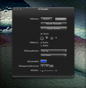 In my previous article I spoke of a desire to get back to theming, and specifically mentioned a desire to do that "black matte" theme I've been thinking about. I guess the article helped spur me on, because after several weeks of work I'm now ready to release Smooth Black, a new button theme for CrystalClear Interface (CCI).
On Theming Mac OS X: How Long Can I Hold On?
CrystalClear Interface and Crystal Black are marvelous, foolhardy, and frivolous experiments in theming the Mac OS X user interface. As they were in the beginning, so they remain today: Elegantly imperfect software products, which will always be buggy. It's just the nature of the experiment. Why? Because they try to do something Apple works hard to prevent, and therefore are outlaw apps: Only able to pop up here and there with a sparkling, think-different approach that just isn't meant to be.
I am the foremost user of these two themes, and I continue to develop them because (1) it's still possible and (2) I really like them. As the author, I'm tolerant of their occasional misbehavior, but I understand that not all observers are so patient. Nobody likes a screaming 3-year-old while enjoying a quiet evening at one's favorite restaurant. I'm no different in that, but I do try to make sure my children learn how to behave as new situations arise that cause them to flare up.
Still, there are always new situations, and, well, children will be children. My children are still quite young, but the day may come when either they are banned from new restaurants for their behavior, or I become too exhausted from apologizing for them to take them out in public any more.
With each release of its operating system, Apple drives me one step closer to that edge. It's not intentional, I'm sure... In the interest of providing a safe OS environment, Apple continues to tighten the knot around inter-application interactions — especially those that allow third-party software, like CrystalClear Interface (CCI), to load itself into other applications, such as the Finder or TextEdit. And yet, without that kind of interaction, CCI and Crystal Black (CB) could not function.
For now, it appears that CCI will survive the transition to Mountain Lion (Mac OS X 10.8), but as with every release of Mac OS X since Tiger (Mac OS X 10.4), the amount of effort to do so is greater. And I fear that as the technologies introduced by Apple for increased security in Lion and Mountain Lion are more widely adopted by software developers, the number of applications that won't run CCI properly will increase.
In some future update, Apple could introduce a change that will turn off the lights for CCI and CB for good, as well as those for AppMenu Magic and my freeware Text Tools. Such a change would mean I could no longer develop the software, let alone support it.
Dress Up Your Mac’s Authentication Panel With Crystal NIBs!
 This little application provides two alterna-tive styles for the “Authenticate” panel that appears when-ever you’re required to enter a password on your Mac. It works by substituting differ-ent “NIB” files — the files that define the window’s interface — for the default system versions. (Jargon Alert: NIB stands for “NeXT InterfaceBuilder,” which was the original IB app developed on the NeXT operating system — the predecessor of Mac OS X.)
In The Works On Mars: CrystalClear Interface 2.6
Work on programming and graphics is now far enough along that it's safe to say that CrystalClear Interface 2.6 will be ready for release soon. How soon? Don't ask, because my answer is always wrong.
CCI 2.6 will be a major upgrade, with some features customers have wanted for quite awhile now. The upgrade will be free for current CrystalClear Interface license-holders, but after release the software's price will increase to $18. The price increase reflects the major amount of work required to push CCI's functionality to the new level, and a lot of that work has to do with making it work — and look right — on Lion (Mac OS X 10.7).
Briefly, the main new features in CCI 2.6 will be:
- Incorporates the Crystal Black button theme for users on both Snow Leopard and Lion.
- Adds eight menubar themes users can mix and match with their chosen button theme.
- Seamlessly swaps custom application graphics for a given theme with the chosen new one.
- Fleshes out the custom system graphics for Lion, so that both the Gradient and the new Black Gloss button themes are almost in parity with Snow Leopard.
- Adds two new window frame styles — "Black Gloss" and "Black Gradient."
- Incorporates two new preset themes — "Black Gloss" and "Smooth Black" — to take advantage the new window styles.
- Adds numerous new Crystal Docs icons, and improves the icons tab to show previews of the various icons.
- Automates the installation of third-party Crystal Docs icons, so the user isn't interrupted and prompted to install for each app as they open it.
- Provides a new set of Crystal Desktop pictures, mainly for users who want a dark desktop. This set of "Deco Bubbles" desktops has six dark variations and four light ones.
- Adds code to enable readable statusbar text for the clock and username "menu extras." (Note: This feature currently doesn't work consistently on Lion.)
Mars Themes Website: New Home For Mars Downloads
A few weeks ago, I launched a new website — Mars Themes — as a central repository for all the various themes, app skins, applications, widgets, and so on that I've developed over the years.
These items — all available as free downloads, except for two — were previously in a section of the Mars website linked to the "Downloads" item in the navigation bar. That link now takes you to Mars Themes. (Oh yeah, the two not-free items are the software apps CrystalClear Interface and Crystal Black. They have their own websites, but are also linked to Mars Themes.)
The new site has all the content previously available here, plus a few more things. . .
Theming Snow Leopard:
How Hard Could It Be To Paint A Leopard Black?
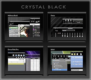
Dark interface themes are extremely popular with a small, but very passionate, group of Mac users. Sadly, since Apple introduced Leopard (Mac OS X 10.5), the old, relatively simple method of creating such themes on the Mac can't be used, and it took the theming community a good year and a half to figure out the current, relatively hobbled tools to theme the few bits of the interface that can be themed.
Given the weakened state of theming on the Mac, it's not surprising that the number of themes available has dwindled to a mere handful. And even those only go part of the way compared with what we used to be able to achieve with ShapeShifter. Still, the yearning for Mac themes remains strong among this community, and black themes are virtually nonexistent now.
Black themes have always been a challenge, because the frameworks used to build applications were designed to assume that text would always be black and the color of windows and buttons always light. Apple introduced a dark-theme paradigm a few years ago with its Heads-Up Display window style, which, with its translucent black background actually assumes that text will be white.
So, why would anyone undertake an effort to introduce a fully black theme for Snow Leopard?
I suppose it's because we Martians just can't step back from a challenge. Not to mention the fact that we, too, are afflicted with the passion for dark themes that many Earthlings suffer from. I also have a good starting point, having developed some useful techniques for the challenge through building CrystalClear Interface.
To acknowledge the theme's heritage, I've dubbed the theme Crystal Black.
Theming A Web Page With Crystal Black:
A CSS Design for Web Inspector
For awhile, I've wanted to theme Safari's Web Inspector—the incredibly useful built-in website viewer/debugger/designer assistant—with the Crystal Black look and feel, but it wasn't immediately obvious how to do this. I assumed that the tool was just a part of Safari, and therefore built with classes and widgets from the Cocoa AppKit (which is the framework all Cocoa apps are built with). However, when I began to inspect the Inspector, I discovered that everything contained within its borders was simply web content: HTML, CSS, JavaScript, and images.
In other words, the Web Inspector tool is nothing but an intricate, sophisticated, and extremely well designed web page!
Having built a Crystal Black CSS file for web pages in general, and with my past expertise in CSS, I attacked this challenge with relish! It reminded me of the time I realized that Dashboard widgets are, at their core, nothing but little web pages (as are simply apps for the iPhone). In tackling this one, the main question was, How should the various elements look? And the hardest part was inspecting the various parts in of the Inspector in great detail to determine which CSS rules governed their default appearance and behavior.
As I discovered, the WebKit has a a sub-framework called "WebCore," which in turn has a folder of resources specifically for the Web Inspector. In the Inspector folder, among other things, is a suite of CSS files that handle different aspects of the Inspector's design and behavior. Of these, the primary one I needed to tweak was called simply "inspector.css."
A Black Gloss Theme for CoverSutra
I recently posted another member of the coming Crystal Black theme for Snow Leopard on my deviantART site. This new component is a glossy black theme for the popular iTunes controller CoverSutra.
Crystal Black is a theme for Mac OS X "Snow Leopard" that I'm still refining and plan to release eventually. I published a preview of the theme last fall, and a few weeks ago released a Crystal Black theme for iTunes. The skins for both iTunes and CoverSutra will, of course, be included in the full theme once it's out.
Crystal Black for iTunes
Last fall, I released an early version of Crystal Black for iTunes 10.1 on my deviantART site and have updated it once or twice since then. This post announces an update of the theme for iTunes 10.1.2 and adds a couple of minor enhancements for 10.1.1.
Crystal Black is a theme for Mac OS X "Snow Leopard" that I'm still refining and plan to release eventually. I published a preview of the theme last fall, and also migrated the theme to iTunes 10 when it came out. Since theming iTunes is 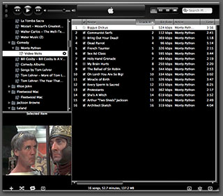 quite a bit easier than theming the entire operating system, I decided to release Crystal Black for iTunes first.
This version of Crystal Black for iTunes continues to improve its usability when iTunes is set with the hidden "High Contrast Mode" option. High Contrast Mode effectively inverts white and black in the iTunes sidebar and playlist contents (see screenshot at right), and looks great with Crystal Black. The high-contrast option is accessible through various utilities you can download to customize "hidden" features of Mac OS X. I use and recommend the free, open-source Secrets for such customizing. Secrets installs an easy-to-use and auto-updated Preference Pane and includes hidden options for a wide variety of third-party apps, in addition to Mac OS X.
One more application-specific Crystal Black theme I plan to release soon will be of interest primarily to web developers: It's a theme for Safari's Web Inspector module. Stay posted for more on that, and for more about Crystal Black as a whole.
Crystal Black Preview: A New Attempt To Put a Dark Skin on Snow Leopard
Like many themers for Mac OS X 10.3 ("Panther"), I was awed by the beta releases of a theme called "Cathode" back in 2004. An artist named Dragun took the theme through a few iterations and then abruptly halted development.
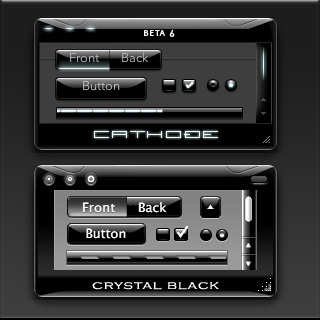 Those of us who used ShapeShifter to run Cathode on our Macs understood why. Although Cathode was beautiful, in practice it was impractical. There were too many elements of too many applications that resisted a dark theme for buttons and window backgrounds.
For me, however—and I'm sure for many theming fans—the dream of using a beautiful black theme like Cathode was a siren call impossible to forget. Over the years, the dream receded further from our grasp because of roadblocks Apple erected—intentionally or not—to the existing mechanisms of theming Mac OS X.
Starting with Mac OS X 10.5 ("Leopard") in 2007, the main tool for applying Mac themes, ShapeShifter, went bye-bye and has never returned. This is one of the main reasons I continued development of CrystalClear Interface, because it was the only way for me to apply a fully realized theme to Mac OS X.
Since Leopard, themers have been able to finesse the problem by changing the system graphics files that apply buttons, menubar background, basic window shape and color, and a few other items to your window appearance. Despite best efforts to unravel the secrets of the Mac's new ways of drawing itself, this mechanism isn't able to consistently change text color in the many contexts in which it appears in a window, thus making design and use of dark theme impractical.
As I'll describe in a future article, tackling the design of Crystal Black, a new theme inspired by Cathode, has been far from easy. And there remain user interface elements that totally resist its charms. But for me, those elements are few enough to make Crystal Black practical.
At this point, I'm confident that I'll be able to complete Crystal Black and release it at some point for all Mac users of Snow Leopard (Mac OS X 10.6). The theme is an offshoot of CrystalClear Interface (CCI) and uses much of the same code. However, Crystal Black is much simpler, has a smaller impact on the operating system, and is compatible with many more applications than CCI. Also unlike CCI, Crystal Black provides a complete theme for iTunes 10.
CrystalClear Interface 2.5:
Taming a Leopard in Winter
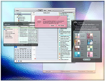
I recently released a major new version of CrystalClear Interface (CCI). Among the most significant enhancements in version 2.5 are its full compatibility with Mac OS X 10.6 ("Snow Leopard") and its ability to finally theme the Finder. Because of new limitations to system add-ons imposed by Apple, taming Snow Leopard has been a daunting challenge, but the final outcome is a version of CCI that's the most stable, robust, and compatible yet. The extended struggle with Snow Leopard over the winter is one of the primary reasons I've decided to require a license fee for CCI 2.5 ($12.00).
Eight New Themes Coming in CrystalClear Interface 2.5
Besides the set of Crystal Document icons previewed recently, another feature of the forthcoming CrystalClear Interface 2.5 is a new set of eight beautiful preset themes, shown below. (Click the images for a closer look.) The themes are designed to complement the eight Frosted Crystals desktop pictures released with CCI 2.2. Of course, you can still set colors, frames, and transparency settings for Mac OS X windows to your own taste, as always. The preset themes are ones I've enjoyed and find a convenient shortcut to designing custom themes.
Introducing Crystal Documents:
A Set of Document Icons for CrystalClear Interface
This is a set of 74 document icons intended to complement CrystalClear Interface and the set of Crystal Albook system and application icons I released a couple of years ago. The set covers most of the document types used by Apple's applications as well as a limited set of document types for third-party applications. The icon set for third-party apps will be augmented substantially as time permits.
These icons are available for download now, and they will be included in the forthcoming release of CrystalClear Interface 2.5 (more on that in another article). In CCI 2.5, you will be able to automatically install and uninstall the various icon sets displayed below, including any of the Crystal Docs icons for any of the third-party applications you use. The new icon install feature will be included in the new CCI Preferences window.
Enjoy!
CrystalClear Interface 2.2

I posted the new version of CrystalClear Interface a few days ago, and then proceeded to hunt down and squash a couple of last-minute bugs. Yesterday, I was also moved to make one of the hard-wired features a configurable option. While not as dramatic an upgrade as version 2.1, CCI 2.2 nevertheless has a large number of new features, enhanced features, and bug fixes, as well a great deal of code optimizing. This article summarizes the more significant changes since version 2.1 was released in June.
CrystalClear Interface 2.1
The Many Faces of CrystalClear Interface 2.0
The beta release of CrystalClear Interface 2.0 is now available on its new website. Also on the site is a documentation page describing all the features of this new version. Be sure to peruse that information—especially the tips and troubleshooting sections—before you try it out.
It’s Coming . . . CrystalClear Interface 2.0
The Transparent Experiment Lives!
CrystalClear Interface 2.0 will soon enter a public beta release. This is a major step from the previous version, released in March 2008 and described in the Mars article:
CrystalClear Interface 1.9:
Going Where No Theme Has Gone Before
Those of you who found CCI 1.9 outlandish no doubt find that version 2.0 sets a new standard for outlandishness. ![]()
CoreUI Finder Utility Now Available For CrystalClear Interface 1.9
CrystalClear Interface Update: Version 1.9.1
 This release fixes a problem with the uninstaller, and is otherwise the same as 1.9.0. (Note: Today’s update fixes the error in yesterday’s release, which inadvertently still had the 1.9.0 installer. Sorry about that!) The uninstaller now runs a new utility, GraphicsToggle, after running the installer/uninstaller, and this takes care of making sure the Leopard graphics are fully restored. See the documentation included with the download for more information about GraphicsToggle.
Announcing CrystalClear Interface v. 1.8.12
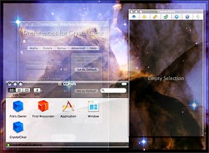 This unexpected journey into the realm of transparent user interfaces has taken me much further than I ever imagined. It's been almost a year now since the first inkling of the idea rattled my brain, which led to the first release of Crystal Clear for ShapeShifter in mid-February.
Thanks to the Cocoa InputManager SetAlphaValue, I was led, Pied-Piper-like, into the enormous and strange world of Objective-C and Cocoa during the summer. I'm finally surfacing from that expedition and have brought a souvenir of my travels into the strange, terrifying, and glorious realm of Cocoa.
Each computer user will have to decide for themselves just how much transparency they can stand while working at their Mac. I was surprised at the amount of loathing that was expressed towards Leopard's newly translucent menubar last month. But I don't think it's indicative of any permanent flaw in the concept. Quite the contrary, in fact: If anything, Leopard's toying with translucency is too much of a baby step, on the one hand, and smacks of me-tooism with Vista, on the other.
Very briefly, the premise I'm proposing is that our computer monitors are essentially glorious light sources, much like the ones that shine through windows in our houses and automobiles. Just as we do with those windows, there are times when we want to bask in the beauty shining through, and other times that we prefer to close the blinds to avoid glare. On the computer, we already know how to close the blinds. I'm suggesting that there's a world of beauty awaiting computer users who can enjoy the light as well.
Update On That Crystal I’ve Been Growing
I can’t believe it’s been 2 months since I published the preview article for Crystal Clear 1.5! What was going to be a 2-3 week project after that turned into a monster of a project that’s taken me on several journeys into the bowels of Mac OS X and Cocoa, the primary framework for building Mac OS X software in the programming language Objective-C. But the story of those journeys–if I ever have time to write them down–is an article unto itself.
Today, I just want to briefly report what’s going on with Crystal Clear. Besides the features noted in August, the screen movie above shows a variety of noteworthy advances, some obvious and some not so obvious. Here are the ones I want to point out in particular:
New Crystal Trinket Eliminates Maintenance on Your Menubar
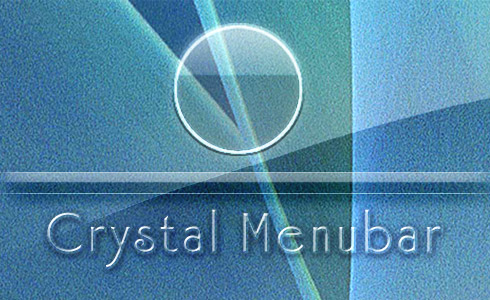
I’m releasing this in advance of Crystal Clear 1.5 since it’s ready to go and there may be one or two folks who are tired of dealing with the “roll your own” menubar from version 1.2, even though it did eliminate the ugly menu-extra smudgies of previous releases.
With Crystal Menubar, you just drag the application to your hard drive (the “Applications” folder, maybe?) and click it. This will put the nice, clear Crystal Menubar in its rightful place at the top of your screen. After that, you can just forget about it. Use whatever desktop picture that strikes your fancy!
If you decide to use it, just add it to your Login Items in System Preferences (the Accounts pane) so it gets launched when you log in.
Crystal Clear 1.5 Preview:
Yes! The Term “Opaque Window” Is An Oxymoron
After all, who 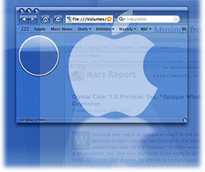 would ever install an opaque window? In the real world, a window by definition is clear—you can see through it. If it weren’t clear, you couldn’t very well call it a “window.” In other words, an opaque window is an oxymoron. Yet, that very oxymoron is the norm on our computer desktops today. As Crystal Clear evolves, its aim is coming closer to making opaque windows as much of an oxymoron on your desktop as they are in that wall over there.
Computer desktops have slowly evolved since 1984, when the first Macintosh was introduced. With each operating system release, Apple has added more realism to the graphics that make up application windows, the desktop, and their various “widgets” and icons. Microsoft and other GUI-design-wannabes have followed along as closely as they could. Through this process, our software windows and icons have gained a little 3D through primitive shading, higher resolution displays, larger icons, better shadows, alpha transparency and compositing, smoother animation and transition effects, and so on. These changes have produced a dramatically more “realistic” look-and-feel today than we had in the beginning. Undoubtedly, this evolution 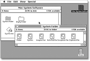 will continue, and desktops 10 years from now will make today’s look similarly primitive.
The Crystal Clear experiment is asking the graphical question, “How about using transparency to improve realism, while enhancing the beauty of our desktops at the same time?”
Up to now, the Crystal Clear theme for Mac OS X has brought clarity to your Aqua window toolbars, titlebars, and menubars. Crystal Albook icons clarified your system and application icons. And there has been much rejoicing.
However, a common question from early users of the theme was, “How about the window edges? How about the status bar? How about Safari’s bookmark and tab bars?” Unfortunately, none of the tools in a Mac OS X themer’s bag of tricks (chiefly, ThemePark ) can help affix transparent colors or graphics onto those bits of Aqua windows, so I had to throw my shoulders up in a major, sad shrug.
Fortunately, my little experiment in alpha transparency didn’t end there. The SetAlphaValue software that’s been a key part of Crystal Clear’s magic from the beginning has led me on a merry (well, mostly merry) romp through Objective-C and Cocoa Land, the world of geeky wonder that lies behind each object on your Mac OS X desktop. With much open-source Cocoa software code, two excellent books, and the rich universe of web Cocoa resources in hand, I’ve been slowly absorbing the syntax and grammar of Objective-C, the programming language of choice for Cocoa application development. As I got deeper into the “messaging” framework that’s a key part of Cocoa, I realized I could hack SetAlphaValue to do much more than just adjust window transparency.
Crystal Clear 1.2: The Transparent Revolution Cleans Up Another Opaque Holdout
This 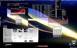 article introduces the latest version of Crystal Clear, which features an enhancement to the system menubar transparency that was described in an article last week. Although I didn't find time to work on the Crystal Albook icon set since the last release, Crystal Clear has a large number of enhancements in various button elements, as described below. I do hope to get some work done on Crystal Albook next time around.
- An experimental approach to solving the problem of "extra overlay shine" on most menu extras in the system menubar (statusbar). This approach can eliminate the visual discord created as menu extras overlay their own "toolbar" over the preexisting one. In opaque toolbars, this isn't noticeable, but it's bothersome in any toolbar with alpha transparency. (This part of the update is described in the recent Mars article, "Desperately Seeking Clarity: Wiping the Dirt from My Crystal Clear Menubar."
- Crystal Clear toolbar elements for Camino.
- New design for menu selection highlights in Crystal Clear Dark. Similar highlights also appear now in the Finder sidebar.
- Completion of pushbutton and popup button elements for Carbon apps (such as Photoshop). (The buttons were already complete for Cocoa apps.)
- New Crystal designs for the bevel buttons (butted and otherwise) that are the bane of my existence when theming Mac OS X. (O! Apple... Please make these go away in Leopard!)
- Reworking of the large metal buttons.
- Various other tweaks and fixes, plus a few more menu extras.
Future releases will work on standardizing the appearance of various otherwise-similar button elements, reducing the height of some pushbutton elements, and completing unfinished work on the slider elements.
Desperately Seeking Clarity: Wiping the Dirt from My Crystal Clear Menubar
 If you're a fan of Crystal Clear who's noticed---and been seriously bothered by---the "smudges" on the Crystal menubar behind most of your menubar apps, I think you'll be pleased by this report about the new version of Crystal Clear. Work on the menubar is hardly the only improvement in the theme, but it's probably the most significant one.
I think of the menubar smudges as "extra shine," because that's kind of what they are: They result from a double layer of the menubar graphic in the space the menu extras occupy. This smudging might not be so distracting if it were applied evenly across all of the menu extras, but of course that's not the case. As a result, from the first menu extra over to Spotlight, the "smudge" comes and goes and can be visually disturbing if you let it.
This smudging is the number one complaint about Crystal Clear, and I'm very pleased to announce that the new version will offer a nice, clean, truly crystal-clear menubar with (virtually) no dirt whatsoever! Unfortunately, you can't download it today, because I don't have all the files quite ready. But I promise to make them available very soon. ![]()
LiteIcon: New Freeware Manages Your System Icons
iThemeOS: New Mac OS X Visual Makeover Software
Crystal Clear: Pushing Mac OS X Windows Beyond Translucent
With 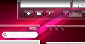 the recent launch of Windows Vista and its new Aero interface, everyone who knows of it is thinking about transparent/translucent windows. Indeed, folks who are into theming have known of Aero for years, since, well, it’s taken Microsoft years to get it to market.
Mac users have already enjoyed transparency in their applications for years now, though not as part of the window “trim.” (As I discuss briefly later on, Aqua doesn’t actually have much “trim”.) Rather, it’s just something we take for granted in applications like the Dock, Dashboard, and Expose, and QuickTime Player (which pops up throughout Mac OS X to present slideshows, image thumbnail views, and of course full-screen video), as well as in Apple’s growing use of “HUD” displays, which use a transparent black interface.
Then, of course, there are apps like Quicksilver, which has taken advantage of transparency in its Bezel interface for years, and more recently in its amazing, animated Cube interface, Growl, which uses Apple’s bezel framework in several styles, and 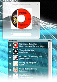 numerous others like DropCopy (whose whole interface is transparent), QuartzClocks (which lets users adjust the transparency of your chosen clock), and AlarmClock (which again uses the bezel framework to great effect).
Nevertheless, when I first saw Mac themer/designer Ice Specter’s attempts to develop a transparent theme for Mac OS X that would duplicate the look of Aero, I was “hooked on transparency” in a big way. At the time, I didn’t realize that Ruler Aero, Ice Specter’s theme, was emulating the new Windows “look,” but it wouldn’t have mattered in any case. For one thing, as cool as Ruler Aero was, it wasn’t usable enough, and it had this disconcerting blend of transparent toolbars (in metal apps) and opaque ones (in everything else). It was a proof-of-concept, and a terrific one at that.
But from the get-go, what Ruler Aero made me lust after wasn’t Windows Vista Aero-style translucency, but rather totally transparent windows. In addition, I wanted a theme that would give me transparent toolbars in both metal apps like the Finder, QuickTime Player, and Safari and in regular Cocoa apps like Preview, Mail, Activity Monitor, Keynote, and Pages (in other words, in most of the apps I use).
However, after experimenting off and on for a couple of years to achieve the look I had in my head, I had pretty much given up. Every thread I followed in the theming forums concluded that transparency wasn’t possible in a Mac OS X theme except in the few places Ruler Aero had achieved it. I concluded that Apple had designed Mac OS X and Aqua so as to completely thwart all attempts at my transparency nirvana.
Then, quite by accident last month, I stumbled onto a setting in Apple’s Cocoa framework that finally unlocked the secret of transparency for Mac OS X’s toolbars. I’ve now finished applying that setting to a Mac OS X theme that enables totally see-through windows, and I’m calling it “Crystal Clear.”
Crystal Clear Preview: See Through Windows On Your Mac
What could be more logical–or more beautiful–than crystal clear windows on your Mac? Were grey metal windows something we yearned for? Of course not! Windows were made to see through.
Coming soon to a Mac near you… Crystal Clear, a new experiment in alpha transparency for Mac OS X.
Here are some preview shots of a few of my favorites.


