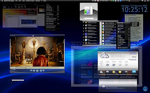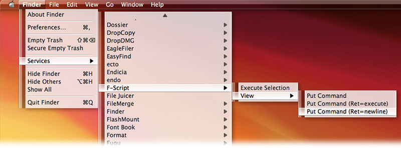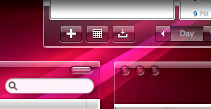
With the recent launch of Windows Vista and its new Aero interface, everyone who knows of it is thinking about transparent/translucent windows. Indeed, folks who are into theming have known of Aero for years, since, well, it’s taken Microsoft years to get it to market.
Mac users have already enjoyed transparency in their applications for years now, though not as part of the window “trim.” (As I discuss briefly later on, Aqua doesn’t actually have much “trim”.) Rather, it’s just something we take for granted in applications like the Dock, Dashboard, and Expose, and QuickTime Player (which pops up throughout Mac OS X to present slideshows, image thumbnail views, and of course full-screen video), as well as in Apple’s growing use of “HUD” displays, which use a transparent black interface. 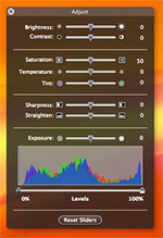
Then, of course, there are apps like Quicksilver, which has taken advantage of transparency in its Bezel interface for years, and more recently in its amazing, animated Cube interface, Growl, which uses Apple’s bezel framework in several styles, and numerous others like DropCopy (whose whole interface is transparent), QuartzClocks 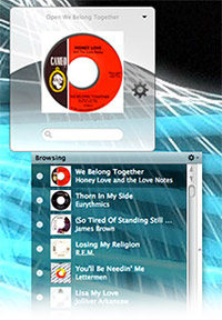 (which lets users adjust the transparency of your chosen clock), and AlarmClock (which again uses the bezel framework to great effect).
Nevertheless, when I first saw Mac themer/designer Ice Specter’s attempts to develop a transparent theme for Mac OS X that would duplicate the look of Aero, I was “hooked on transparency” in a big way. At the time, I didn’t realize that Ruler Aero, Ice Specter’s theme, was emulating the new Windows “look,” but it wouldn’t have mattered in any case. For one thing, as cool as Ruler Aero was, it wasn’t usable enough, and it had this disconcerting blend of transparent toolbars (in metal apps) and opaque ones (in everything else). It was a proof-of-concept, and a terrific one at that.
But from the get-go, what Ruler Aero made me lust after wasn’t Windows Vista Aero-style translucency, but rather totally transparent windows. In addition, I wanted a theme that would give me transparent toolbars in both metal apps like the Finder, QuickTime Player, and Safari and in regular Cocoa apps like Preview, Mail, Activity Monitor, Keynote, and Pages (in other words, in most of the apps I use).
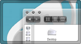 However, after experimenting off and on for a couple of years to achieve the look I had in my head, I had pretty much given up. Every thread I followed in the theming forums concluded that transparency wasn’t possible in a Mac OS X theme except in the few places Ruler Aero had achieved it. I concluded that Apple had designed Mac OS X and Aqua so as to completely thwart all attempts at my transparency nirvana.
Then, quite by accident last month, I stumbled onto a setting in Apple’s Cocoa framework that finally unlocked the secret of transparency for Mac OS X’s toolbars. I’ve now finished applying that setting to a Mac OS X theme that enables totally see-through windows, and I’m calling it “Crystal Clear.”
I can hear the naysayers already: How ridiculous! Aren’t you worried about usability? How can you get anything done if you can’t tell which window you’re working on?
I’m totally sympathetic to those concerns, and though I’ve addressed them well enough for my own needs, I have no illusions that Crystal Clear windows are going to be usable by everyone. This most definitely is not going to win any contests for usability, but after refining it for the last couple of weeks, I’m using it daily because it doesn’t get in my way at all, and I really love the way it looks—especially if I’ve got some gorgeous desktop pictures to look at through its windows.
In this article introducing Crystal Clear, a Mac OS X theme for ShapeShifter, I’m going to be quite frank about the potential usability flaws inherent in window transparency and how I’ve tried to overcome them. I’m also going to spend some time explaining some of the inconsistencies in Aqua as it’s applied throughout Mac applications that make “edge” themes like Crystal Clear—and dark themes in general, too—difficult to get perfect. Both of these discussions will also provide some tips on how to optimize Crystal Clear on your Mac if you want to try it out.
First, I want to give credit for the breakthrough to a small piece of open-source freeware that Michal Parrot released a couple of years ago: SetAlphaValue. This is a Cocoa “InputManager” system extension that gives users the ability to manipulate Cocoa’s native “alphaValue” window property. I’m just beginning to understand the fundamentals of Cocoa, so I won’t be at all surprised if I get some of this wrong. But as I understand it, one of the methods you can employ with a Cocoa window is “setAlphaValue”, going from 1.0 (fully opaque) to 0.0 (fully transparent). The alphaValue default is 1.0. (I learned a little about this through the use of the marvelous F-Script utilities, a free toolset that I highly recommend to anyone interested in poking around Cocoa interactively.)
I’m certainly not the first person to realize that SetAlphaValue would let you make any Cocoa window transparent, and obviously Michaël Parrot knew his tool would bring pleasure to the Mac masses. From the beginning, he has introduced it by saying “… this program is only aesthetic, just for fun ;)” And among the Mac themer crowd, awareness was raised about SetAlphaValue as well as a similar (but not nearly as fun or flexible) $8.00 shareware product called InvisRay, and how these could be used to make windows transparent or translucent. However, both tools affect the transparency of the entire application window they target, and translucency in areas of text you’re trying to read can be simply annoying, not fun or beautiful.
 What I discovered is that you don’t have to make a window very transparent at all in order to activate transparent graphics that are part of your ShapeShifter theme. In fact, just setting the alphaValue of a window to 0.99 is enough to turn toolbars totally transparent in Cocoa applications. At 1.0 (opaque), toolbars that use transparent graphics will appear coal-black. But at 0.99, they’re gorgeously clear, while the rest of the window will look almost totally opaque.
Prior to this, the only graphic elements in a Mac OS X theme that could utilize transparent graphics this way were those demonstrated in Ruler Aero: The top-level status bar, titlebars, menus, and the four corners of “metal” windows (those with their internal “theme” set to use a “texture”). By implementing extremely wide graphics for the metal-window corners, Ice Spectre discovered that you could enable full transparency across the top and bottom of metal windows. This still left the sides of metal windows opaque, and nothing I’ve discovered changes that.
It’s useful to point out here, however, that transparency in the “sides” of application windows is almost totally irrelevant in Mac OS X, because most windows don’t have any sides at all! I didn’t really notice this until thinking all this through recently and then looking at videos of Microsoft’s new Vista “Aero” interface. In Windows, all application windows have little border “sides” that serve no purpose other than to let users drag them around and resize them. As Mac users know, however, you don’t need to be able to resize a window from any side in order to have a happy experience. Nor do you need to be able to drag a window around from any of its four sides.
Nevertheless, Windows users who switch to a Mac are invariably a bit bewildered by the operating system’s somewhat restrictive drag/resize methods. An article I’ve got planned for the near future will look at a whole category of Mac OS X software that addresses this need. In fact, nearly all of these tools–some of them free–go even further than Windows in enabling drag-anywhere, resize-any-way functionality in Mac windows. Needless to say, with the increase in switchers over the last year or so, there has been a huge increase in the number of these “window tricks” tools coming to market–most recently, tools like Zooom! and MondoMouse (each about $10)–grant you powers over Mac OS X windows that far exceed what you can do on Windows, er, windows.
And, you can do these things without little “drag borders” encumbering every one of your windows. Therefore, the lack of transparent borders in Crystal Clear is, in my view, mostly irrelevant. And for metal windows that do have sides, I’ve added a background graphic that at least dresses up those sides a bit.
So, after finagling the technical barrier, the next one was usability. How do you actually work with transparent-toolbar windows and buttons?
One thing that helps a lot right off the bat is to use Single Application Mode (SAM), a way of managing your workspace that I still plan to write about in detail one of these days. At the moment, I use the shareware LiteSwitch preference pane to enable SAM, but there are a zillion other utilities that do this now (including Quicksilver). Basically, SAM hides each application when you switch to another. In nearly all SAM utilities, you can override this behavior by holding the Shift key when switching. SAM therefore ensures that you have only one application’s windows showing at any one time. I recommend this even if you don’t use Crystal Clear, because it makes for a much tidier, less distracting workspace.
I also use a free “haxie” called DesktopSweeper, which “turns off” my desktop icons when I’m not working in the Finder. This is probably anathema to many users, who rely on seeing their desktop icons at all times. But if you don’t use yours, and they merely make for a cluttered desktop, you might enjoy DesktopSweeper, which basically sets a configurable timer to hide the icons when you switch from Finder. (You can even make them disappear when the Finder is active… ) This tip merely eliminates visual distraction that might annoy you when viewed through transparent toolbars, but is by no means essential.
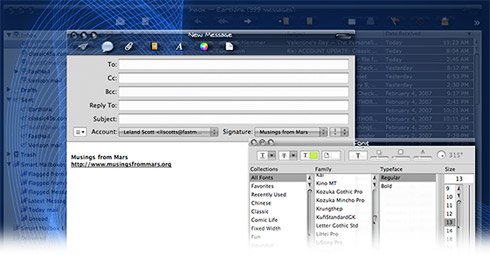
However, the heart of the usability problem is this, which remains even if you use SAM and keep your desktop sweeped up: Suppose you’re working in Mail, where you open a new window to compose an email. When using Crystal Clear, the transparent toolbar makes it difficult to tell which toolbar is which, and it can be hard to be sure you’re clicking on the right button, since you can often see those of the window below as clearly as those of the topmost one. In addition, with a mostly-white background, a Crystal Clear toolbar is hard to distinguish, since it tends to blend in with the background.
To attempt to solve these problems, I did two things:
 First, I deliberately made the clear glass in Crystal Clear slightly “smoky,” with a gentle black gradiant below contrasting with a brightening gradiant above . This helps it stand out against most backgrounds, since it subtly deepens the color of the background.
- Second, I take advantage of one of the coolest features of SetAlphaValue, which heretofore I had not taken terribly seriously. SetAlphaValue lets you set default alphaValues for an application’s main window, for
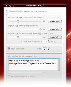 all of its windows that are not main, and for all of its windows when the application itself is in the background. You can set these defaults globally, and then modify them as needed for each individual app. I’ve hacked the open source SetAlphaValue to set defaults that automatically make background windows fade to about 35% of opaque, so that the frontmost window stays opaque while background windows fade away somewhat. This makes it much easier to distinguish the window you’re working on from other active windows on your screen. You can, of course, modify the defaults for your own use once you install and start using SetAlphaValue.
The screenshot of Apple Mail that I posted in the preview article showed the application with the frontmost window at 99% opaque and the background window at 35%. I’m putting a smaller version here to demonstrate how this looks.
Although these settings make Crystal Clear very usable (and enjoyable!) in my opinion, there remain some usability and design quirks that are beyond my ability to solve. The following is a list of some of these quirks, as well as some additional “best practices” for users who want to try Crystal Clear:
- Cocoa toolbars get temporarily “messed up” when closed and reopened. However, if you refresh the screen (switch to another app and switch back, or hide and then show the window), the toolbar will clear up.
- Occasionally, you’ll see “ghost” images of previous window titles or icons in metal toolbars or titlebars … if this bothers you, the only way I’ve found to “clear up” the toolbar is to use the haxie WindowShade to reduce its custom shadow density. If you don’t use WindowShade, you may not experience this problem. If you do, try reducing the density slider in the custom window shade section.
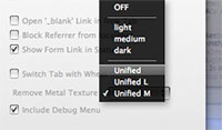 In Safari, the tab bar will look best if you install the free SafariStand plugin. Use one of the themes in Stand to enable a unified toolbar look. I recommend the “Unified Medium” option.
- Main menubar “extras” that don’t use the MenuCracker bundle show a second layer of shine, and I haven’t found any way around it. Apparently, these menus believe they need the regular “Root Menu Title” background, because they don’t know they already have one. MenuCracker seems to take care of the problem, but most menu extras don’t use it, unfortunately. (I’m not completely sure that MenuCracker is the variable here, and if anyone knows something different, please share!)
- The optimum setting for the Finder toolbar is to use “icon only” with regular (not “small size”) icons. Otherwise, the toolbar area will either overlap the opaque area somewhat when you use Spotlight, or the text labels won’t be very readable. The problem is that, unlike Unified toolbars in Cocoa apps, the transparent toolbar in metal windows doesn’t expand and collapse as you change view options. This is why I recommend using SafariStand to enable a unified toolbar in Safari.
- Because of the issues noted in the preceding bullet point, I find that in general Mac OS X toolbars look best if you select “icon only”. This can be a problem if you’re using an app and don’t know what the icons stand for (yet). If it’s a unified Cocoa toolbar, just keep the text on in that case.
 If you use a lot of Carbon applications, you might find Crystal Clear less than optimum. That’s because unless it uses a metal window theme, you won’t see any transparency except for the titlebar. In fact, for non-metal Carbon apps that have a toolbar, you’ll find the toolbar background is black. This is because the Carbon framework doesn’t support alpha transparency in its windows (I assume). The way I think of it is that the Carbon framework today is to Cocoa as Windows XP framework is to Vista’s: Namely, not exactly state-of-the-art. Still, so far Apple hasn’t been able to convince a lot of major application developers (including the big guys like Microsoft and Adobe) to utilize the Cocoa framework. So, my advice is, avoid applications that don’t use the Cocoa framework where possible. The only one I use daily is Photoshop, and it looks just fine in Crystal Clear. So does BBEdit and Firefox. Microsoft Word, however, does not. But I find the combination of Pages and TextEdit superior to Word anyway.
- Avoid background pictures with large patches of white, especially at the top of the screen. Although Crystal Clear seems to work well with both light and dark desktop pictures and with pictures that are both “busy” and “serene,” it doesn’t do well against pure white, since the white text in toolbars and titlebars (and the status bar) will not be distinguishable.
In addition to transparent graphics for various interface elements, you’ll also notice transparency in some text colors and text backgrounds. I’m still tinkering with these, and would appreciate any feedback on ways to make these settings better. For example, just today I darkened the list background colors a bit.
One of the most frustrating aspects of theming, in my view, is text colors. Although Mac OS X apps are 90% consistent in the way text colors are applied, there are still 10% that use a given text color in an unexpected location of the user interface. Users of ThemePark are familiar with the “Text Colors” section, which attempts to identify and define colors for all the various user interface elements in Mac OS X. So, for example, in situations where “list text” is used (usually, for lists), there are separate colors for “selected” list text and “disabled” list text. In addition, there is a third color for “selected, focused” list text, and a fourth for plain old default list text.
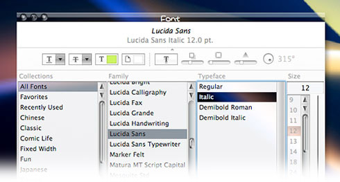
A common situation where all four instances of list text is used is in the Font palette that you can invoke in most Cocoa applications that support text editing (see screenshot). Here, the first two columns show default list text (black against white background), as well as “selected” list text (black against a translucent white background). The third column shows an instance of “selected, focused” text (white text against a translucent black background), and the fourth column shows … actually, I’m not sure where that text color comes from. You’d think it would be one of the four types of list text, but as far as I can tell, it’s not. Or perhaps it’s “disabled” list text, which in Crystal Clear is a translucent black (grey) color. But why would the font size in this view be considered “disabled”, even when you click on and edit it? Who knows, but that’s the hand themers are dealt.
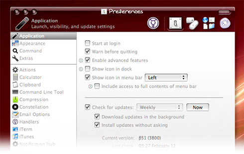
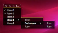 “Disabled” list text also shows up a lot in the preferences window for Quicksilver. You may notice that in the accompanying screenshot, the text color is a bit light. That’s the best compromise I’ve come up with so far, since “disabled” list text is also the text color used in some situations where black text doesn’t work. It took me quite a while to Sherlock this thing out, but it turns out that the text color in test menus in Interface Builder (Apple’s GUI builder that comes with its free Developer Tools, and which is derived from the NextStep app of the same name) is “disabled” list text. In Crystal Clear, which uses a translucent black background color in its menus, menu text is defined as white, but illogical though it is, that’s not the color Interface Builder uses for its menus. It uses “disabled” list text. Oh well… these are the trials of building an appearance theme for Mac OS X, I suppose. Compromise is required reading.
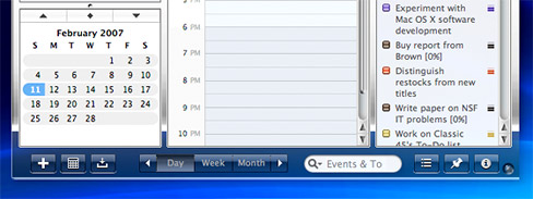
Another place where compromise in text color was required is in the setting for “control interior text” (normally used as the color of text that overlays button elements) and “control exterior text” (normally the color of text in the window view that contains buttons, check boxes, and the like). Occasionally, developers use these in reversed roles, or they use them for instances that have nothing to do with window controls. Oddly, one place I grappled with here was in iCal, where the color for “control exterior text” is used atop the tabs at the bottom of the window that are used to toggle between “Day,” “Month,” and “Year” calendar view. Normally, the text color used on top of tabs is—naturally enough—”tab text”, but for some reason (probably just a coding error), Apple is using “control exterior text” here. As a result of these competing objectives, that color, like “disabled” list test, had to be compromised.
As my wife just asked me, “Why are you explaining all of this?” And my answer is simply, “It’s my way.” I like to document what I do and why, so I can remember later. If I didn’t, I’d spend another hour or two hunting down these text-color anomalies in the unlikely event I take 2 months of my life to develop another interface theme for Mac OS X. ![]()
As mentioned in the preview article (which by the way has numerous screenshots of the theme), Crystal Clear comes in this incarnation with specially designed elements for the following applications, and if I continue using it, I’ll probably add more apps as time permits. Some of these involved developing Templates for ThemePark (which is surprisingly easy for most apps, by the way), and I plan to upload those to the site that serves as a library for ThemePark application templates.
- Address Book
- Automator
- DevonThink Pro
- iCal
- iTunes (Note: I’d always assumed iTunes was a Cocoa app with a metal skin, like Calculator or iCal. Not so. iTunes has always been a Carbon app that originally had a skin designed to look metal. Somehow the Finder, which is also a Carbon app, DOES use a true metal skin, which is why you can get transparency there. But iTunes is, as themers have always known, “different.” As far as I’ve been able to tell, there is no way to add a transparent skin to iTunes. This is a real shame, but there it is. All I did originally was theme the titlebar buttons for the big window, and I plan to do the same for the mini window too. But that’s all…
- Preview
- Safari/WebKit
- System Preferences
- ThemePark
- Yummy FTP
 Hint for Geeks: If you have SetAlphaValue installed, a sure-fire way to determine whether a given application is Carbon or Cocoa is to look in the application’s main menu item (e.g., the one labeled “Safari” or “Finder” or “Preview”, etc…) If you see a SetAlphaValue item in that menu, it’s Cocoa. If you don’t, it’s Carbon. Incidentally, that SetAlphaValue item is how you invoke it to modify your global and/or individual application preferences. With SetAlphaValue, you can also attach alphaValues to particular em:windows of a given app. So, for example, you could invoke it in Safari when you have the Downloads window open and, in the scrollbox halfway down, you’ll see “Downloads” as one of the active windows. Select it and then click once on the slider control, which will change the window’s value to 99. This should forever ensure that the Downloads window doesn’t fade away like other Safari windows. You can apply this technique to any application that uses SetAlphaValue.
 The guikit file also contains four desktop pictures courtesy of Xanthic, a designer who’s done precisely one interface theme, which turned out to be one of the very best ever (IMHO): TiSkin. TiSkin also comes with its own set of icons, wallpapers, and, um, Windows variants. Besides the four included pictures, you can find many other images on his site that look equally beautiful with Crystal Clear.
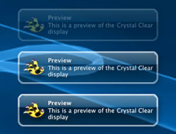 In addition, after writing my article on how to make a Growl style a few months ago, it was a snap to put together an appropriate Growl style for Crystal Clear, which is included in the Crystal Clear download package below. I’m also making it available here as a separate download.
One more goodie I’ve been meaning to add is a visual theme for the delightful iCan software. iCan puts a powerful, skinnable trashcan on your desktop, and I’ve wanted to make one for Crystal Clear since none of the default themes quite did it for me. With an iCan theme, you can also add a customized “poof” and custom sounds. I’m not 100% happy with this particular iCan,  but it’ll do for now. I’m adding it to the Crystal Clear package, or you can download it separately here.
Nearing the end of the article, it wouldn’t do to publish a Mac OS X theme without a full desktop shot, so you can click the accompanying desktop image to see one if you like. Otherwise, just grab the guikit and get going!
As a reminder, you will need to have Unsanity’s ShapeShifter software installed at this point. Unfortunately, ShapeShifter ain’t free (it’s $20), but I do think Unsanity deserves a round of applause for making it available and so fun and easy to use. The latest versions include a side utility called GuiTweak, which lets you apply Apple’s core image filters to any theme and create your own variants. Still, since Crystal Clear itself is free (I guess I’d accept a donation, though), I’d love to figure out how to make a self-installing version, as the designer of the gorgeous Uno has done. But so far I haven’t had the time to investigate that option.
Also, don’t forget you’ll need to get and install SetAlphaValue, either in its
original form (from M. Parrot’s website) or using the version included in the Crystal Clear application package (i.e., the version hacked by yours truly).
On March 2, I released a variant of Crystal Clear that uses light translucent menus instead of black ones. The new Crystal Clear “Lite” also comes with a full set of themed menu extras for Apple’s built-in apps, as well as an additional set for some third-party menubar apps that I use: DropCopy, FastScripts, iKey, Yahoo Widget Engine, SoundSource, and a couple others. The Crystal Clear download above also includes themed toolbar icons for SafariStand. Enjoy! (You can click on the following preview to get a large, full-screen image if you like.)
Download Crystal Clear. (16.9 mb)
(Updated 4/20/07: This download now includes Crystal Clear Lite and Dark, as well as the new Crystal Albook icon set.)
Note that the warning about use of SetAlphaValue that Parrot includes with the original version also applies to the modified one (see the “ReadMe” file included in the package). To install SetAlphaValue manually, just drag the SetAlphaValue folder to either
- /Library/InputManagers/ or
~/Library/InputManagers/
You’ll have to create the folder InputManagers if doesn’t yet exist. If you use the supplied installer, it will put SetAlphaValue in the main Library folder, in which case you’ll need to restart your Mac to activate it.
Note: To disable the “fading” behavior either globally or for a particular application, click on the first item in the application’s main menu (the one named after the application—e.g., “Safari”) and look for the menu item “SetAlphaValue,†which will be about halfway down the list, usually. This will open the SetAlphaValue preferences window.
From here, you can either:
- Click on the first checkbox, “Disable for this application,†or
- Change the value of the first slider to a value you prefer (the first slider is set by default to 35). Once you do this, click on the “Default Value†button to the right. This will tell SetAlphaValue that you want this to be the new default value for all windows in all of your applications (although it may not reset the default for applications you’ve already opened, unless you delete the SetAlphaValue preference (plist) file). You can change any of the other settings if you want, but that’s the main one you’ll want to do.
Alternatively, you can remove SetAlphaValue from your system by deleting the directory “SetAlphaValue†from your /Library/InputManagers folder. (Note that this is the top-level Library folder, not the one in your Home directory.)
Oh, one last tip that some of you might find useful… a reader brought to my attention a nifty free app called FocusLayer, which I’m using to supplement SetAlphaValue on my Mac. It can be used instead of SetAlphaValue, however, if you’re not inclined to mess with your windows’ transparency. FocusLayer instead inserts an adjustable dark layer between the frontmost window and the others, effectively dimming them… think of the “lightbox” effect that Apple uses in System Preferences and elsewhere. FocusLayer can put a menu extra in the toolbar so you can easily switch it on and off, and you can also easily exclude specific apps if you don’t want them touched. One nice thing it has over SetAlphaValue is that it can affect Carbon as well as Cocoa apps. If you try it, be sure to change the default time interval from “0″ (the default) to 1 or 2 seconds… otherwise, you may experience the high CPU utilization rate that I did at first.
(Pant! Pant!) Before I totally run out of words, I wanted to also give credit to a few other themers whose work and inspiration went into the making of Crystal Clear. Many of the interior buttons and controls are modified from Enigma, a 2005 theme developed by a designer named Hosince. (Most of these are replaced with updated graphics in Crystal Clear Lite.) The scrollbar arrows and track, as well as the list headers, are modified from elements in XiDG Albook, developed by XiAP GUI Studio. I utilized these mostly because of time constraints, and maybe one day I’ll do custom designs to replace them. (I’d gladly take contributions from real designers, too! I’m more of a programmer than a designer, as the design guys can easily tell, I’m sure.) Finally, I also want to thank Norwegian designer Gloss, whose Glass theme got me thinking again…


